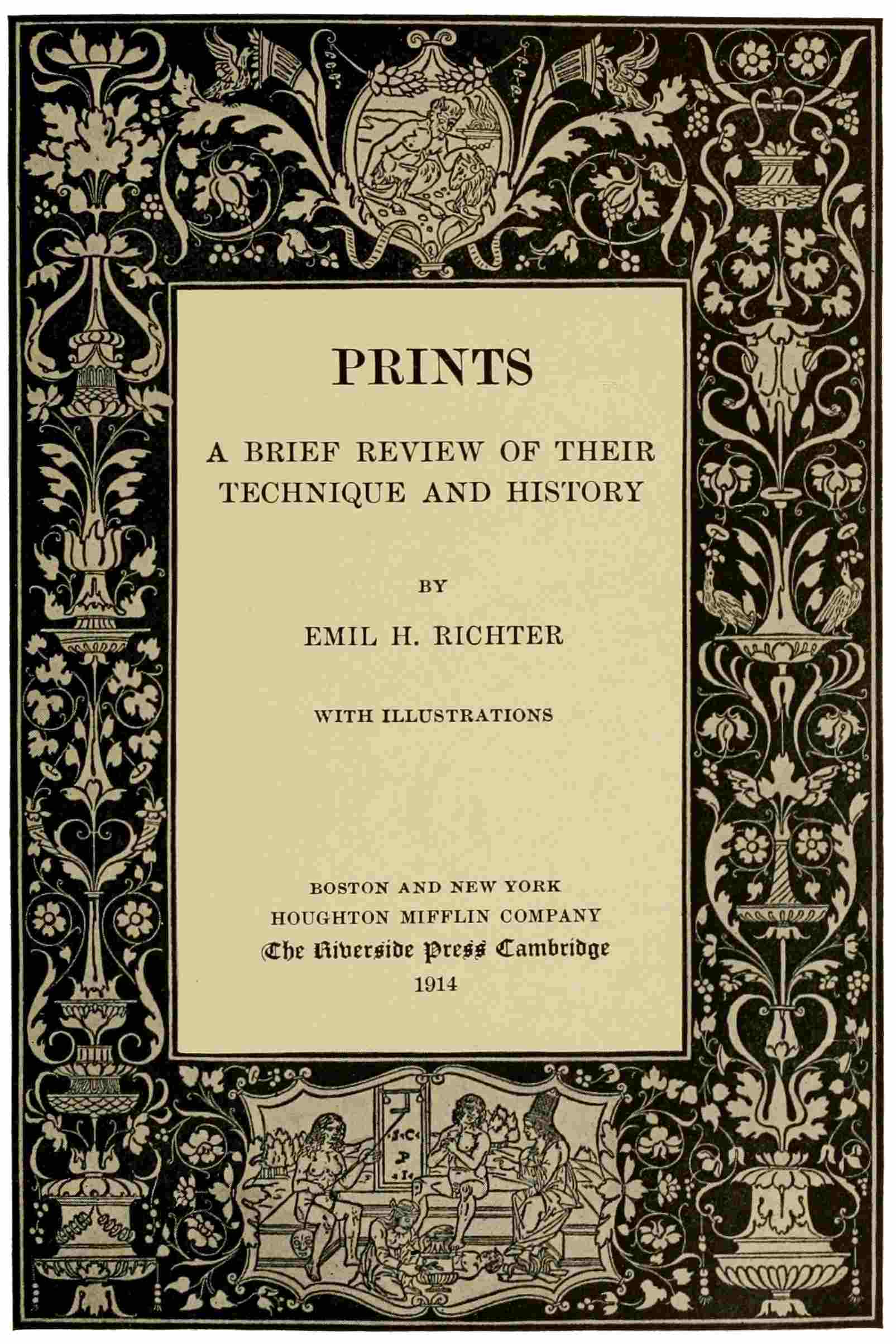
PRINTS
A BRIEF REVIEW OF THEIR
TECHNIQUE AND HISTORY
BY
EMIL H. RICHTER
WITH ILLUSTRATIONS
BOSTON AND NEW YORK
HOUGHTON MIFFLIN COMPANY
The Riverside Press Cambridge
1914
This eBook is for the use of anyone anywhere in the United States and most other parts of the world at no cost and with almost no restrictions whatsoever. You may copy it, give it away or re-use it under the terms of the Project Gutenberg License included with this eBook or online at www.gutenberg.org. If you are not located in the United States, you'll have to check the laws of the country where you are located before using this ebook.
Title: Prints
A Brief Review of Their Technique and History
Author: Emil H. (Emil Heinrich) Richter
Release Date: May 3, 2021 [eBook #65243]
Language: English
Character set encoding: UTF-8
***START OF THE PROJECT GUTENBERG EBOOK PRINTS***
| Note: | Images of the original pages are available through Internet Archive. See https://archive.org/details/printsbriefrevie01rich |
Transcriber’s Note
Larger versions of most illustrations may be seen by right-clicking them and selecting an option to view them separately, or by double-tapping and/or stretching them.

PRINTS
A BRIEF REVIEW OF THEIR
TECHNIQUE AND HISTORY
BY
EMIL H. RICHTER
WITH ILLUSTRATIONS
BOSTON AND NEW YORK
HOUGHTON MIFFLIN COMPANY
The Riverside Press Cambridge
1914
COPYRIGHT, 1914, BY HOUGHTON MIFFLIN COMPANY
ALL RIGHTS RESERVED
Published November 1914
v
Prints have long been an undisturbed domain of the collector and scholarly connoisseur. Centuries of study and research are resulting in the identification and description of this vast amount of material. The literature on prints embodies these results in the form of handbooks, histories, catalogues for reference, essays, and specializing treatises. These are written primarily for the use of students and collectors, with the elaboration and detail requisite for this class of readers.
Manifestations of a widening interest are more evident every day. With this broadening popular interest has come a demand for a plain, short explanation of “prints.” In the absence of such a brief review and in answer to repeated inquiries, a series of lectures were prepared and delivered—somevi years ago—by the writer. These lectures are herewith offered, in slightly revised form, to those interested in the nature and development of prints.
This little book is not a compendium of the graphic arts, just an introduction. Brevity and simplicity have been aimed at, the purpose being to awaken interest and convey initial information conducive to further study.
The charm and value of a print lies essentially in the quality of line or tone peculiar to the process employed in its making. These cannot be rendered adequately by the half-tone illustrations which accompany these pages. The prints themselves must be seen to be truly appreciated and understood.
vii
| I. | How Prints are Made | 1 |
| Introductory, 1. Bank note and magazine illustration, 3. Three main divisions of processes. Woodcut, 4. Wood-engraving, 5. Engraving, 6. Dry-point, mezzotint, 8. Etching, 9. Lithography, 10. The printing presses used, 11. | ||
| II. | The Origin of Woodcut | 12 |
| Not a sudden invention, 12. Utilitarian origin, 14. The past reviewed, 15. The panel picture and its cheap substitute, 18. Saints’ pictures, 20. Playing cards, 21. Increasing demand for pictures, 24. Block-books, movable type, 26. Book illustration in Germany and Italy, 28. Examples of early woodcuts: German, 30, Italian, 32. | ||
| III. | The Early Days of Engraving | 35 |
| Intaglio printing, the goldsmith’s niello, 35. Engraving in Germany and Italy, attitude and results, 37. Anonymous masters, 40. Schongauer, 41. Early Italian examples, 44. Pollajuolo, Mantegna, 46. Giulio Campagnola, 47. | ||
| IV. | Italy | 49 |
| The professional engraver, 49. Marcantonio Raimondi, 50. The publisher, 51. Revival; Carracci, 52. Painter-etchers, 53. Later developments; Canaletto, 55. The classical engravers, 55. Chiaroscuro woodcut, 56.viii | ||
| V. | Germany | 59 |
| Culmination, Dürer, 60. Lucas van Leyden, 65. Italian influence, 66. Little masters, 67. Woodcut: Cranach, Holbein, 69. The two masters, Dürer and Holbein, 70. Decline, 71. | ||
| VI. | The Netherlands | 73 |
| History. Flemish and Dutch art, 73. Engraver families, commerce in Saints’ pictures, 75. Virtuosi of the graver, Goltzius, 76. Rubens and his engravers, 77. Van Dyck, 78. Cornel Visscher, 79. Rembrandt, 80. Ostade, 84. Ruysdael. Landscape and animal etchers, 85. Italian influence, decline, 86. | ||
| VII. | France | 87 |
| Woodcut illustrations, 87. Engraving, Jean Duvet, 89. The Fontainebleau school, 90. Callot, Claude Lorrain, 91. Portrait engraving, 93. Mellan, 94. Morin, 95. Nanteuil, 96. Edelinck and others, 97. New processes, 100. Color-prints, book ornamentation, 101. Classical engraving, Wille, 104. Italian preëminence, 105. Etchers, vignettists, 105. Spain: Goya, 107. | ||
| VIII. | England | 109 |
| Early days, Hollar. English engravers, 109. Hogarth, 110. Bartolozzi, 110. Mezzotint engravers, 111. Earlom, 113. Wood-engraving: Bewick, 114. | ||
| IX. | The United States | 116 |
| Colonial times; Pelham, Peale, 116. Stipple; book illustration, 117. Wood-engraving, the tone engravers, 118. Etching, 120.ix | ||
| X. | The Nineteenth Century | 121 |
| Individual expression, 121. Blake, 122. Chodowiecki, 123. A new era, Constable, Delacroix and others, 124. Turner, 126. Wood-engraving and lithography, 127. Menzel; Gavarni, Daumier, 129. Raffet, 130. Revival of etching, 130. Jacque, Millet, and others, 131. Etching versus Engraving, 131. Haden, Whistler, 132. Meryon, 133. Gaillard, 134. Exacting demands on the graphic arts; Zorn, Klinger, 135. Conclusion, 136. | ||
| Books recommended for study of prints, 138. |
| Title-page to Herodotus. Anonymous | Title-page |
| St. Margaret of Hungary. Anonymous | 30 |
| Page from Ars Memorandi. Anonymous | 30 |
| Page from Nuremberg Chronicle. Anonymous | 30 |
| Virgin and Child with St. John. Anonymous | 32 |
| Page from Hypnerotomachia. Anonymous | 32 |
| Page from Morgante Maggiore. Anonymous | 32 |
| Madonna of Einsiedeln. Anon. Master E. S. | 40 |
| Death of the Virgin. Martin Schongauer | 42 |
| Sibilla Samia. Anonymous | 44 |
| Clio, from the so-called Tarocchi. Anonymous | 44 |
| Battle of Nude Men. Antonio Pollajuolo | 46 |
| Christ between Two Saints. Andrea Mantegna | 46 |
| St. John the Baptist. Giulio Campagnola | 46 |
| Death of Dido. Marcantonio Raimondi | 50 |
| Adam and Eve. Marcantonio Raimondi | 50 |
| Titian. Agostino Carracci | 52 |
| Madonna and Child. Federigo Barocci | 54 |
| Torre di Malghera. Antonio Canale | 56 |
| Diogenes. Ugo da Carpi | 56 |
| Four Horsemen, Apocalypse. Albrecht Dürer | 60xii |
| Arms with the Skull. Albrecht Dürer | 62 |
| Rest in Egypt. Albrecht Dürer | 62 |
| St. Jerome in his Study. Albrecht Dürer | 64 |
| Cardinal Albrecht. Albrecht Dürer | 64 |
| Adoration of the Magi. Lucas van Leyden | 66 |
| Tournament. Lucas Cranach | 68 |
| Johannes Zurenus. Hendrik Goltzius | 74 |
| Rubens. Paul Pontius | 76 |
| Jan Brueghel. Anthony van Dyck | 78 |
| Gellius de Bouma. Cornel Visscher | 78 |
| Adoration of the Shepherds. Rembrandt | 80 |
| The Three Trees. Rembrandt | 80 |
| Janus Lutma. Rembrandt | 82 |
| Tobit Blind. Rembrandt | 82 |
| The Spinner. Adriaen van Ostade | 84 |
| The Travelers. Jacob Ruysdael | 84 |
| The Diamond. Nicolaes Berghem | 86 |
| Tour de Nesle. Jacques Callot | 90 |
| Le Bouvier. Claude Lorrain | 92 |
| Duc de Guise. Claude Mellan | 94 |
| Antoine Vitré. Jean Morin | 94 |
| Pompone de Bellièvre. Robert Nanteuil | 96 |
| Philippe de Champaigne. Gérard Edelinck | 96 |
| Bossuet. Pierre Imbert Drevet | 98 |
| Champs Élysées. Nicolas Henri Tardieu | 100xiii |
| Instruction Paternelle. Georg Wille | 104 |
| Plate from the Caprichos. Francisco Goya | 106 |
| Catharine of Braganza. William Faithorne | 110 |
| The Hon. Miss Bingham. Francesco Bartolozzi | 110 |
| Mrs. Carnac. John Raphael Smith | 112 |
| Flower and Fruit Piece. Richard Earlom | 114 |
| Thomas Jefferson. David Edwin | 116 |
| Chief Justice Marshall. Asher Brown Durand | 118 |
| Still-life with the Peacock. William J. Linton | 118 |
| Plate from the Book of Job. William Blake | 122 |
| Home of a Painter. Daniel Chodowiecki | 124 |
| Inverary Pier. J. M. W. Turner | 126 |
| Æsacus and Hesperie. J. M. W. Turner | 126 |
| Christ Disputing with Doctors. A. v. Menzel | 128 |
| Cartoon on Louis Philippe. Honoré Daumier | 128 |
| Midnight Review. Auguste Raffet | 130 |
| Woman Churning. Jean François Millet | 130 |
| Sunset in Ireland. Sir Seymour Haden | 132 |
| The Doorway. Venice. James McN. Whistler | 132 |
| Le Petit Pont. Charles Meryon | 132 |
| Dom Prosper Guéranger. Ferdinand Gaillard | 134 |
| Girl Bathing. Anders Zorn | 134 |
| Expulsion from Paradise. Max Klinger | 134 |
Prints are familiar to every one of us, and yet the subject of prints is strangely unfamiliar. If we look at a painting, a piece of sculpture, or at a monumental building, we know how these things came into being. Without any effort we can see in our mind’s eye the painter, with palette and brushes, applying the colors on his canvas, we can see the sculptor thumbing the clay model on the stand before him, with alternate gentleness and force, while the spectacle of stone-masons and bricklayers at work is a matter of daily occurrence. Likewise are we daily face to face with prints in our homes. They2 are familiar objects that have always been there; we are so used to them that we hardly see them. But have we ever conjured up, in our mind’s eye, the vision of an engraver, or etcher, or lithographer at work making the print which is so familiar to us? It is a world, indeed, this field on which the energies of thousands upon thousands of men have been expended, expressive of the thoughts of great masters, expressive, yes, eloquent, of the changing mental attitude, the changing customs and interests of successive periods. There is no field, I am tempted to say, in all the realm of art, more comprehensive, more broadening than this subject of prints. In order fully to appreciate the phases of its development, we must find out, first of all, what a print is, and how it is made.
The term “print,” as we use it here, applies to any design conveyed upon paper or any similar substance by means of pressure, usually in the printing-press. Prints are not3 all produced in one and the same manner;—if this statement should prove surprising, just open any magazine on an illustration page; then place beside it, for comparison, a new dollar bill. Notice the even tone of black in the magazine illustration and the intensity of the black, sharp-cut, metallic lines of the head on the bill. It is quite evident that these two examples have been produced by different means; the magazine illustration shows that the inked lines and dots which constitute the picture have been brought upon the paper with considerable pressure: the ink is embedded into the paper; whereas, if the bill is new, you will notice, upon close inspection, that the ink of every line and dot lies upon the surface of the paper. Pass your finger lightly over some of the heavier lines, and if your finger-tips are sensitive, you will distinctly feel these ridges of ink. Why this difference? Because human ingenuity has devised several ways of obtaining an impression. There are three4 such possibilities, which divide the graphic arts into three main groups, namely:—
Relief processes: Woodcut, wood-engraving;
Intaglio processes: Engraving, dry-point, mezzotinting, and the etching processes;
Planographic processes: Lithography, and its derivatives.1
1 In order to keep the subject as simple as may be, we will leave aside that vast array of modern processes based upon photography, and therefore known as photo-mechanical processes (half-tone, photogravure, and the like) and devote our attention to the hand processes only.
Examples from two of these main divisions have just been under discussion, the magazine illustration being a relief print, the bill an engraving on steel, consequently intaglio. Let us now devote a few moments to their technical features, taking first the oldest of all the processes, woodcut.
If we take a block of wood, nicely planed, finish its face with sandpaper, and cover it with printer’s ink, an impression from that5 blackened surface would naturally be an unbroken, rectangular patch of black. Now we take a knife with a strong, short blade, a woodcutter’s knife, and with two slanting cuts we take out a thin long sliver from the middle of this blackened surface of wood. The result of an impression will now be a black surface with a white line where we have cut away the wood. Another two cuts parallel with the first will result in another white line, or rather we shall now have a black line, with a white space on either side, the black line being the ridge of wood standing between the two pieces which we have cut away. Could anything be simpler than this working recipe?—wherever black is wanted, leave the wood standing; where you need white, cut away the wood. The same theory applies to wood-engraving, with some changes in material and implements. The wood-engraver uses cross-grain blocks of the hard boxwood, instead of planks of cherry or pear wood, and on this hard surface the graver6 replaces the knife. The graver—most useful of tools—is a long, thin, diamond-shaped bar of steel, ending in a blunt point with cutting edges; its wooden handle fitting the palm of the hand. The graver is pushed forward and ploughs with great precision across the block or plate, cutting lines of any degree of delicacy or boldness. Like the knife, it removes the wood, consequently leaving a white line or dot wherever it has passed. Hence the term “white-line engraving,” often used for wood-engraving.
When we turn to the second great division, to the intaglio processes, we find that the recipe of the woodcut has to be just reversed to fit this new proposition. Consult the diagram of the three possibilities of printing; the cross-section of the relief-block presents a series of flat-topped ridges with valleys between them. The tops of the ridges print, the valleys are the spaces which are to appear white in the impression. The second figure, a cross-section of an7 intaglio plate,—an engraving on copper we will say,—shows no hills and vales, but a flat surface with a number of V-shaped cuts filled with ink. When engraving on a copper plate, we cut with the graver into the metal every line of our design that is to appear black. Wherever we want a white space we are careful to leave untouched the polished surface of the plate. Having completed the cutting-in (engraving) of our design, the plate is covered all over with printing-ink, and this is rubbed thoroughly into every furrow which we have cut, so that they are all filled flush with the surface. The surface of the plate is wiped clean. An impression taken from the plate so prepared will show us a black line for every furrow we have cut. Small wonder that the lines on the dollar bill were perceptible ridges of ink, since all the ink in the furrows of the plate is now on the surface of the paper. The theory of the intaglio processes is plainly this: wherever you want black in your design, cut lines or8 dots into the plate; wherever white is needed, leave the smooth surface of the plate untouched. Based upon this formula, the different intaglio processes produce their blacks in different ways; in dry-point engraving, for instance, the design is scratched into the metal by means of a sharp needle-point, the etching-needle. In tearing through the copper the needle leaves a jagged ridge of copper standing on the sides of each line, this “burr” retains some ink after the plate has been wiped clean, and gives to the dry-point line its peculiar velvety, slightly blurred appearance. The mezzotinter begins his work by roughening the whole surface of the plate with the “rocker” into myriad indentations and tiny projecting teeth of copper. The plate in this condition prints a uniform, velvety black, the deepest tone obtainable. Now by scraping away the little teeth of copper more or less completely, the design is modeled at will in varying half-tones. The high lights are obtained by9 burnishing the copper quite smooth again. The etcher, instead of cutting the lines of his design into the copper, trusts to the corroding action of powerful acids. Covering his plate with an acid-proof etching-ground, he draws his subject with the etching-needle, using just sufficient pressure to cut through the thin film of ground and lay bare the copper. The plate is then put into an acid bath which eats away the metal wherever a line has been laid bare. The ground is then washed off with a suitable solvent, and the plate printed. There are a number of processes based on etching, like aquatint, crayon manner, stipple, soft-ground etching, and others, but a review, however brief, of all these kindred devices does not lie within the scope of these pages.
We have now reviewed the relief processes, both dependent entirely on hand work, and the intaglio processes, engraving, dry-point, mezzotint, likewise relying upon manual power to prepare the plate for printing.10 In the etching group of intaglio devices, a chemical factor is called upon to lessen and accelerate the work of the hand. The last group to be considered, planographic processes, is based entirely upon chemical and physical action. The drawing to be reproduced is made with fatty crayon or ink upon a slab of a special variety of limestone; the stone is then treated with acidulated water, and with gummed water. As a result, when the stone is moistened, all those parts which have been drawn upon reject the water, but have an affinity for printing-ink, while the portions not drawn upon have an affinity for water and reject printing-ink, as long as they are kept moist. Neither by ridges nor sunken furrows, just from one plane surface,—hence the term “planographic,”—merely by the enmity of water and fatty ink are these lithographic impressions obtained. Plates of metal are often substituted for stone (zincography, algraphy), but the process always remains the same.
11
It goes without saying that each of these three possibilities of printing necessitates presses of appropriate construction; thus, in the so-called platten press, the pressure is exerted vertically upon the block by the flat metal plate which comes down upon it, on the same principle as in the letter-press familiar to us all. All intaglio plates are printed in roller presses, in which the plate, laid on an iron bed, passes between two rollers, one above, one below, as in a clothes-wringer. The lithographic press, finally, has a traveling bed, which passes under a stationary flat piece of wood. During its passage under this wooden bar, the paper is firmly pressed down upon the stone, which would be crushed in the other types of presses.2
2 Lithographs made on metal plates may be printed in an intaglio press as well.
After this summary review of the technique of prints, let us consider, with what brevity we may, the great phases of development of the graphic arts.
12
The term “invention” is often used in referring to the origin of printing and of engraving, as though these devices had come into being quite suddenly,—overnight, as it were. The belief is prevalent, indeed, that one man in Mayence originated, developed, perfected, established printing, and that another man in Florence originated printing from engraved plates about that same time (middle of the fifteenth century). If we look more closely into these subjects, it becomes evident that Dame Tradition has flashed the light of fame upon one link only, of a chain of achievements which stretches back into the unknown. She has clothed one man, call him Gutenberg, call him Finiguerra, with the sum of thought and attainment which had preceded them, that the achievement might gain added impressiveness.13 The printing-press, and printing from movable type, had reached a state of high perfection at the time when Gutenberg printed his epoch-making Bibles, and research has substantiated the belief that a period of experiment and development must have preceded and led up to such excellence, although these early days of printing still baffle the ingenuity of research. The genesis of printing from engraved plates is equally difficult to establish, though the claim of invention by any one man is as little admissible here as in the other instance. It is a matter of gradual development. Remember, it is the printing from engraved plates which concerns us in our inquiry. Engraving as a means of decorating metal surfaces dates back to remote antiquity, but that is foreign to our present subject. Only when engraving is used as a means of reproducing a design, does it enter within our sphere of interest. Similarly are we concerned to a certain extent with the wood-block method used in14 the days of Byzance, for stamping patterns upon cloth, because it is the parent of our woodcut. We have here, however, a device used for the decoration of textile fabrics, and we must reserve our interest for the time when the design printed from the wood block, upon paper or any other suitable carrier of an impression, becomes the essential consideration.
The origin of the processes of reproduction is invariably utilitarian. Every advance, every new technical attainment, can be traced to the demand for devices which would lessen labor and save time. The graphic arts do not share with painting a development based upon a desire for æsthetic expression. Their origin is imitative, thoroughly democratic, and every process continues in that lowly sphere, until the genius of some powerful artist lifts it into realms of art. For the very reason of this utilitarian tendency, and because of a gamut of expression restricted to line and tone for15 the interpretation of a world of color and form, the graphic arts, even more than other forms of artistic expression, need the steady hand of the gifted artist to sustain them on a high plane of excellence. Deprived of this guiding support, their decline to levels of mediocrity and commercialism is swift and inevitable.
If we glance at early periods of history, we are readily convinced that before the fifteenth century there existed no demand for pictorial work widespread or emphatic enough to call into life speedier substitutes for hand work. Surely no need of such substitutes was felt in the Græco-Roman world, where a well-developed system of scribes met the demands of their patrons. Nor were multiplying devices needed in the early days of Christianity. The new faith, to be sure, made its appeal to everybody, to the high-born and lowly alike, but it relied mainly on the word of the preacher for the transmission of its simple creed. During the dark ages16 of ferment, migration, and strife which followed, the monuments of antique culture, erudition, knowledge were engulfed. What demand could there have been for the multiplying arts in that period of dense ignorance, of ceaseless struggle for life itself, for the bare necessities of life, for merely endurable conditions? The Church, the only institution of stability in this sea of unrest, became the repository of whatever remained of tradition and erudition,—mysteries, these, to be jealously guarded and held as a privilege of the clergy.
Owing to the prevalent illiteracy among the people in these dark ages, the Church, in its mission of spiritual guidance, relied, as of old, on the preacher’s word. The power of his exhortations was seconded, however, by silently eloquent, impressive teachings surrounding the worshipers, namely, the scenes and figures of religious import, painted upon the walls of the church. That same endeavor to stimulate pious thoughts carried the17 miniature into liturgical books, into religious manuscripts generally. The writing-room of the monastery was all-sufficient to provide for the pious needs of clergy, rulers, and nobles. Here the patient copyist drew again and again the outlines of the large illuminated initials of his text, until he bethought himself of the labor he might save by imitating the cloth-printer, and cutting wooden relief-blocks of these outlines which he might stamp upon his parchment. An early device this, adopted in the twelfth or thirteenth century, but clearly foreshadowing the development which was soon to follow.
Meantime, in that iron age religious enthusiasm had fired the crusaders, the armor-clad Occident had met the Orient, bringing back some of the wisdom of the ancient East into the scholar’s study and the convent cell, and broadening man’s outlook upon the world.
We know how Gothic architecture grew up in the North, how in the Gothic church18 the ample wall space, which had been heretofore the realm of painting, was divided, reduced, suppressed. We know how the curtailed pictorial art sought new spheres of expression, how the panel picture took possession of the altars. Before long this picture, which could be shifted from one position to another, was used independently of altars, for the adornment of suitable wall spaces in the church, until finally it found its way from the church to the home, henceforth to be one of its indispensable adornments.
As painting made its way into the lay world, the impersonal, traditional, dogmatic character of sacred subjects faded away. Not that ecclesiastic art had lost its deeply religious sincerity, but the artist saw nature with new eyes; he realized the beautiful world around him, and lovingly painted the plants and flowers at the feet of the Virgin. He removed her throne from the formal diapered background of gold, and placed it in19 the midst of the actual living world. The figures became more personal and lifelike; worldly subjects, even portraits, or at least efforts in the direction of individual differentiation, came within the artist’s sphere, while as yet the sacred subject remained the one great theme of artistic expression.
The panel picture had come into the home as a means of decoration, but the wealthy only could gratify their desire for this costly form of artistic adornment. The burgher, the artisan, the economical household, could not think of owning such painted luxury, not any more than they could afford the costly miniatures painted on parchment. Then some bethought themselves that they might cut the outline of figures on blocks of wood, after the manner of the cloth-printers and of the initial blocks which we have found in use in monastic writing-rooms. These outlines could then be printed on parchment, or on that new and cheaper product, paper, as an inexpensive substitute for panel picture and20 miniature. In this manner the common people obtained their saints’ pictures or “Helgen” (Heiligen), more or less crude in design, clumsy in the execution of knife-work, colored with the gayest pigments which the Briefmaler could find. With all their imperfections these early woodcuts were prized and evidently found a ready market, as souvenirs of pilgrimages, as fit embellishments of wayside shrines or altars of the chapels and churches of poor parishes, as scapulars, or pasted in books, as makeshifts for the unattainable miniatures, or else they were simply fastened on the wall, as a decoration. Tastes were simple, and with all their crudeness, these productions—of greatly varying size and of every degree of careful or careless execution—are not without charm even to the twentieth-century beholder.
The same artisans who cut and printed these saints’ pictures found lucrative employment in a field quite remote from21 religious matters. Playing-cards had been introduced into Europe from the Orient, probably in the latter part of the thirteenth century. They quickly won popular favor and were used by rich and poor with equal zest. Cards exquisitely painted or charmingly engraved attest the favor accorded the game by people of rank and wealth, but in making cards for the use of the people at large, cheapness of production far outweighed any æsthetic considerations which might have existed. Cards had to be sold cheaply, and they had to be produced in large quantities to satisfy the growing demand. How were these conditions to be met? One solution of the problem was stenciling, another stamping the outlines on paper by means of relief-blocks; both were resorted to by the artisans of the fifteenth century, and their trade spread beyond the confines of Germany, to the south of the Alps, causing Venetian craftsmen to clamor for legislative protection of their home production.
22
In all these early manifestations, we saw woodcut in the service of the common people; we saw it used instead of other means of production for reasons purely utilitarian. But a change is at hand, for has not the crusader sown a seed throughout the land; has not the human mind been awakened from its mediæval lethargy? The humanist arises, seeking enlightenment and the solution of life’s problems amid the meager surviving relics and records of the art and thought of antiquity. Feudal conditions are grudgingly modified, under pressure from a new element, which brings about a gradual shifting of the balance of power, intellectually as well as economically and politically: the rise of the Town. During our early, turbulent centuries with their grim
misery not only loved company, as the old proverb has it, but absolutely needed it.23 Groups of those, too weak singly to withstand the attacks of that vast, lawless element which lived by oppression and plunder, huddled themselves together, built themselves shelters, and intrenched themselves against the common foe. In the course of time, owing to an advantageous position or to intensity of commerce or industry, these one-time shelters grew into towns, rising in wealth, power, and independent spirit, girt about with strong walls and moats, each town a state within the state, protected by imperial grants and privileges, bound together by the common enmity of the feudal power, and within the walls by an ardent local patriotism. Strong in their guilds and associations, in touch with each other and with the world by the constant travel of merchants and craftsmen, the towns became not only centers of wealth, but also the bearers of progressive thought, of art, of mental enlightenment. Here the graphic arts might well originate and flourish, for here24 were their patrons, the burgher, the craftsman, the people.
The time was at hand when the call for the multiplying arts would become imperative—compelling. Man looked about, and beheld a world full of beauty and abuses; he felt himself a unit, an individual, not merely part of the mass of mankind, and he was going to think for himself; he demanded to know, to learn, to grasp the truths and probe the problems of his world. For the instruction of this untutored multitude, eager for light, there were two modes of expression, instantly intelligible: the simple spoken word, and that other—the illustrative, explanatory picture. This latter must now go forth also among the people, to help in the task of enlightenment; not the panel picture, to be sure, nor the miniature in the costly manuscript, for aside from their costliness they could never numerically satisfy so universal a demand. In response to the call—we are now in the fifteenth century—we see25 woodcut pictures pasted into manuscripts, to form edifying picture books, the pictures printed from wood blocks, a few lines of text added with the pen. Then both picture and text are cut into the same wood block in imitation of the picture manuscripts. These early “block-books,” of Biblical or moralizing contents, were intended for the use of pupils in the monastic schools which were then the only educational institutions.
In the early days of woodcut, impressions were taken from the wood block by laying a sheet of paper on the inked surface of the block and rubbing the back of the paper with a stiff scrubbing brush, or with a flat piece of wood, so as to bring it in close contact with the inked ridges on the surface of the block. It is evident that neither the quality nor yet the speed of this form of printing could long satisfy even the most easy-going craftsman. A more perfect mode of printing was needed and gradually evolved, culminating in the printing-press. Similarly the cutting of26 letters of the text on the picture blocks—in the so-called block-books—must soon have proved itself impracticable, for the reign of these books is quite brief. One is tempted to let fancy play around the bald facts, and to watch the artisan, wearily cutting the same letters again and again into the wood block, until he bethinks himself,—a half-dozen others likewise: “Why cannot I saw off the lettering cut on another block, cut it up, word by word, or, better yet, letter by letter, then put the letters together in words and sentences as I need them, and use them with my newly cut picture? It would save a deal of trouble!” Thus the next step was movable type, used around, between, together with, the blocks bearing the illustrations. The rapid spread of type-printing simultaneous with these developments concerns us merely because the vast number of illustrated books published during that period greatly favored the development of woodcut illustration.
Throughout these developments, we27 always discern the same utilitarian element which I have pointed out. Far from originating in any striving for a higher, more ideal form of artistic expression, the devices for printing both pictures and text were simply means to save labor and expedite publication. The manuscript, the miniature, were the ideals to be approached, and they were high ideals, to be sure. Distinguished humanists like Pope Nicholas V, Poggio, Giannozzo Mannetti, and others, being themselves experts in calligraphy, demanded the best efforts of their scribes and miniaturists. It is a pleasure merely to look at their books. The material used is invariably parchment, the bindings in the Vatican and at Urbino, crimson velvet and silver. It could hardly be expected that these men, who spared neither pains nor expense to show their respect for the contents of a book, would view the advent of printing with anything like satisfaction. Their collective feelings are well summed up in the one remark28 of Federigo da Urbino, that he would be ashamed to own a printed book.
Not by these nor for their use had type-printing and picture-printing been called into life, but by the needs of the people, and at the people’s call the world was flooded with a multitude of works, informative or entertaining in character. Soon German printers set up presses in Italian cities, and ere long the publishing centers of the South, especially Venice, vied with Germany in importance of production.
Book illustration was considered from a very different point of view in Germany and in Italy. German illustration grew out of a demand for and pleasure in the explanatory picture. The demand for picture books and for books consisting chiefly of illustrations came from a public easily pleased, satisfied with crude outline cuts daubed over with colors. In Italy illustration came in answer to a desire for artistic illustrative ornamentation, on the part of a public of29 cultivated taste. For this reason the German illustrated book bears a character largely instructive, while the Italian illustration is essentially decorative. Very few of the early books in the German language are devoid of illustrations. The pictures constitute their decoration,—they are used as chapter headings,—long before the advent of purely ornamental embellishments. In Italy the printed book takes over from the manuscript the idea of decorative embellishment. Borders are stamped—with relief-blocks—upon the printed pages of early Venetian books, and colored by hand. This craving for color is as old as mankind; its demands are urged upon the graphic arts at all stages of their development. The demand for color caused the manuscript to be illuminated, and the pen-drawn outline of the early miniature to be filled in with pigment; we have seen its call answered in the crudely colored saint’s picture. The outline is explanatory, intellectual, the coloring adds a30 sensual pleasure, and this additional feature of bright color was soon demanded also of the printed book. The printer’s answering endeavors are seen in the red initials printed into pages of black text, in title-page designs, arms and ornaments, in borders and diagrams printed in two, sometimes three colors. Another effort in this direction of color is the chiaroscuro3 woodcut, but that belongs to a later period. A few illustrations will convey a more definite idea of these early woodcuts. Here is a dignified, pleasing example of the “Helgen,” cut in outline, as usual, and colored by hand (the dark tones on the garments and elsewhere are due to this coloring). No shade-strokes are as yet introduced, merely an outline; the rest is left to the colorist. After that, inscriptions are cut into the block, or written in, and this combination of lettering and picture carries us to the block-books.
3 Pronounce: keearoskooro.
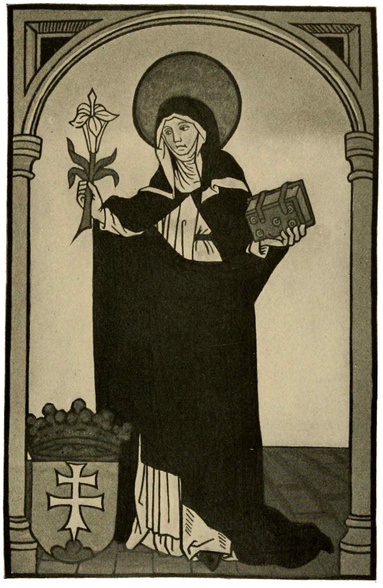
ST. MARGARET OF HUNGARY
Woodcut with hand coloring
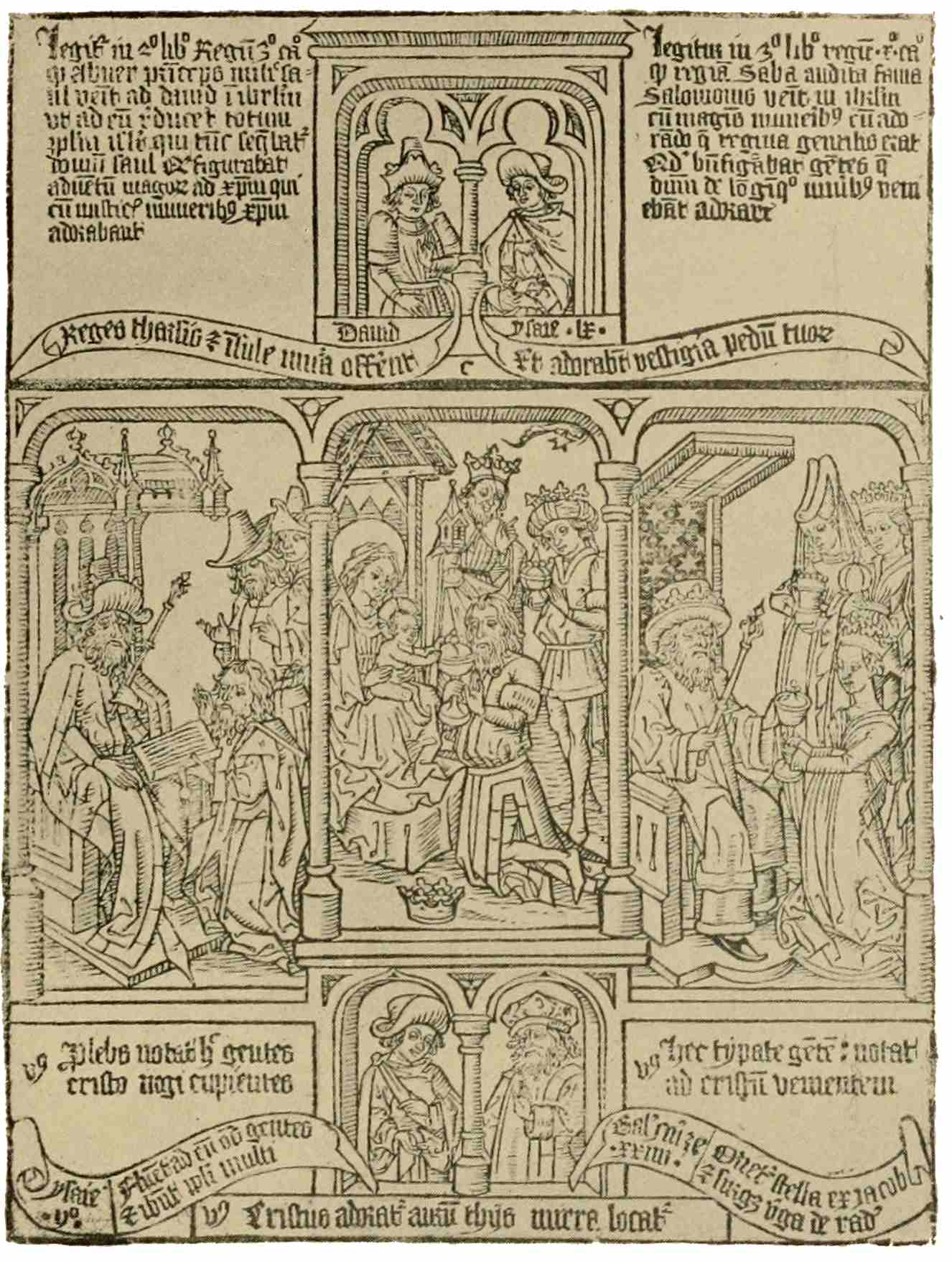
BLOCK-BOOK PAGE
Ars Memorandi
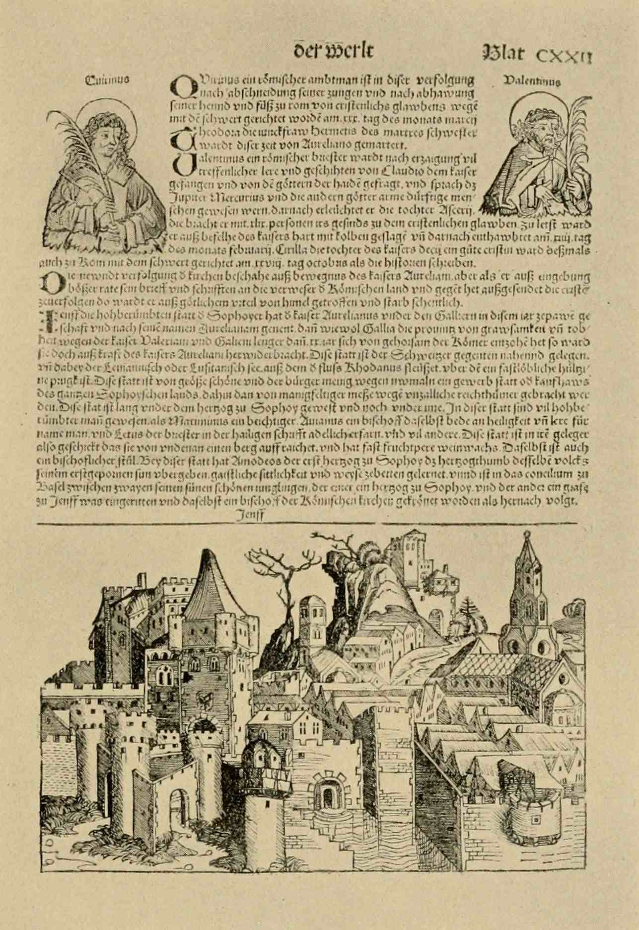
PAGE FROM THE NUREMBERG CHRONICLE
Nuremberg, 1493
31
A typical page from the “Ars Memorandi” (probably cut in the Netherlands) shows the character of these school books. This is designed to help theological students in memorizing the Holy Writ. The pictures are good; the text, hard to read, was soon to be replaced by movable type.
A page, from the Nuremberg “Chronicle” of 1494, shows us the state of woodcut, technically as well as its use in books. Many examples might be shown, from different parts of Germany, from schools swayed by various currents of artistic thought. Common to them all, despite their crudity, is a growing familiarity with woodcut, a realization of its possibilities and of its limitations. Artistic talent of a high order—compared with earlier productions—reveals itself, resulting from a division of labor. The artisan of the playing-cards and early saints’ pictures could never have risen to these heights of creative independence. His simple figures were copied from manuscripts, or from some other handy32 model, but when it came to supplying the growing demands of book-illustration with material from fields without precedent in past productions, the publishers were constrained to entrust artists with these designs, and the woodcut maker was given the task—not easy, though mechanical—of cutting with precision the lines drawn by the artist.
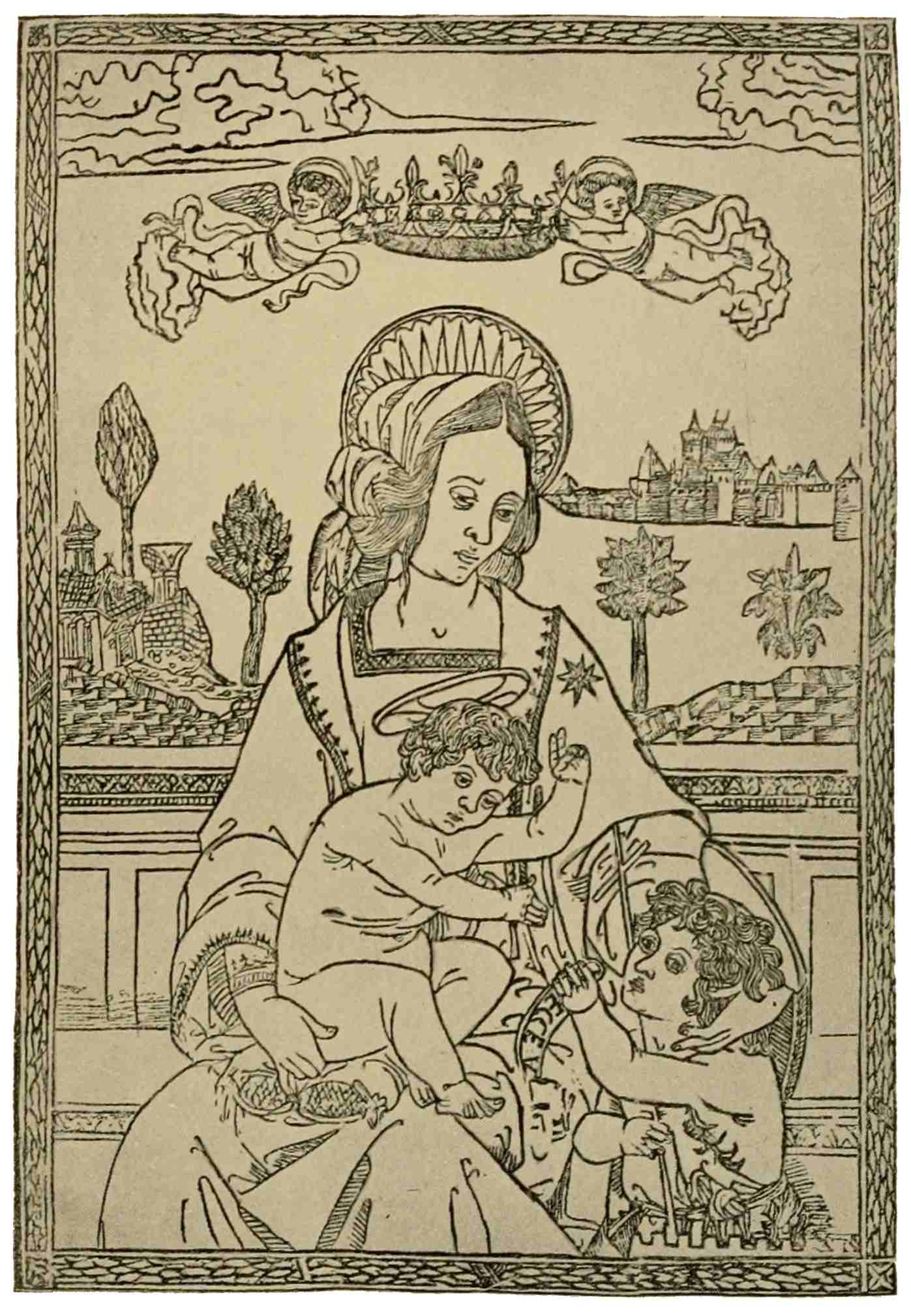
VIRGIN AND CHILD WITH ST. JOHN
Woodcut
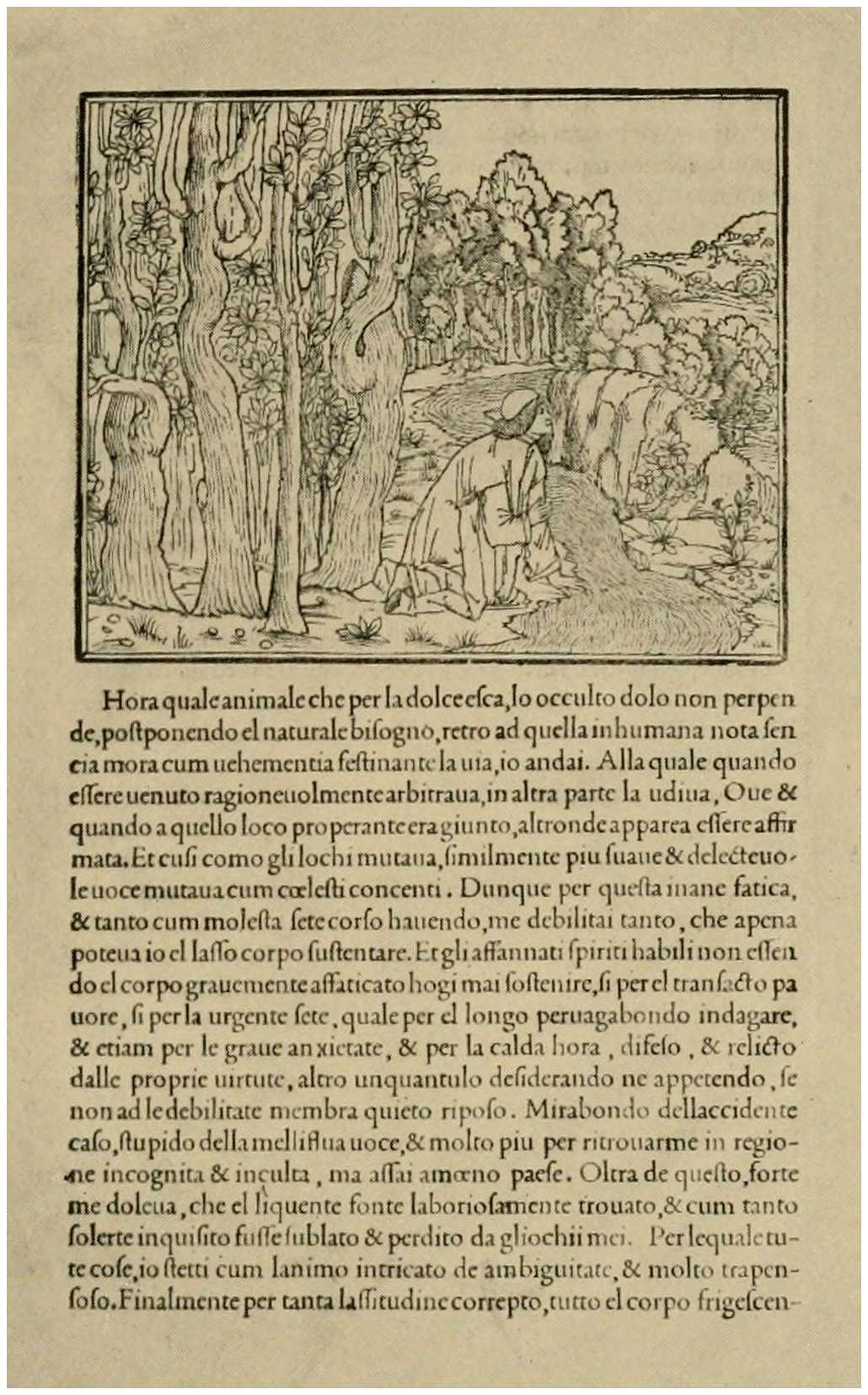
PAGE FROM HYPNEROTOMACHIA POLIPHILI
Venice, 1499
This development is common to Germany and Italy alike; but throughout the early productions of the Southern country, we seem to hear an echo of the sublime harmonies achieved in painting. For instance, in this large “Helgen” of Italy: a simple outline woodcut, this Virgin and Child with St. John, but in its simplicity what dignity and strength. The accents introduced by slight decorative indications and the shade-lines in the hair add charm to the simple, charming composition, by contrast of tone. Excellent cutting, this, after a masterly design. But in a country which has just reached the zenith of artistic achievement, we may expect, likewise, such remarkable decorative designs as the title-page border for the Venetian “Herodotus” of 1494, which frames the title of this volume.
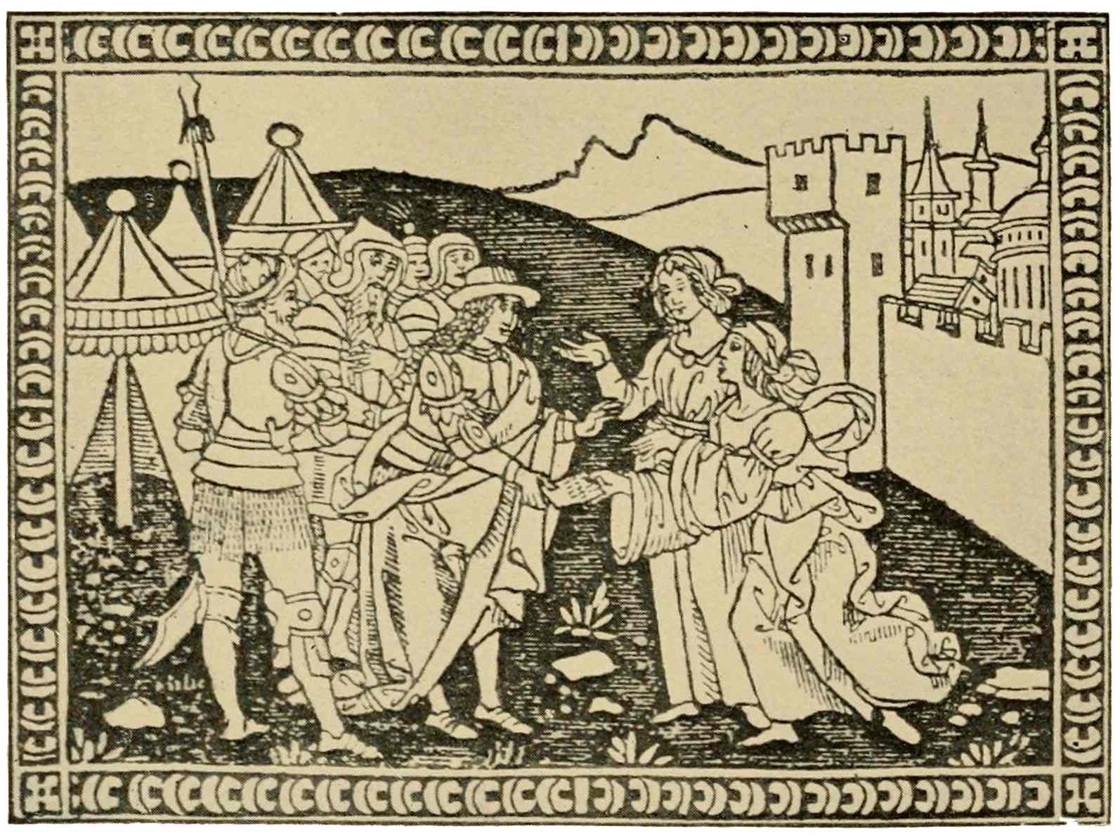
PAGE FROM MORGANTE MAGGIORE
Florence, 1500
33
It is the golden era of typography, this last decade of the fifteenth century. Brought to Italian towns by German printers, both type and illustration soon fall in line with the prevailing high standard of excellence. If further proof were needed, it would be found in this page from a Venetian publication, the “Hypnerotomachia Poliphili.” See how well the beautiful type of the text harmonizes with the illustration, how nicely the values of both are adjusted to form a harmonious page. Simple, unpretentious outline is used to convey the beauty of the artistic conception. These same characteristics will be met again in engraving as it is used by Italian masters. Woodcut as well as the other forms of reproductive art remain the servants, never become the friends of artists in Italy.
34
For brevity’s sake, we must pass by northern Italy and turn to Florence which was, next to Venice, the foremost southern publishing center. In this example, taken from Pulci’s “Morgante Maggiore,” published in 1500, we notice a keener appreciation of the possibilities of woodcut. Broad masses of white, with severe outline, scantily shaded, contrast with bold masses of black, whose intensity of effect is modified and blended by means of tenuous white lines, a manner likewise adopted in illustrations for the forceful sermons of Savonarola, whose teachings, widely read, necessitated a number of successive editions.
35
Having followed woodcut from its beginnings to the end of the fifteenth century, it behooves us now to devote our attention to the earliest intaglio process, namely, engraving.
Ever since the days of antiquity it had been the practice of metal-workers to cut decorative designs into the surface of the metal. Armorers and goldsmiths practiced this art of engraving in mediæval and Renaissance times. For our present purposes the absorbing question is this: How did the idea of printing from this decorated metal first suggest itself? We may get a clue by watching the engraver at work. With the graver he cuts a maze of lines into the metal; it is almost impossible to see the design owing to the glitter of each new-cut furrow. This troubles the engraver himself, and in36 order to see just what he has done, he smears the plate over with a mixture of lamp-black and oil, rubbing it well into the furrows. Then he wipes the plate clean, and now the design stands out plainly in black lines upon the shining metal surface. If he were now to take a piece of paper and press it against the plate, the black color in the furrows would adhere to the paper, and every line cut into the metal would be reproduced there. In such an accidental way, no doubt, the possibility of obtaining impressions from intaglio plates became known some time about or before the middle of the fifteenth century. But, of course, such an impression taken by hand pressure is bound to be very imperfect, and it may have been some time before some goldsmith thought it worth while to experiment with these printing possibilities. At first impressions may have seemed useful as guides for further work on the metal, or they may have served as memoranda of work done and delivered.37 As a matter of fact, goldsmiths did make use of this new-found mode of printing, and took impressions from their small decorative niello plates, before filling in the engraved lines with the final black enamel,—the “nigellum.”
If woodcut were dubbed the democrat among the graphic arts, certainly engraving must be called the aristocrat of the family. It originates in the goldsmith’s workshop, amidst a guild of skilled designers, who not unfrequently practice painting together with their craft. No wonder that in such hands engraving should shape itself along artistic lines from the start. In Germany engraving finds a ready welcome among other manifestations of an art essentially of the town, of the burgher, while the art of the Italian quattrocento celebrates its great triumphs in the erection or adornment of sumptuous edifices, under the fostering care of princes and prelates. The German naïvely depicts, with minute precision, the scenes and38 environments of his homely sphere; all subjects, whatever their time or country, are shifted into the familiar setting of his own time and his own surroundings. Hence we see the crucifixion taking place in a clearing amidst firs; we find German and Dutch burghers in the scenes of the Passion, or kneeling in adoration—as Magi—before the new-born Child.
The Italian artist is no less zealous in his search for nature’s truths, but at the same time he harks back to those remains of former artistic perfection which are just then being reclaimed from the soil, heirlooms from classical antiquity. Guided by both, he imparts a semblance of life to his ideal forms, that they may appear real, though belonging to a higher world. The cult of antiquity establishes a retrospective tendency in the choice of subjects represented. Traditional themes taken from the Bible, from legend and mythology, are used again and again with changes in the composition, in costume,39 lighting and color scheme, all in the constant endeavor to excel in perfection of form and composition, and in harmonious, beautiful coloring.
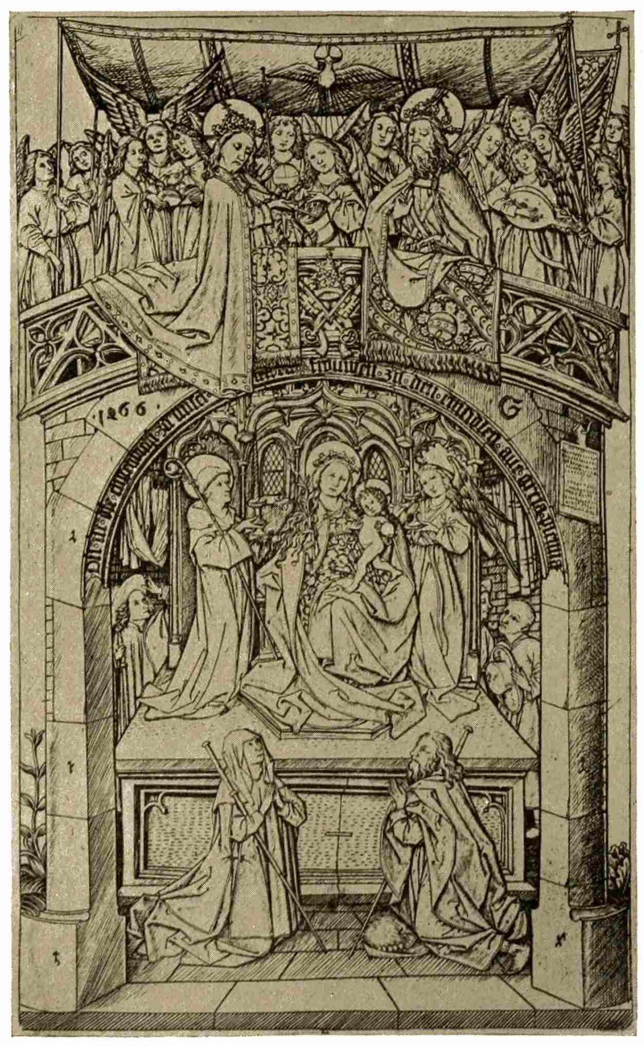
MADONNA OF EINSIEDELN
Master E. S.
In Germany purses are more slender, customers are content to adorn their homes with woodcuts or engravings instead of paintings. Pictures are wanted, with figures carefully drawn, explicit pictures, finished, natural in appearance, with plenty of detail in figures and accessories, something appealing to their humor, to their piety, to their own sphere of interest. Hence the tendency to carry every scene into the familiar setting of actuality; hence the interest in the natural surroundings of the scene; hence the predominance of Biblical and religious subjects which appeal to the pious; and for others the scenes of daily life, tournaments, soldiers, not to forget plates and books of designs for the use of craftsmen. The production of picture-like prints in which hand coloring was not to be considered, necessarily brought40 about a speedy development of technique. Even in early work it seems as though the German engraver realized, more than his Italian contemporary, the possibilities of the engraved plate; the figures are quaint, reminiscent of the Gothic past, but they are well cut, in clear, sweeping outline. The shading is simple, but not timid or awkward, and pleasantly follows and accents the form. Few of these fifteenth-century engravers have left us as much as a name or the most meager data as to their lives. In many cases we have not even a date, a sign, or an initial placed somewhere on the print, as a means of identification. We are conscious, in these early examples, of the artistic spirit in which the engraver treats the saint’s picture and the playing-card, extensive fields, exploited already by primitive woodcut. A choice between eminent representatives among the anonymous engravers would lie between the so-called Master of the Playing-Cards, the Master of the Amsterdam Cabinet, and41 Master E. S. An illustration of the excellence achieved by the last named artist will be found in his presentation of the Madonna of Einsiedeln. Notice the development of the picture element, the sureness with which the graver is used, long strokes and delicate touches, varying with the needs of modeling and design. This mastery over the medium is yet more apparent in the engravings of Martin Schongauer, the leading figure in fifteenth-century engraving. In his work we still discern the peculiar characteristics of the period, long slim hands and feet, an emaciation which brings the head into prominence, a tendency—reminiscent of the Middle Ages—to treat each object independently, as a unit, as a symbol of its kind; but then what purity and sincerity emanate from his figures. In his “Death of the Virgin,” what a harmonious effect, what keenness of observation. He knows little of the rendering of nudity,—all Northern artists are hampered in that way,—but his bodies,42 though lacking in structural skill, are wonderfully well caught in pose and gesture. His observation and his resourceful imagination were fully recognized by both Dürer and Raphael, who both availed themselves of his achievements. The graver helps to round the forms, by following the direction of the curves. Long, steady, curving strokes, emphasized in the deep shadows, breaking up—in the lights—into dots which blend into the high lights of white paper. No hesitating, little criss-cross strokes here, but a dignified simplicity of line which enhances the dignity and simplicity of his compositions. Remember that in order to appreciate these essential qualities of line and of resulting effect, you must consult the original prints; half-tone illustrations cannot be expected to convey more than a general idea of the originals.
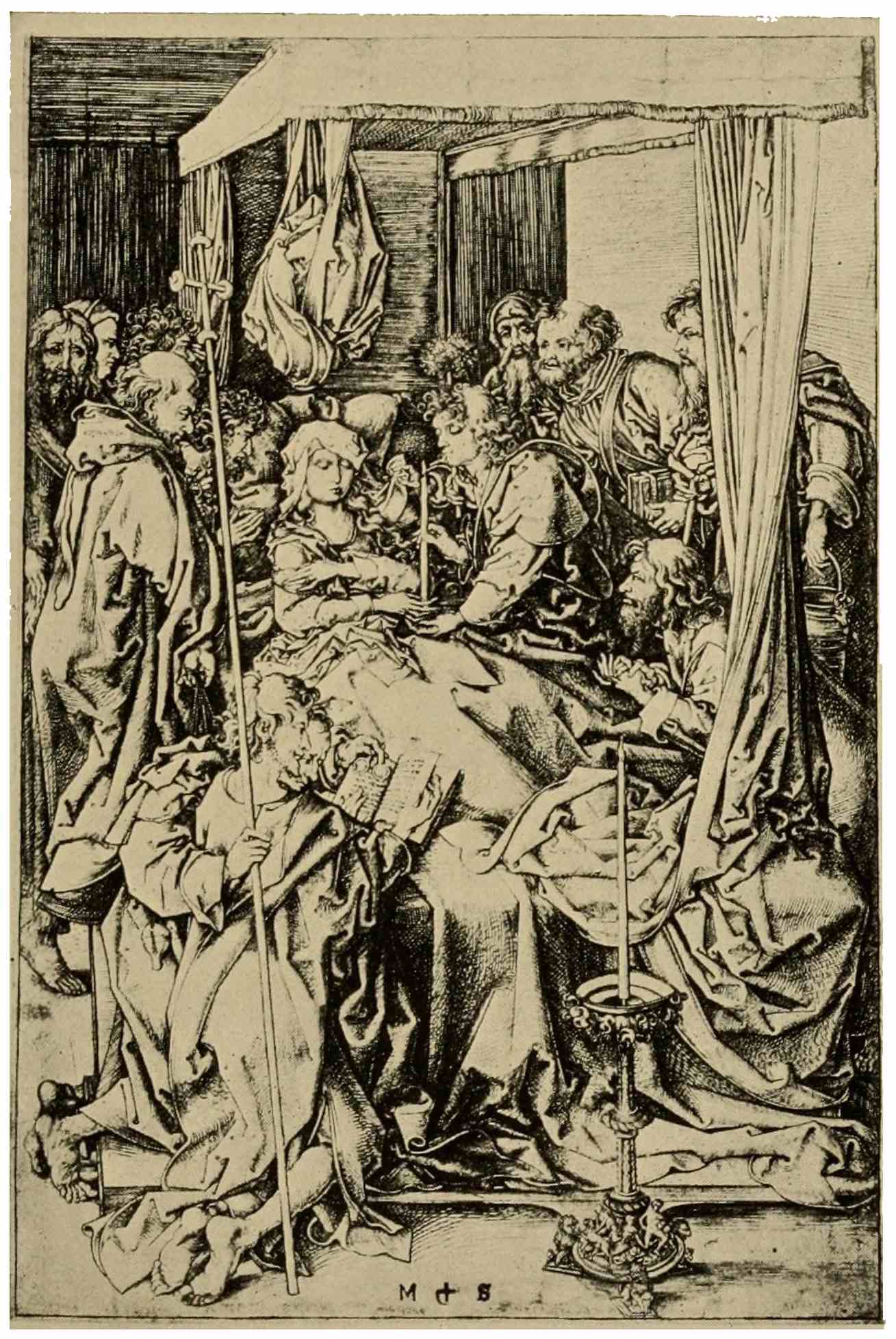
DEATH OF THE VIRGIN
Martin Schongauer
It would be unfair to attribute all this artistic development to German initiative alone. Italy has practically no share in it, at this period, but the close commercial relations existing between Germany and the Burgundian Netherlands must have facilitated an artistic intercourse most beneficial to the former country. The stupendous creations of the brothers Van Eyck, of Van der Weyden, Memling, Van der Goes, and others did induce workers in the artistic crafts to visit the Low Countries. Their contemplation must have been a source of stimulating inspiration to the German painters, and indirectly to German engraving. Direct influence there could not be, since we look in vain through the ranks of this flourishing school of Flemish painters for any manifestation in the graphic arts. Only the arts of opulence: painting, costly illuminated manuscripts with miniatures, or the woven tapestries of Arras and Brussels, brocades, and laces, were produced in the prosperous towns and at the brilliant ducal court of Burgundy.
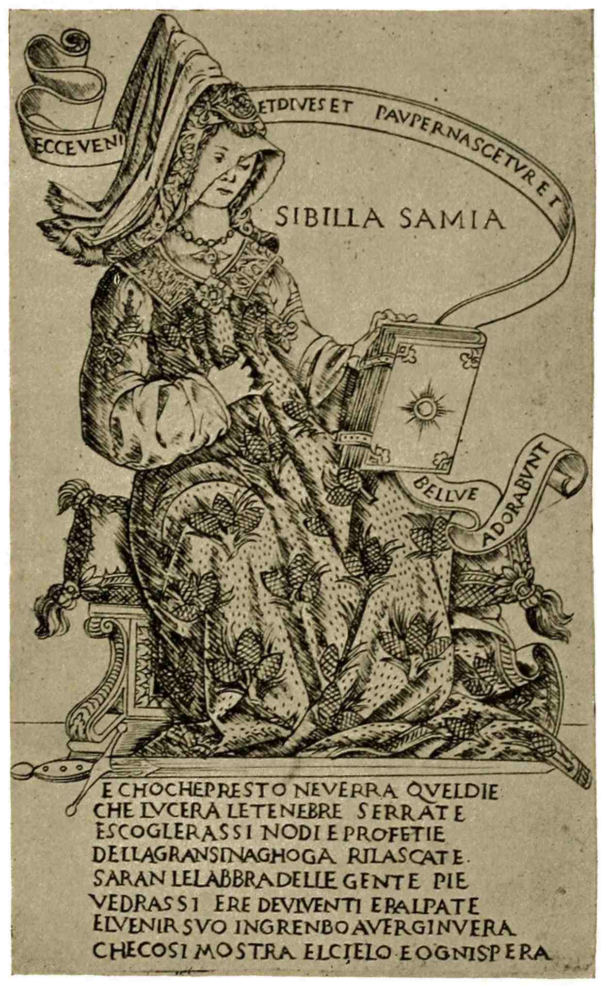
SIBILLA SAMIA
Florence, 15th Century
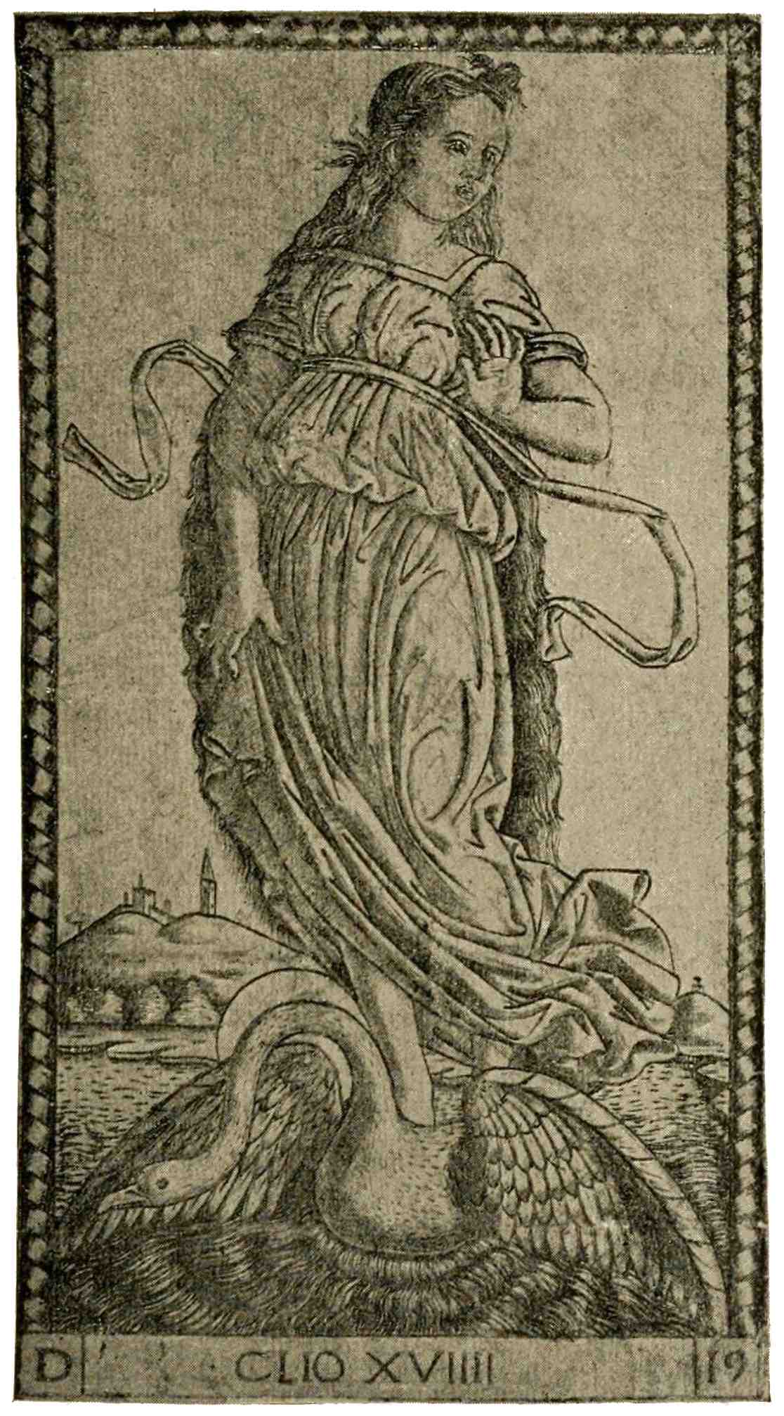
CLIO, FROM THE SO-CALLED TAROCCHI
Northern Italy, 15th Century
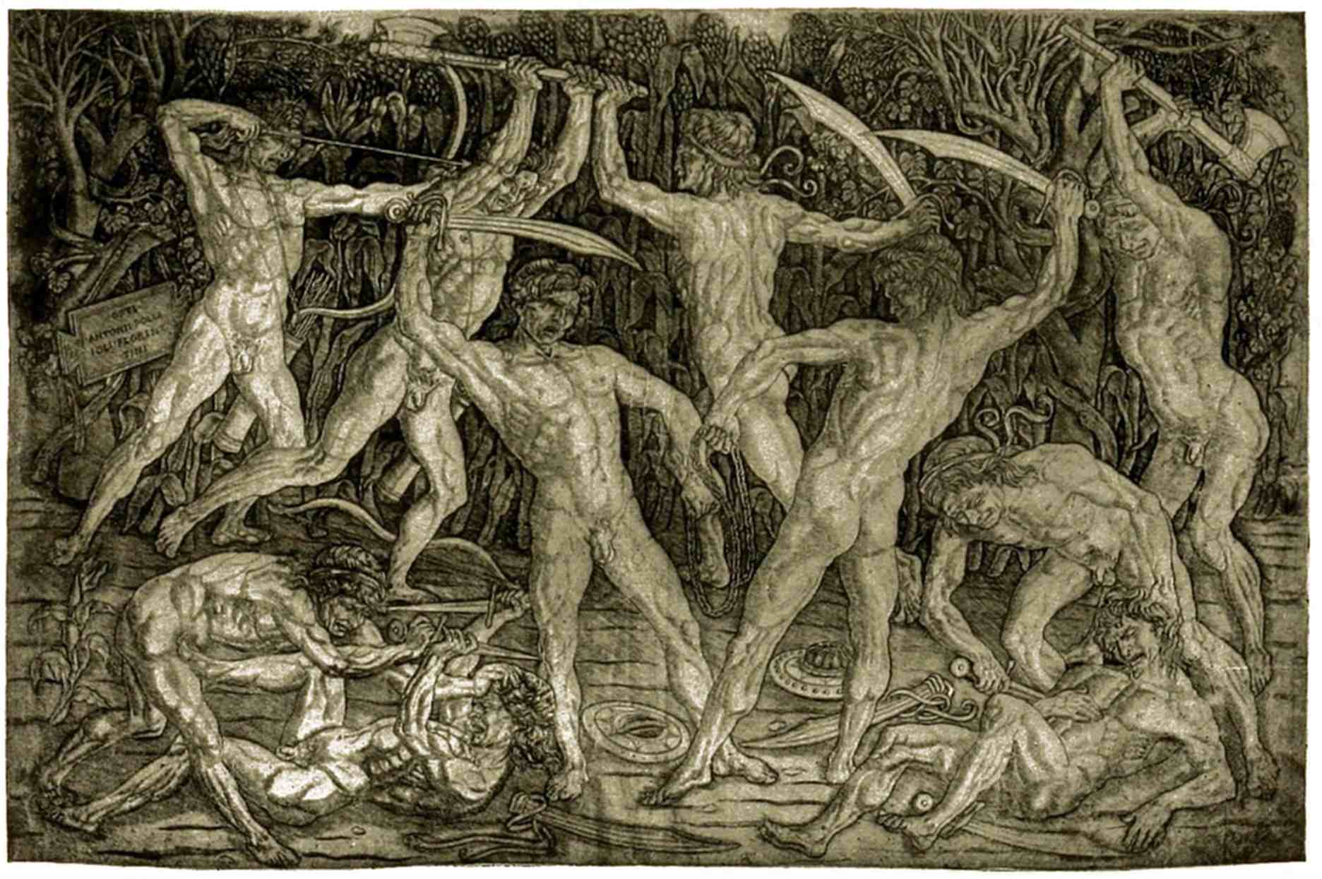
BATTLE OF NUDE MEN
Antonio Pollajuolo
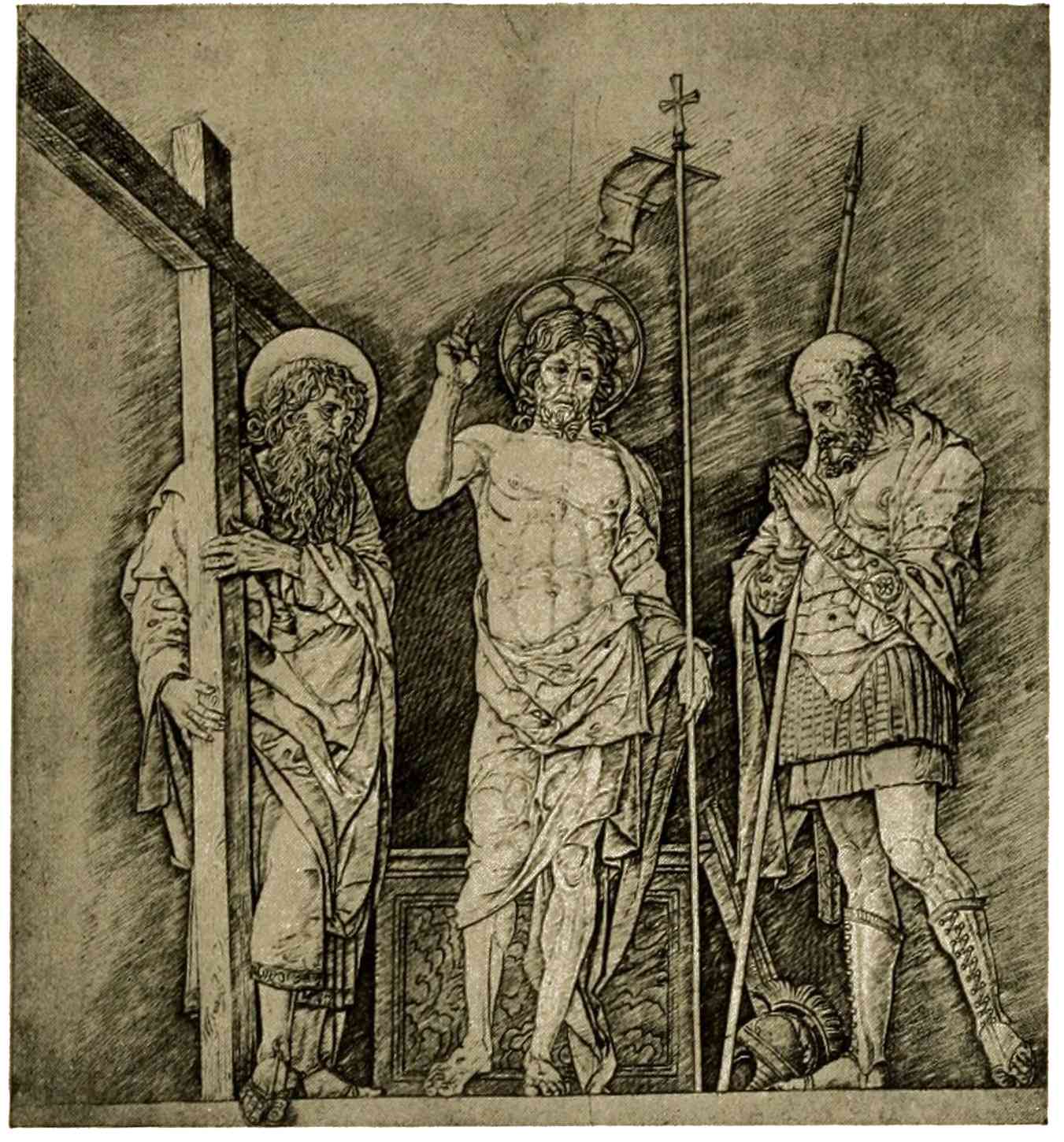
CHRIST BETWEEN TWO SAINTS
Andrea Mantegna
Early Italian engraving begins with the44 niello of the goldsmith, little silver plates for ornamental uses, with minute scenes and figures, usually well cut, as might certainly be expected in a guild so highly skilled. It is interesting to follow engraving as it broadens beyond the neat and primarily ornamental sphere of the craft, into the large field of art. Florence, the center of dignified, conservative art, the Florence of Botticelli has given us the two classical series of “Sibyls” and “Prophets.” The manner of execution, as we see in the example shown, is still that of the goldsmith, fond of ornament, of detail, shading with minute strokes, close together, which blend to form a tone. The other example is selected from a North Italian series of the same period. It forms part of what by some authorities is thought to be a set of “Tarocchi,” a game of cards peculiar to Italy. Less severe, more graceful than the Florentine example, it is another triumph of the goldsmith in the field of the graphic arts. From him engraving passes under the sway45 of the painter. If we compare Italian and German graver-work of those days, a plate of Mantegna, for instance, and a plate of Schongauer, we shall readily perceive that in engraving the German master thinks in line. The Italian painter thinks, not in line, but in masses of light and shade, in terms of the antique marbles, which he has studied with such enthusiasm. His design goes on the copper as it would be jotted down on paper with the pen, without consideration of the graver, except that it seems a useful implement for multiplying his sketches, which are wanted in many studios and workshops. A simple, even outline, and for shading, parallel lines, straight and close together, generally in a uniform diagonal direction,—that is all. Fine early impressions from plates of this character have quite the charm of a drawing; deep shadow-tones are then visible, caused by a system of slight, tone-giving lines over the heavier shadings. When these have worn off, they leave only a system of hard,46 wiry-looking shade-strokes; unfortunately the good early impressions are very, very rare, so that we are accustomed to look upon the gray, worn impressions usually found as being the actual work of the artist, which is unfair. The absorbing interest of antique bas-reliefs is evident in the large “Battle of Nude Men,” by Antonio Pollajuolo, breathing the enthusiasm with which Italy told anew the artistic message of the distant past, yet lacking the poise and moderation which we admire in the grand classical sculptures. In his eagerness to proclaim the beauty and power of the human body in vigorous action, he far outstrips his powers of expression, yet his muscular exaggerations need not materially lessen our enjoyment of this powerful, expressive print. In Andrea Mantegna, we reach the central figure of this early period of Italian engraving. In him are combined the humanist’s devotion to classical art and the fiery energy of a man of action, filled with his art, rugged, stern, taking from47 nature and antiquity the forms of artistic expression. At his hands the world is invested with a grandeur seldom achieved, inspiring to his contemporaries, helpful and stimulating to young Dürer in his strivings toward greater breadth, simplicity, and unity of composition. In Mantegna’s “Christ between two Saints,” we find the same scant means of graver-work which he employed in all his austere compositions: a well-defined outline, even, without swelling, softening accents, simple shading, generally in a uniform diagonal direction; nowhere an attempt at texture, or differentiation of color. The subjects are all treated as though they were cut in high relief on slabs of stone, without variation of surface or suggestion of distance. Venetian influence mitigates the ruggedness of Mantegna’s gaunt, imposing “John the Baptist,” by means of the unusual, soft, stippling technique adopted by Giulio Campagnola, which gives the print more the appearance of a grainy wash drawing, in48 contrast with the usual pen-and-ink aspect of early Italian prints. Scores of other important examples might be adduced, but they can easily be found in any good history of engraving.
49
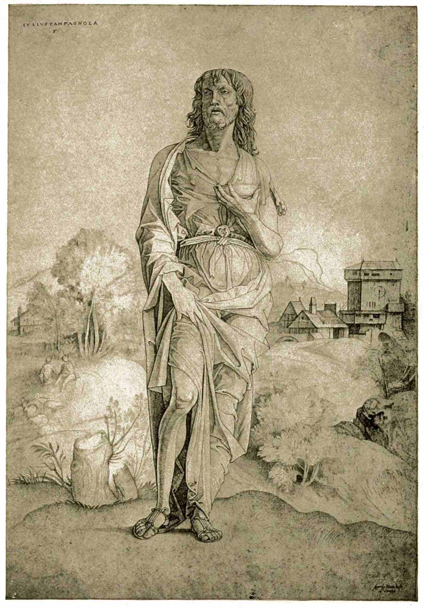
ST. JOHN THE BAPTIST
Giulio Campagnola
The sixteenth century brings new developments to be noted, new factors to be considered. In Germany it rings in the culmination of artistic development under the leadership of Albrecht Dürer, whose towering personality lifts both engraving and woodcut to high levels of excellence. The cultivation of the technique of engraving has carried Germany far and away beyond the South, in a technical perfection duly appreciated in Italy; and when the demand for prints grows, when they become a marketable article, the Italian engraver copies German prints in order to gain the requisite technical knowledge. This Italian engraver, however, is not a painter-engraver as in Germany, an artist, namely, engraving his own designs. We know that the Italian artist continues intent on grander tasks and50 indifferent to the charms of the graver, hence a division of labor: the busy painter jots down the sketch or cartoon and the professional engraver undertakes the lengthy task of transferring, of interpreting the artist’s drawing by means of the graver. The subtle continuity of thought, from the first conception to the finished plate, which we prize in original engraving, is necessarily destroyed in such collaboration, but the engraver, working exclusively on the copper plate, is able infinitely to vary and develop the resources of the process by dint of practice. A noted instance of such collaboration is found in the “Death of Dido,” engraved after Raphael’s design by Marcantonio Raimondi. The lifework of Marcantonio is mainly devoted to the reproduction of sketches of the great Urbinate, whose genius inspires the engraver and lifts him to the highest rank in sixteenth-century Italy. His pliable graver, trained by much copying after Dürer and other Northern masters, delicately outlines the figures.51 The shade-strokes follow and accent in easy curves the rounding forms and the gradations of light and shade. There is variety in the line, no longer the uniform diagonal shading of the early period. It is, in a word, excellent engraving, which is seen likewise in his “Adam and Eve,” after a figure sketch of Raphael. The latter print shows also the pitfalls which await the thoughtless copyist. Raphael’s cartoon for this print shows the two lovely figures without any background whatever; Marcantonio, always at a loss without a definite model to copy, looked for a suitable background, and found it in a German print which he faithfully pieced in, peasant houses and all, as a setting for Adam and Eve!
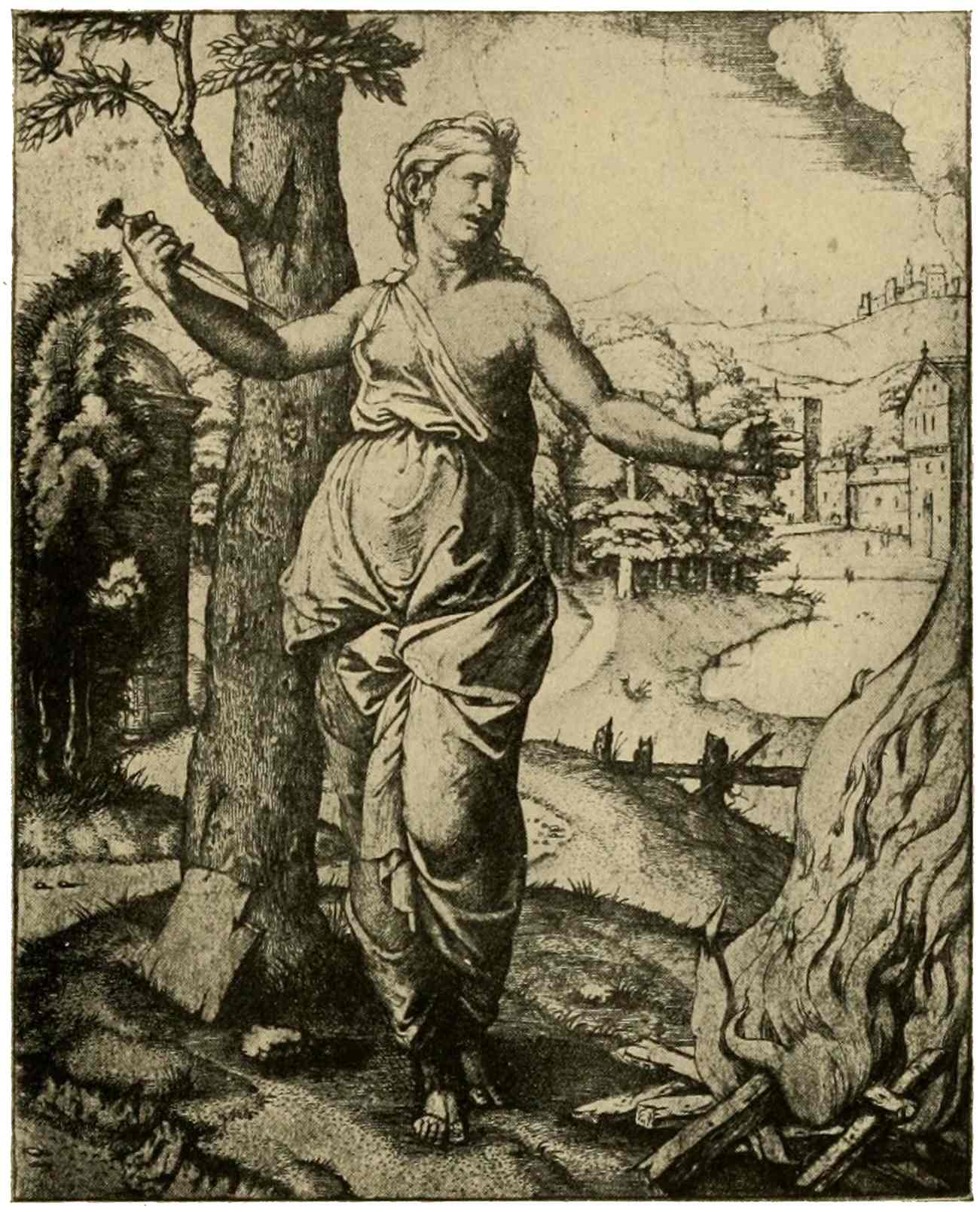
DEATH OF DIDO
Marcantonio Raimondi
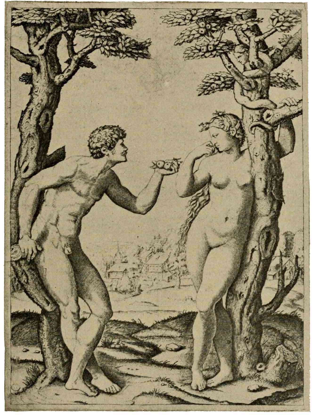
ADAM AND EVE
Marcantonio Raimondi
About this time the publisher of prints appears, buying plates from engravers and publishing them, centralizing a commerce which—before this—had been carried on by the engraver himself or by the artist who employed him. This commercial factor52 lowers the standard of engraving, both by the choice of subjects demanded of the engraver, with a view mainly to a ready sale, and by the quality of work tolerated. The only excuse for some of the plates published must have been their cheapness. Under these conditions and, moreover, at a time when painting was rapidly declining, one cannot look to the graphic arts for masterpieces. Venice, it is true, is yet in her glory; encouraged by the interest of Titian, woodcut flourishes for a while at the hands of Boldrini and others. As to engraving, Venetian art demanded of it a technique strongly expressive of color; a new impetus was needed for a revival of the medium. This was supplied by engravers from the Netherlands, where the technique of engraving had been highly elaborated in this the latter part of the sixteenth century. A noted representative of this Italian revival is the painter-engraver Agostino Carracci. If we examine this portrait of Titian, engraved after the great53 master’s own painting, Carracci’s skill in engraving will be at once apparent. Long parallel strokes, close together, give a rich deep hue to cloak and cap. The brown fur trimming, with its loose, broad handling, contrasts effectively with the delicate work on beard and hair. The short, swelling stroke used in the light background, the clear, transparent cross-hatching on the cheek, all denote great advance in differentiating this variety of textures.
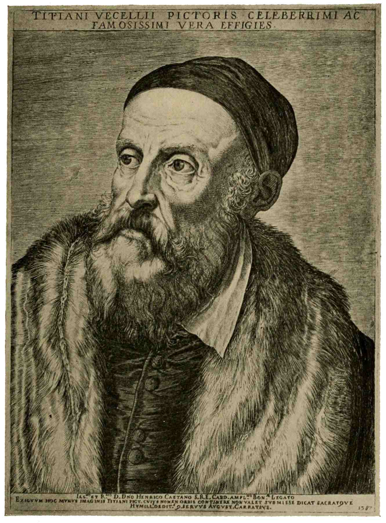
TITIAN
Agostino Carracci
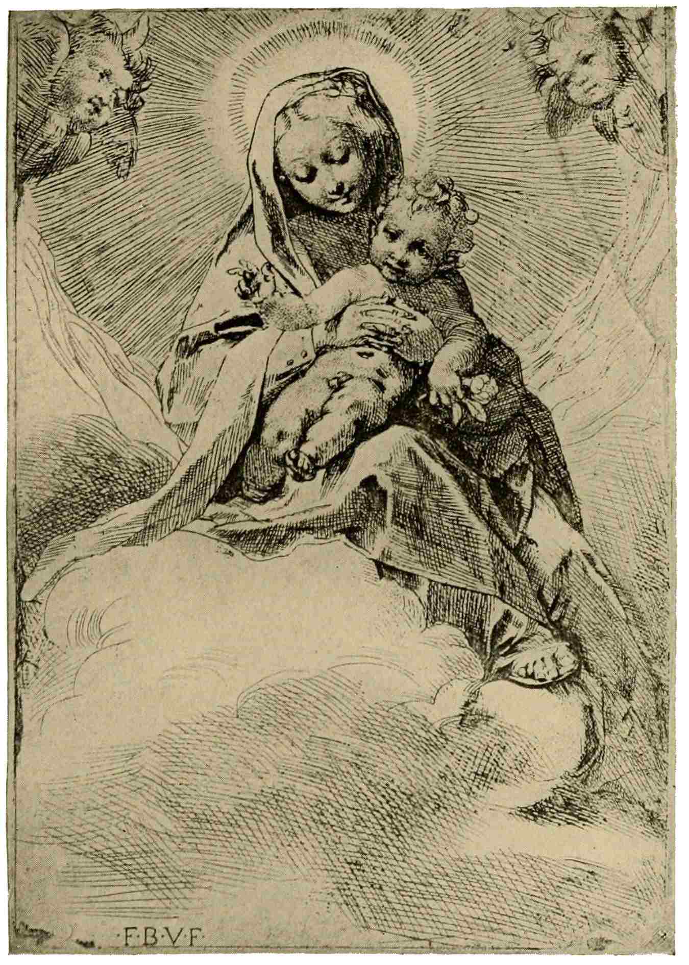
MADONNA AND CHILD
Federigo Barocci
Thereafter, as engraving sinks into routine and commercialism, let us turn to etching, a process likewise introduced from the North and practiced in Italy since the sixteenth century. Its easy technique offered many advantages to the artist over the intricacies which had crept into engraving, to be mastered only by long practice. The ease and freedom of the etched line, its expressiveness and—not least—the accidental effects resulting from unforeseen action of the acid, appealed to the artists, but the process54 came too late to share with engraving in the reflected glory of the grand Renaissance period. Etching is the medium used by Parmeggiano, Primaticcio, Guido Reni, and many others, but they do not take the graphic arts any more seriously than their predecessors in Italian art. Their plates are hasty experimental jottings, which show that their main interest is centered on more pretentious conceptions; only rarely do they attempt the picture-like elaboration which we find in this “Madonna and Child.” It is the work of Federigo Barocci, certainly one of the best painter-etchers of the period, and reveals to some extent the rich, effective accents, the freshness and freedom of line attainable in etching, which is to find such splendid exponents in the Netherlands. It is well worth while, though not within the scope of this condensed review, to dally amidst these sixteenth-century etchings, and then, proceeding to a later period, to linger over the powerful, direct presentations of55 Giuseppe Ribera and to glance at the figure sketches of Salvator Rosa. The eighteenth century brings us the spirits compositions of the two Tiepolo, effective, with sharp, sparkling play of light and shade, and Antonio Canale (Canaletto), who makes us feel the very breeze which blows, in his etchings, and the warmth of the sunshine which bathes his Venetian views. What more delightful glimpse of the Italian coast than this “Torre di Malghera” with the dazzling white watch-tower and the exquisite, luminous handling of sea, sky, and distance. The same eighteenth century witnesses an intense revival of activity in engraving. The technical triumphs then achieved in France stimulate Italian engravers, whose mastery of an elaborate technique is plentifully exemplified in the plates of Raphael Morghen, Volpato, Longhi, Toschi, and a number of other well-known men in the large group of “classical” engravers. Their energies and skill are mainly devoted to the interpretation56 of those glorious creations of painters of the Renaissance, which had entirely baffled the early engravers with their limited technical resources. These thousands of plates were exceedingly popular for many years, some of them—the “Last Supper” after Leonardo, engraved by Morghen, for instance—is much sought for to this day in fine impressions. Broadly speaking, while these engravings are certainly skillful achievements in a highly systematized, elaborate technique, their technical perfection is aggressive and imparts a formal coldness, a lifelessness, and a metallic quality, which doubtless explains—in part—their decline in popular favor during recent years.
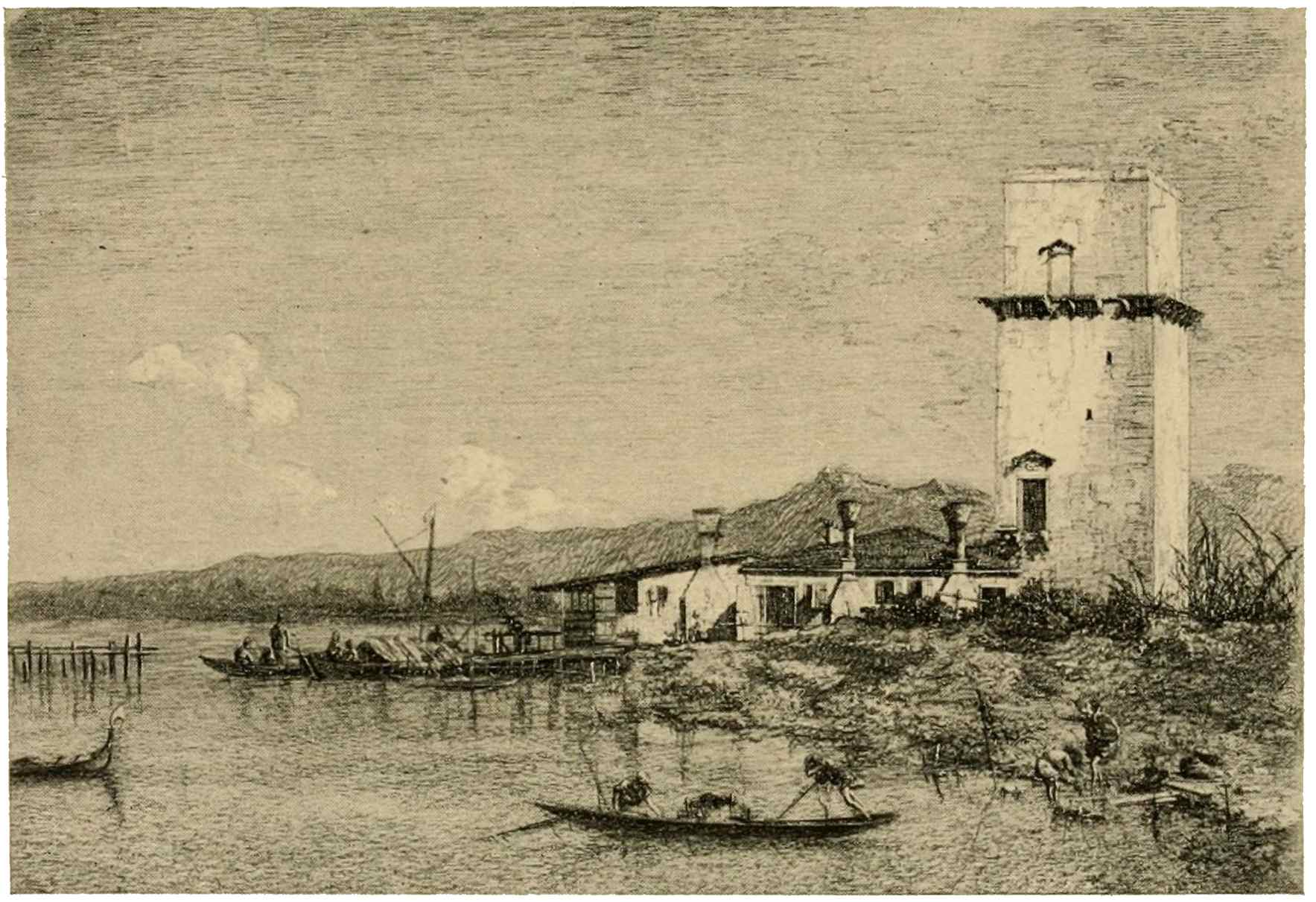
TORRE DI MALGHERA
Antonio Canale
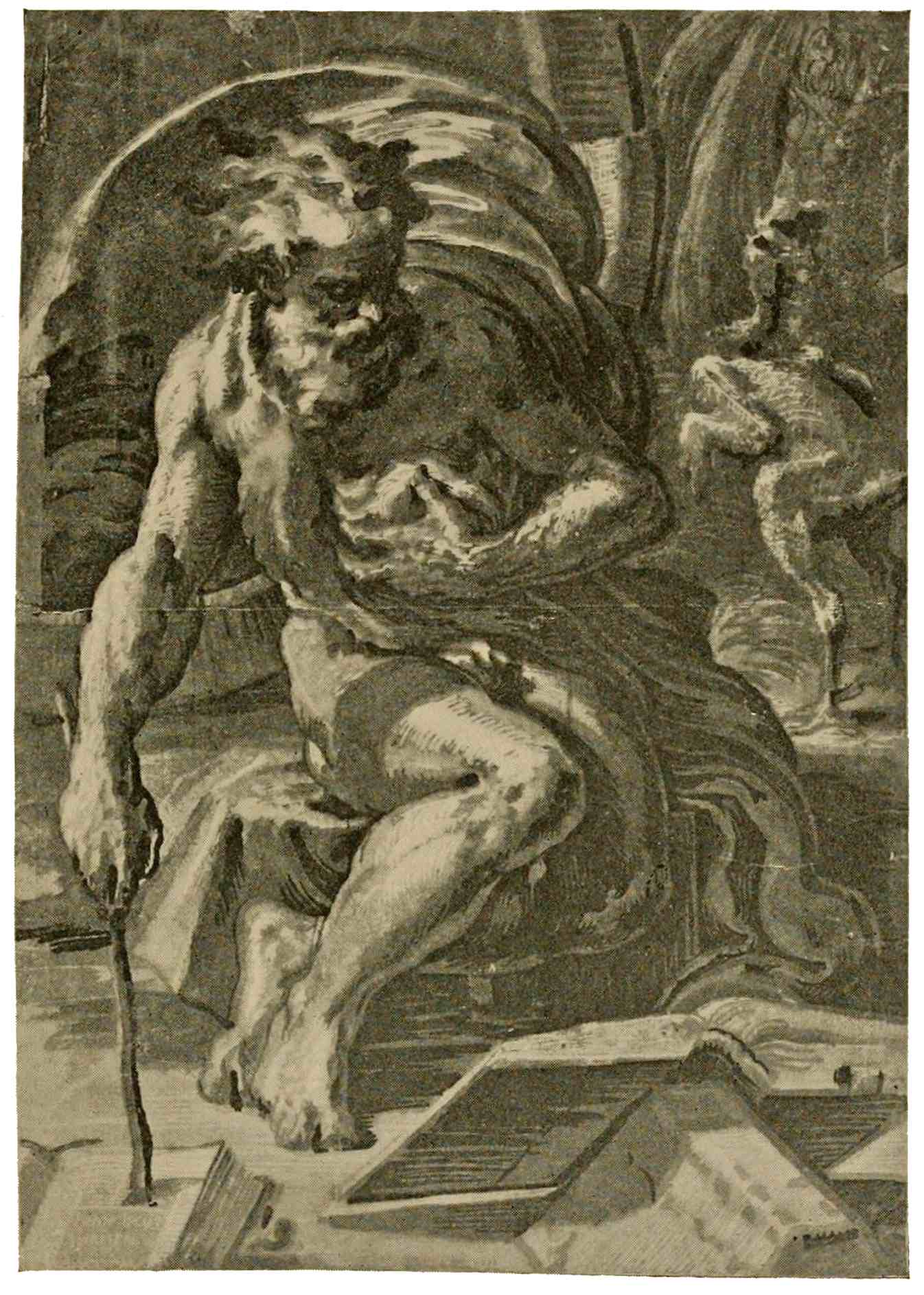
DIOGENES
Chiaroscuro woodcut by Ugo da Carpi
Before leaving the South, we must yet cast a glance at an interesting though minor manifestation of the graphic arts, the chiaroscuro. Repeated allusions have been made to the demand for color on the part of the general public. In response to this ever-present craving for the joy of varied tones, the chiaroscuro takes a step in the direction of painting by translating color into several graded tones giving the effect of a semi-colored wash-drawing. The process was used in various ways, in various countries and at various times, but the golden era of chiaroscuro is the sixteenth century in Italy. The example selected, “Diogenes,” by Ugo da Carpi, is one of the finest of the period. It is impossible to render in this monochrome reproduction the rich glow of superimposed tones of golden and greenish browns, which constitute its greatest charm; chiaroscuros must be seen themselves to be appreciated. One can then see what manner of success attended the wood-cutter’s endeavors, the endless possibilities of variety of tones become apparent, also the difficulty attendant upon the accurate placing (register) of the paper on the three or more successive blocks printed from, one for each tone. A few scattered experiments in Germany, during the period of extensive58 production in northern Italy, and thereafter a short-lived appearance here and there, such is—briefly—the history of the chiaroscuro woodcut.
59
In former chapters, we have followed the origin of woodcut and engraving in Germany, to the end of the fifteenth century; we have seen woodcut grow from the crude conceits of the early craftsman to illustrations of distinct artistic merit; we have followed engraving from its origin in the goldsmith’s shop to the expressive beauty of Martin Schongauer’s plates. Both are to culminate during the early sixteenth century. At this time Maximilian reigned over the vast German Empire: “Massimiliano pochi denari” the Italians called him, because of the insufficiency of the imperial resources. Ambitious to perpetuate the glory of his illustrious house, yet quite unable to vie with the Pope and Italian princes in the erection of sumptuous edifices, the Emperor saw in the effective and inexpensive woodcut a means of60 transmitting to posterity a record of his own deeds and adventures and of the virtues of his ancestors. The leading German artists of the time were employed on designs for their imperial patron, chiefly Hans Burgkmair of Augsburg, and Albrecht Dürer of Nuremberg. With Dürer we reach the zenith of the graphic arts in Germany. He stands, a monumental figure, seen from afar, influencing—not only his German contemporaries, but the artists of Italy and of the Low Countries. Dürer was a thoughtful, forceful, imaginative leader; he was more—he had thought out the resources, the latent possibilities of engraving and of woodcut, he knew their limitations and the manner of presentation most adequate for either process. These principles of treatment are illustrated in his prints, set forth so clearly as to be readily understood and applied by other engravers, by other designers for woodcut. For this reason he has become a teacher for all times. His development may be followed through many stages, from his early manner, imitative of fifteenth-century masters, to the pictorial finish and wonderful play of light in his grand “St. Jerome in his Study.” Italian influence is felt in many of his early plates, the “Effect of Jealousy,” for instance, the “Apollo and Diana,” or the charming “Madonna with the Monkey”; but his vigorous individuality was not swayed long nor impaired by these Southern charms which were soon to overwhelm Northern art. Even in the days when young Dürer responds with enthusiasm to the power, to the passionate energy of Mantegna, his German characteristics are plainly apparent; I am thinking of his famous series of illustrations to the Apocalypse. Take the powerful print of the “Four Horsemen,” with their resistless onward rush, violent action vividly expressed, every figure, every detail instinct with close scrutiny and conscientious rendering of nature. Then as to technique, see how outline and shade-stroke are made to yield62 their full measure of expressiveness. None of the uniform diagonal shading of early Italian masters is found in these woodcuts; nor shall we find such summary treatment in Dürer’s engravings. If we turn to his “Arms with the Skull,” for instance, we see there no mere suggestion of shadow, every line tells. The outline swells and accents the form, the shading-strokes curve and bend to accent the rounding, the modeling of the figure; the quality, strength, tonality of the line varies with every texture which is to be expressed, such as the metal of the helmet, the feathers on the crest, the cloth, the leather, the wood, the hair. The modest means of black lines and white paper, which at first had seemed barely sufficient for suggestive outline and indications of the rounding of form, are now becoming a medium fit for the presentation of all the infinite phenomena of visible nature. From the large, predominant figures massed in the immediate foreground of early woodcut series like the Apocalypse,63 or the large Passion, Dürer progresses to a deepening of the scene in the serene woodcut illustrations of the “Life of the Virgin.” We are led along the pleasant, peaceful paths of life, we are spared the anguish and suffering of the previous series. In this illustration, for instance, we see the Holy Family at rest in Egypt; Joseph is working at his trade, while the Mother watches her sleeping Babe, and angels busy themselves or gambol about the Holy group. The scene is laid in a pleasing German landscape, among low hills, which carry out the serenity of the composition.
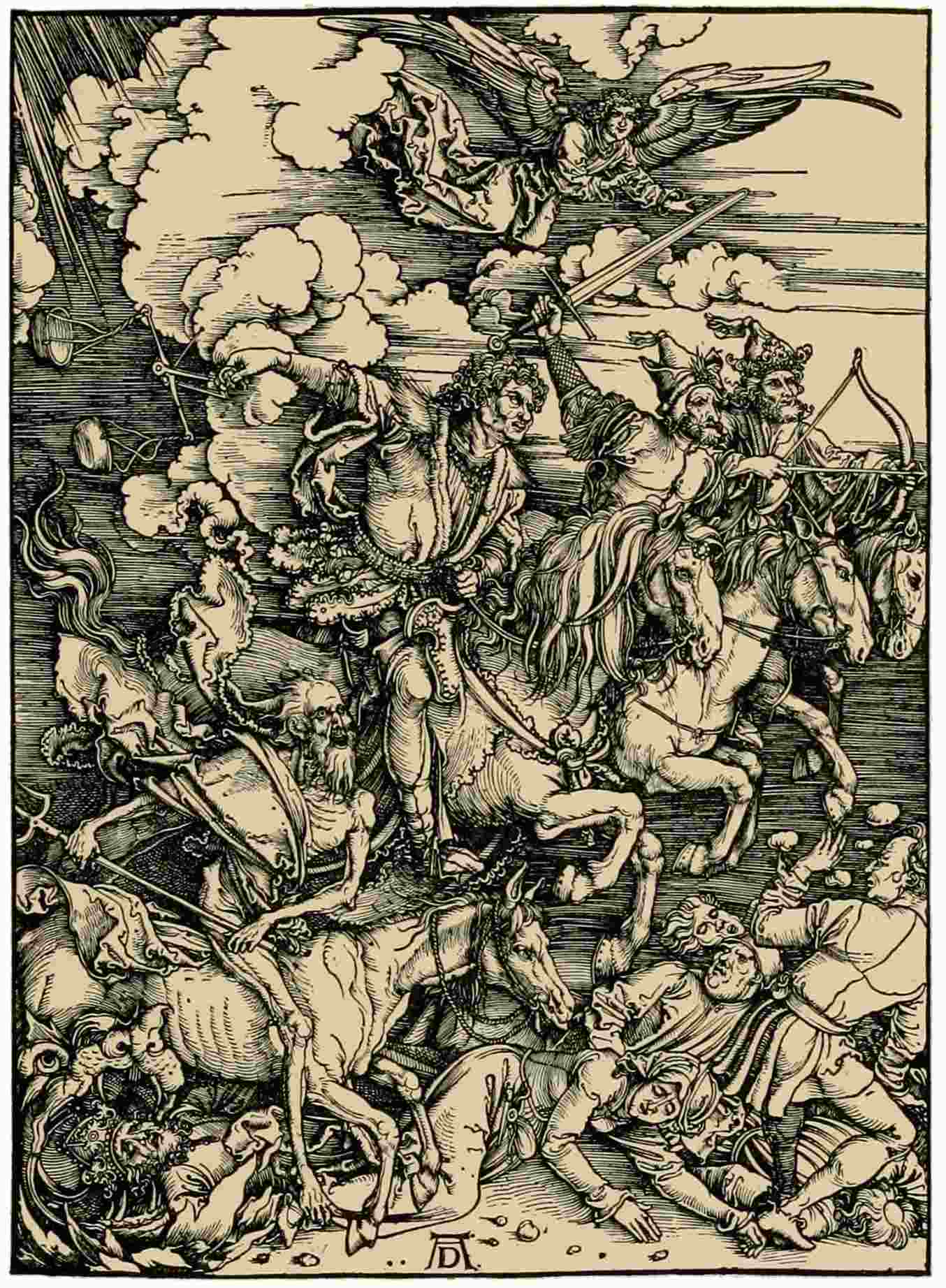
APOCALYPSE: THE FOUR HORSEMEN
Woodcut. Albrecht Dürer
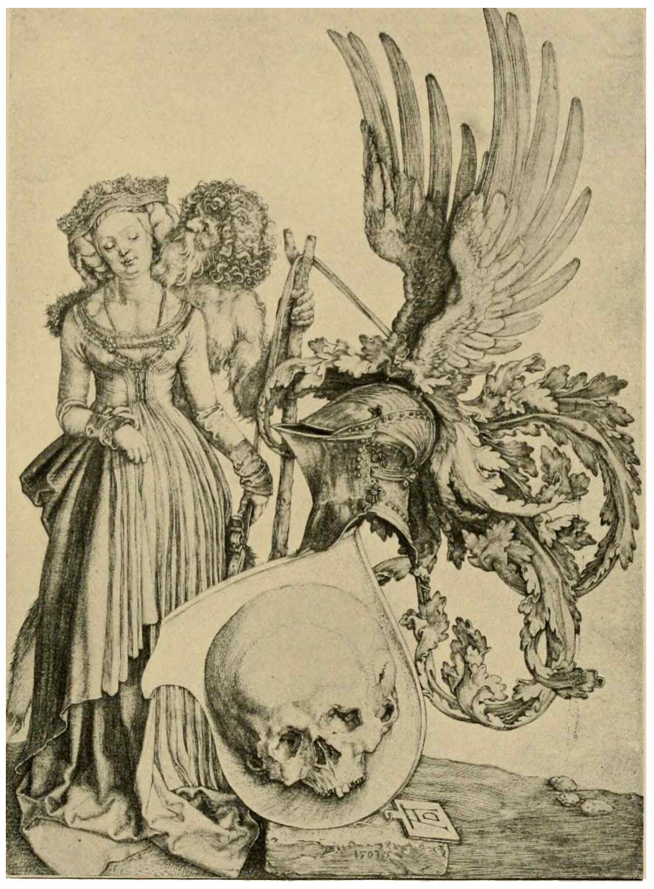
ARMS WITH THE SKULL
Albrecht Dürer
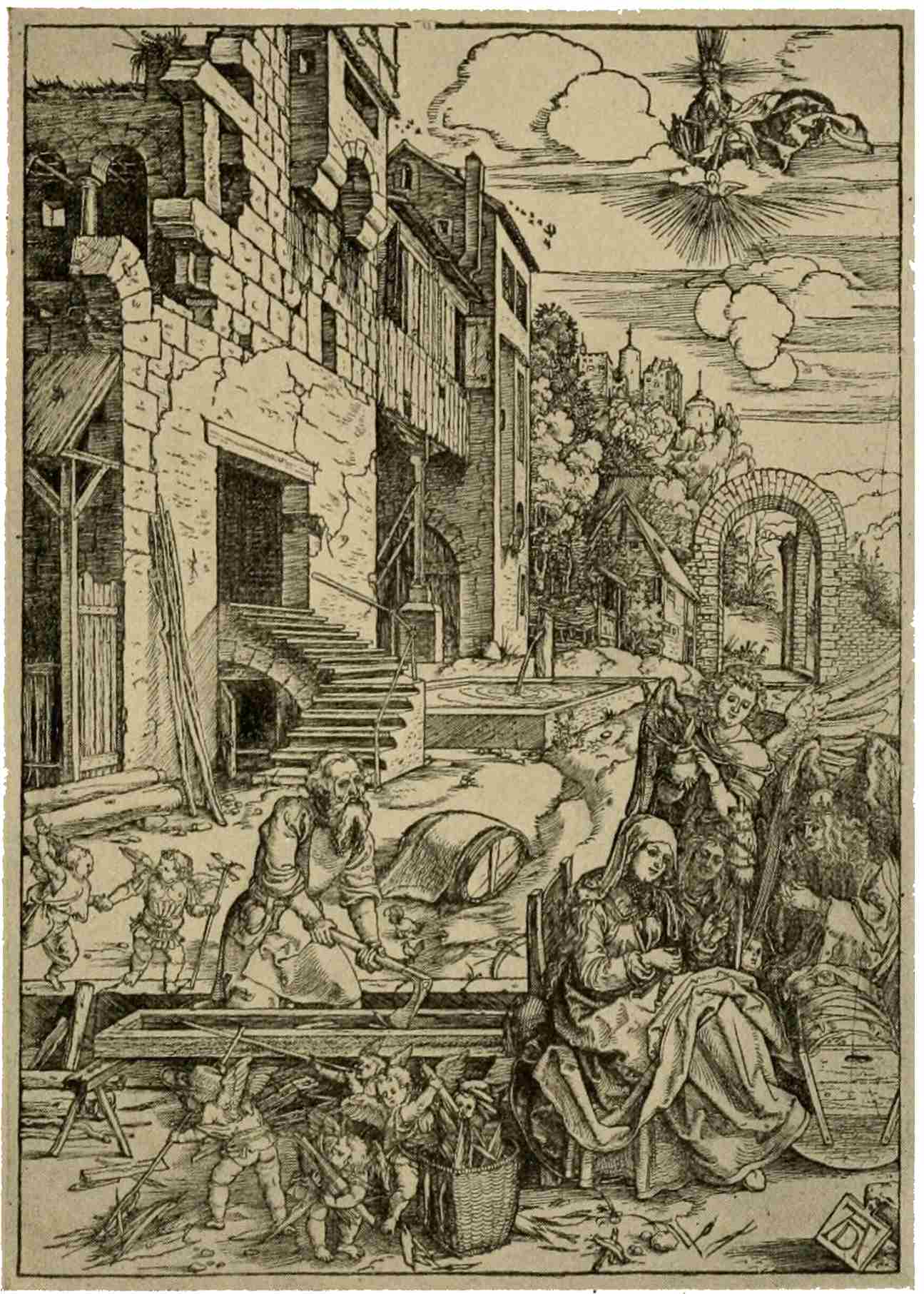
LIFE OF THE VIRGIN: REST IN EGYPT
Woodcut. Albrecht Dürer
The fullness of Dürer’s powers as an engraver is manifested in the three plates which typify man’s attitude toward life. First comes the good, steadfast knight, the champion of righteousness, unmindful of his weird escort of death and a hellish monster as he wends his way through a dark defile to his home on a distant sunlit hill. We then see despondent, bitter Melancholy, vainly64 demanding of science the answer to life’s riddle. Finally, we come to St. Jerome, serene in his chosen solitude: a mind resigned, at peace with the world which has been left behind. These engravings take a very high rank, indeed, in German art. Such technique of engraving as that here found had never before been even approached: broad gleams of sunlight brighten the room, striking the walls and floor; in the silvery half-light every texture, every substance is expressed by differentiations of the graver-stroke. Yet with all the infinite detail which abounds in the plate, the tonality is so sustained and detail so discreetly introduced, that the general feeling, after all, is one of simplicity.
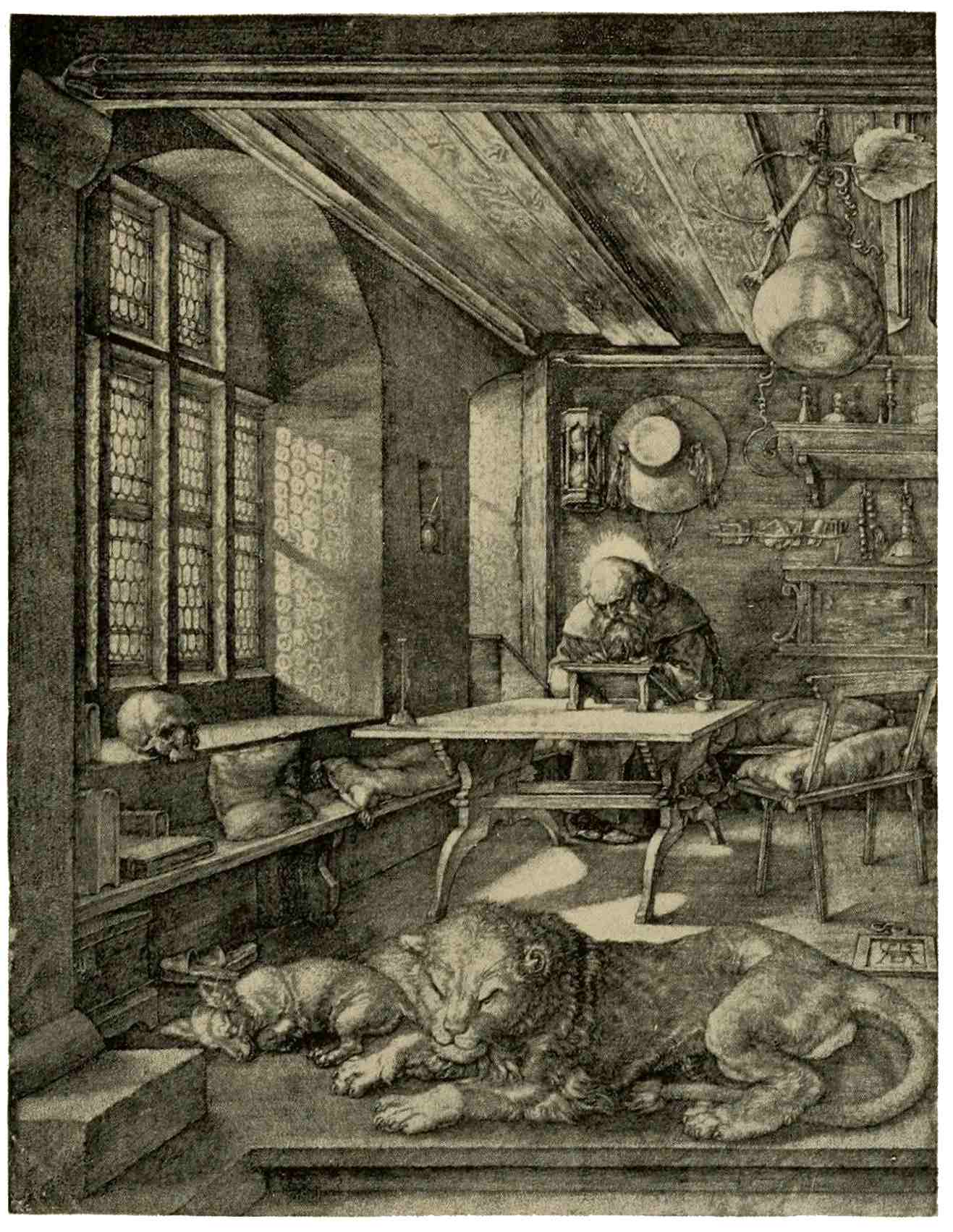
ST. JEROME IN HIS STUDY
Albrecht Dürer
One other aspect of Dürer’s genius must be introduced, namely, his mastery in portraiture. In the strong face of Cardinal Albrecht of Mayence, the keenest observation of the man is revealed with means astonishingly simple. Notice how far from65 extreme depth the shadings have been kept; all in the range of silvery grays, which Dürer sought in preference to dark shadows. The values in the figure, the arms and the inscription have all received careful consideration from this master whose genius was, indeed, the faculty of taking infinite pains.
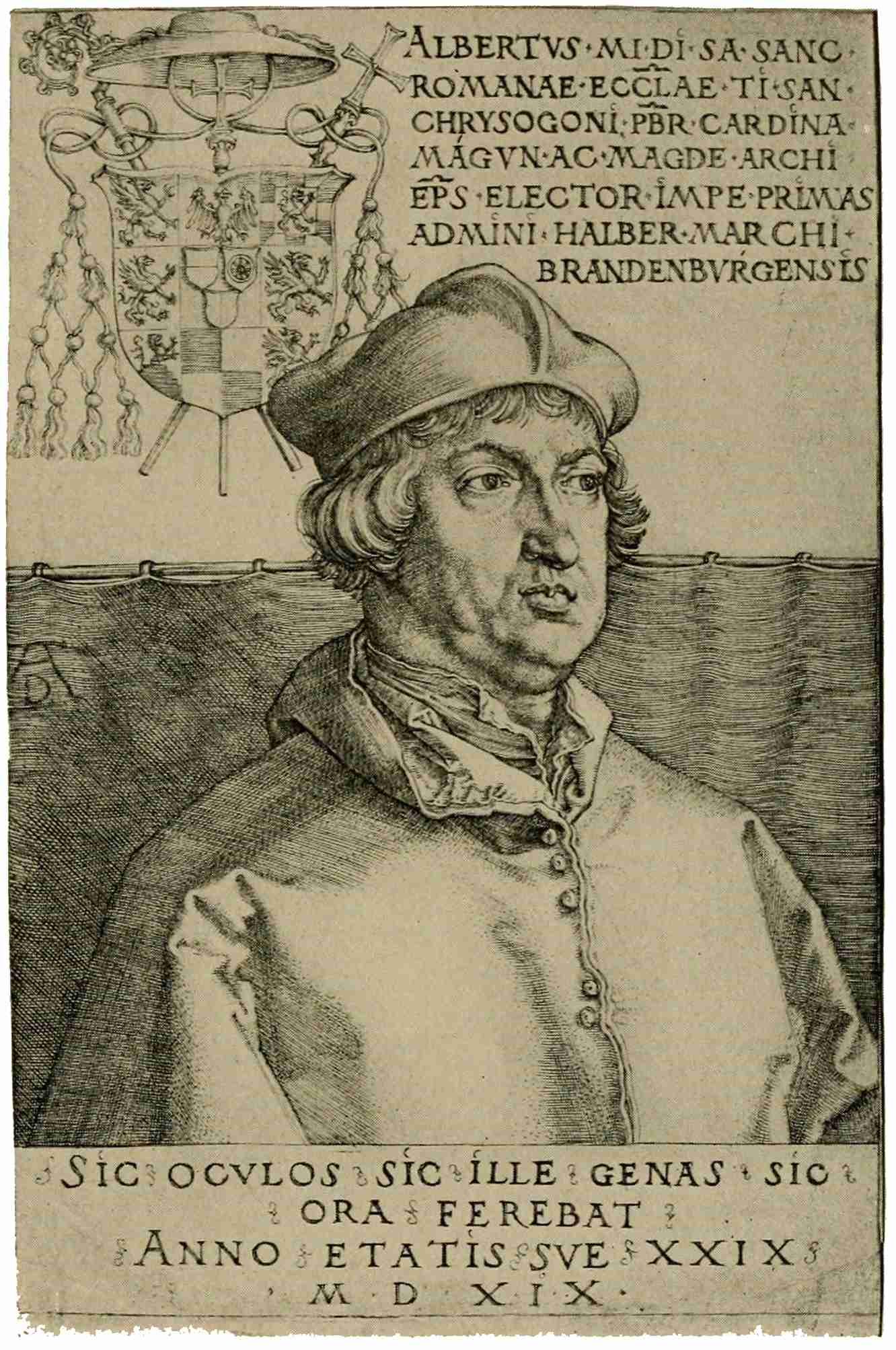
CARDINAL ALBRECHT OF MAYENCE
Albrecht Dürer
From this brief glance at the great Nuremberg artist, we must turn now to his Northern contemporary, Lucas van Leyden, likewise a painter-engraver, and a solitary figure in the Netherlands at that period. Bred in the realistic maxims of the fifteenth century, his Northern origin asserts itself in the careful detail and truthful presentation of nature, in the characteristic types of his figures. Truthful rendering of natural facts—as has been mentioned before—is a quality common to Northern artists. Dürer, in his fondness for psychological themes, is in tune with the humanists of his time. Leyden, though strongly influenced by the German master, has not Dürer’s depth of thought. He does66 not infuse that deeper meaning into his plates. Following the bent of his Germanic mind, he reverts to the simple, daily scenes of life, and when he undertakes to render scenes from other times and from distant places, he transforms them into events of his own day and his own surroundings. He can thus express himself with the directness of an eye-witness, and therein lies much of the charm of his work, which was much appreciated even in Italy. One of the few large plates of Lucas van Leyden will illustrate his artistic and technical powers. The “Adoration of the Magi,” broad in composition, sober and harmonious in the handling of the graver, typically Northern in feeling, is perhaps the finest of his achievements. Later in life his restless, searching mind was diverted to the allurements of Italian grace of form, and gave itself up to its influence without reserve.
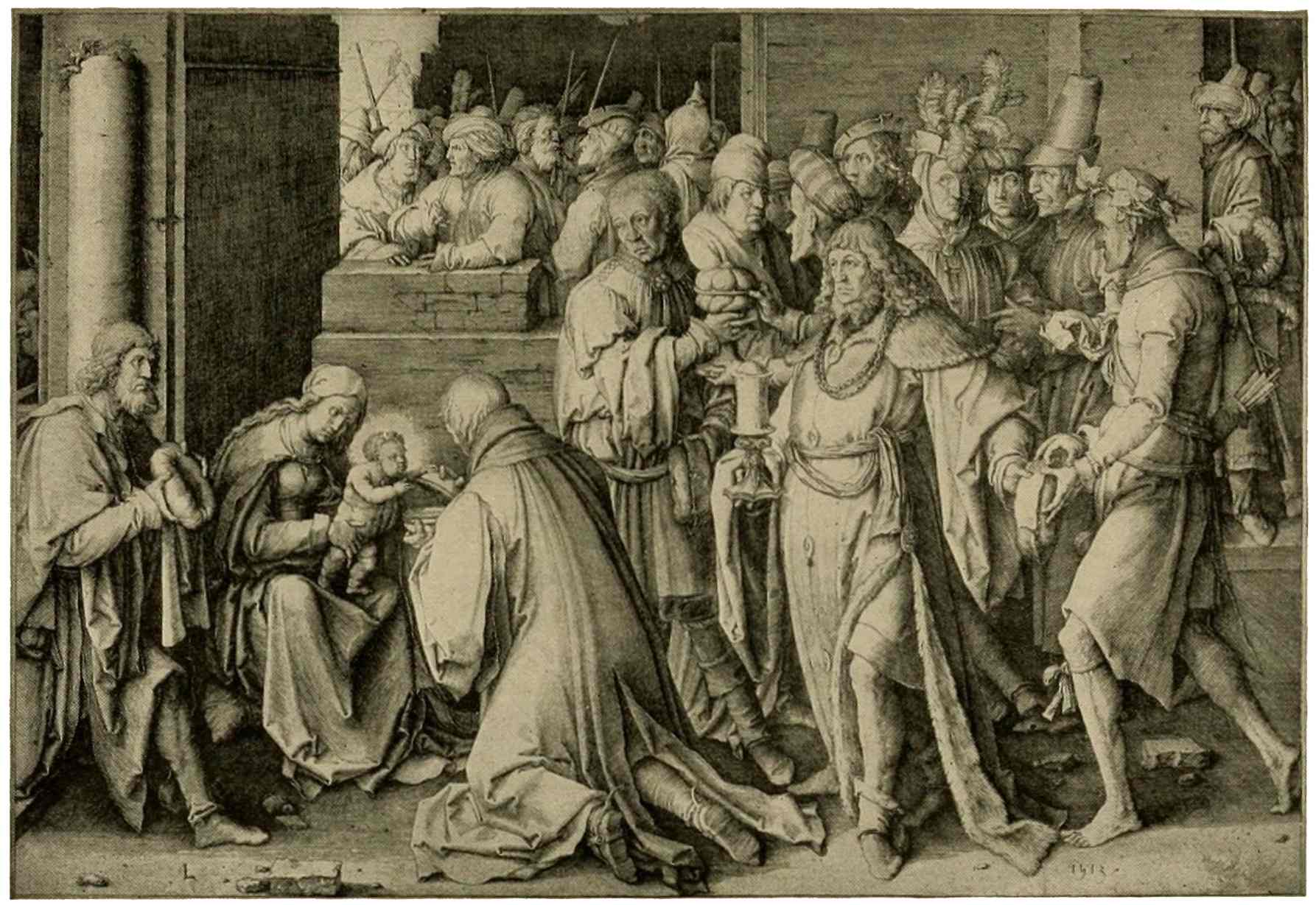
ADORATION OF THE MAGI
Lucas van Leyden
A great wave of enthusiasm for Southern ideals swept over the entire North about the67 third decade of the sixteenth century. It established the supremacy of Italian standards of artistic merit, which—as we know—were not such as to give new life to the graphic arts. This wave of Italian influence was felt in the immediate following of Dürer, in that group of painter-engravers, known to us as the “little masters,” though little only in the size of their plates. A high standard of technique is common to them all, with variations in their perfection. Variations there are also in the measure in which they yielded to Italian influence. Their graver was devoted to the rendering of a great variety of subjects; Northern characteristics are still evident in their portraits, in their Biblical scenes with German types of figures. Northern customs are depicted with Northern minuteness; on the other hand, the study of Southern models has developed in these Northern engravers an appreciation of the beauty of the nude, which is freely introduced in mythological, allegorical,68 Biblical, and other subjects, and very skillfully handled. We are apt not to appreciate the gravity of this Italian invasion, of this Southern supremacy in Northern art. Ideal perfection of form was a new language to the Germanic artists, accustomed to the realistic, faithful rendering of nature as they saw it, with all its facts, perfections, and imperfections alike. The change often meant that the artist forgot his native tongue, if the expression may be used—a harsh tongue, if you will, but sincere and expressive; in return he acquired, often but imperfectly, a new language in which his expression needs must be imitative, not original.
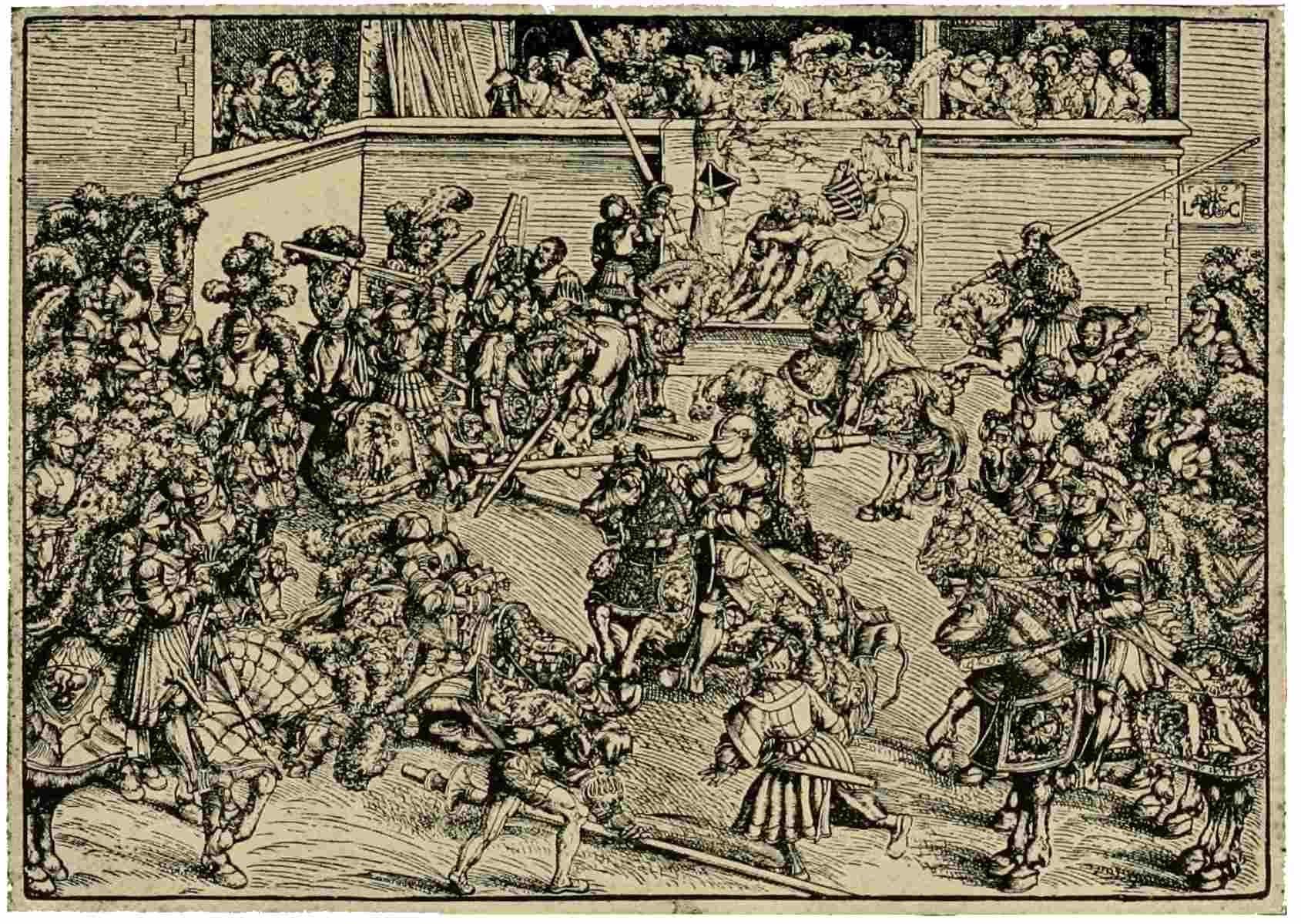
TOURNAMENT
Woodcut. Lucas Cranach
The true Northern spirit still greets us in the woodcut productions of that period. Woodcut was used for subjects of wide popular interest, for Passion series, portraits, religious subjects, and all manner of illustration. Dürer had used the relief process extensively for such purposes, likewise Burgkmair, who was, with Dürer, one of the foremost designers for the extensive publications of Emperor Maximilian. Lucas Cranach elected the strong, emphatic woodcut for much of his graphic work, prominently employed in the service of the Reformation. An example of his work, this tournament scene, is a reminder of the times in which he dwelt, and an illustration of his vivid power of presentation, typically Northern with its crowded figures.
Other masters there are in plenty, whom we must neglect, as we shift our abode to Basle for a moment. We find ourselves here, about 1516, in the midst of a thriving publishing center. Enterprising printers seek to secure pleasing decorations and illustrations for their scientific and literary output. They look for a good draughtsman to design some tasteful headings and end-pieces, borders and initials, and are well pleased with the samples submitted by a young newcomer, by name Hans Holbein. At first the cutting of his designs offers some difficulties, but when70 the right man has appeared, when Hans Lützelburger has joined his skill to the genius of Holbein, their joint productions attain a peerless mastery. High summits in art always invite comparison; this is true of Dürer and Holbein, even though these two great German masters are so widely different from each other. Dürer is nowhere greater than in engraving, while Holbein excels in painting; both are masters of woodcut. Dürer, with his scholarly, analytical nature, ponders over the deep, essential meaning which underlies the multitude of his observations, and sets down his conclusions in types broadly generalized. His St. Jerome—to quote but one instance—is not so much a specific old man in his study as the expression of a mental attitude common to mankind generally. Holbein is more a man of impulse, quick to express himself in a direct manner full of life. He is more sensual, and has much feeling for pleasing form and a beautiful flow of lines. He accents the event71 itself more strongly than Dürer, who is given to express himself rather by association of ideas. It is a significant fact that Dürer chooses his subjects with preference from the figurative New Testament, with its parables, while Holbein prefers to illustrate the Old Testament, a book of essentially historical character. Every scene is plainly told and intensely human in Holbein’s Biblical illustrations, as well as in that masterpiece of his, the “Dance of Death.” We cannot but marvel at the feeling of spaciousness in these small prints, at the lifelike action of the expressive little figures, at the perfect harmony of these figures and their surroundings.
At the time of Dürer’s death, in 1528, the long period of warfare, devastation, and misery had begun which was to end only after the Thirty Years’ War. Emperor Maximilian was dead; Charles V had broken the power of France in Italy; his mercenaries had sacked Rome, and incidentally ruined72 Marcantonio, the Italian engraver. His promising school was dispersed. It was a period of decline, both north and south of the Alps.
From that time on, the successive influences of Italy, of the Netherlands, and of France sway the character of German art. A clever superficiality develops, which adapts itself to the characteristics of the art in vogue. Etching, the sister art of engraving, cannot boast any signal triumphs during this period of German art, although, from the early days of its adoption, it was used to a considerable extent by the Hopfer family. Dürer experimented with the process, but soon returned to engraving. The greatest German etcher of the following (seventeenth) century, Wenzel Hollar followed the Earl of Arundel to England, there to build up his fame.
73
The seventeenth century, which witnesses German art in its decline, brings about a wonderful flowering of art in the neighboring Netherlands. This country had passed from Burgundian rule to the Hapsburg dynasty. With the advent of Charles V, it passed under the rule of Spain. The master hand of that emperor had been able to curb the feeling of unrest and ferment caused by the Reformation, but the oppressive measures of his somber successor, Philip II, drove the Dutch and Flemish people to rise in arms for the defense of their liberties. A long, cruel war of emancipation ensued, and near its close there came a parting of the ways which bears directly upon our subject. In 1598, the division occurred; the southern—Flemish—provinces remained true to the House of Hapsburg, true also to the long-established74 Catholic faith. Consequently their art retained its strongly religious element, tinged with Italian traditions. The great exponent of this Flemish trend of art is Peter Paul Rubens, of whom more presently.
The northern (Dutch) provinces adopted the teachings of Calvin, and soon established their independence. Their churches were bare of any pictorial adornment; their art was forced, therefore, to develop mainly in the sphere of home life. If we term Rubens the leader of Flemish art, Rembrandt stands for the highest development of Dutch art. Between these two leaders lies a broad field with many blending, interweaving influences, many local characteristics, in this magnificent epoch. The only way to approach the subject in a few brief sentences is by considering as one vast unit the whole period of seventeenth-century art in the Netherlands, both Dutch and Flemish.
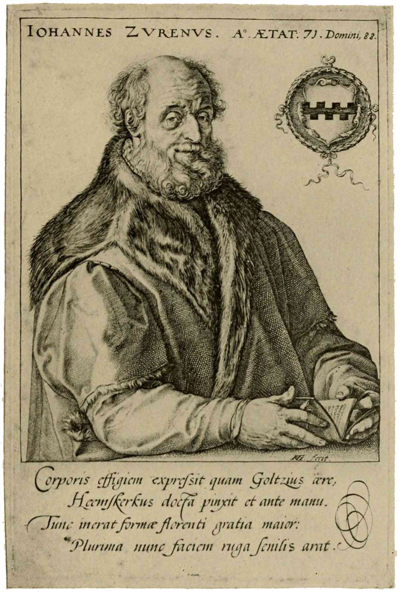
JOHANNES ZURENUS
Hendrik Goltzius
It will ever be a matter for surprise that75 this small country should burst into the full glory of a great period of art at a time of incessant, strenuous warfare. First the long, exhausting war with Spain; then a war with England; finally, a war with the powerful France of Louis XIV. Within the time limit of these wars lie the dates of the birth of Rubens, and of Rembrandt’s death, marking the culmination of art in the Netherlands. If we look back to earlier days of Dutch engraving, we discern the isolated figure of Lucas van Leyden, the only painter-engraver of fame in the Netherlands at the time of Dürer. After his death no master of similar merit arose to carry on his traditions. Engraving, deprived of eminent guidance, sank to levels of commercialism. Saints’ pictures being always in great demand throughout Christendom, engravers in the Netherlands devoted their energies largely to this field, and that country became the center of production of all kinds of engraved devotional prints.76 Trained by daily routine practice, the engravers acquired a high degree of dexterity in handling the graver. Whole families of engravers—the Wierix, the Van de Passe, the Galle—devoted themselves to this work, which assumed the character of a manufacture of engravings. One did the figures, another the backgrounds, another again the draperies, ornaments, etc., according to their respective aptitudes. Toward the close of the sixteenth century, this Northern skill in handling the graver was communicated to Italy, and there mastered by Agostino Carracci. In Holland manual dexterity was carried to its height by a virtuoso of the graver, Hendrik Goltzius. His “Pietà” in the manner of Dürer, and a series of large plates, in which he exhibits, in turn, characteristics of this and other noted artists, reveal his technical mastery. They disclose also his power of close observation, which appears to best advantage in portraits such as that of Zurenus. Excellent judgment is shown in the selection of line; the effect is sparkling, brilliant; in fact, this very brilliancy, this cleverness in the telling use of the line, becomes an end to be striven for, and no longer the means only employed to express an artistic thought. This worship of technique carries Goltzius and his numerous followers to extremes of mannerism, where we must leave them and turn to the engravers grouped around Rubens.
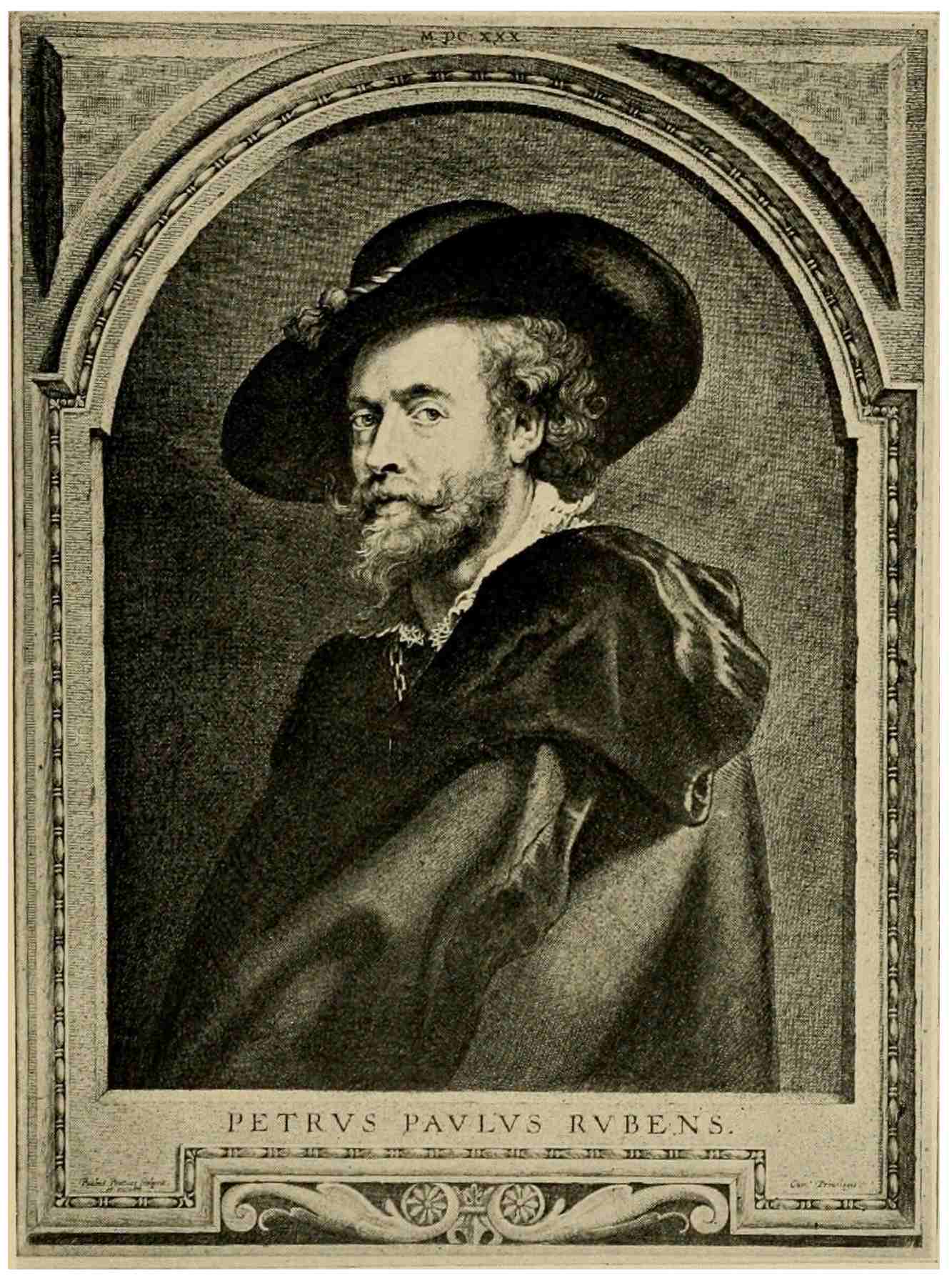
PETER PAUL RUBENS
Paul Pontius
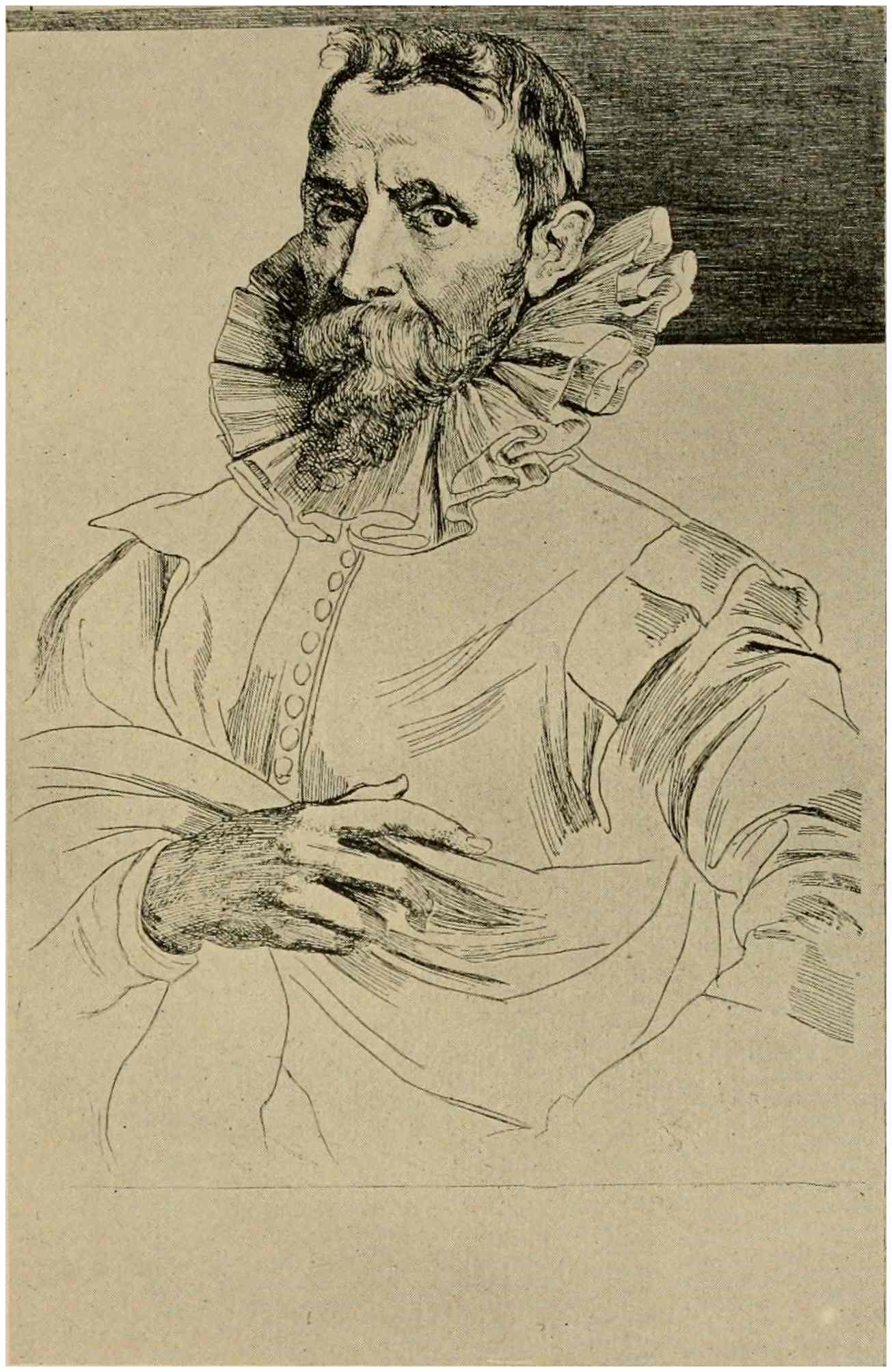
JAN BRUEGHEL
Anthony van Dyck
Peter Paul Rubens perceived the advantages which prints might bring to a painter by the propagation of his compositions. So he surrounded himself with experienced engravers, whom he guided by suggestions and corrections. How well they interpreted the work of the master may be seen in Rubens’s portrait of himself, engraved by Paul Pontius, one of the noted engravers of this group. A stride toward the expression of color is to be perceived in this plate; great variety in the rendering of cloth, hair, lace, the face, the background and frame. The78 problem of expressing color, as well as form, now enters more and more into the sphere of engraving; a problem much more difficult than would appear at first thought. Here is the task which faces the engraver: he must keep true to the original he reproduces, true in form, true in color values, by a judicious gradation of tone. At the same time he must strive to make his plate interesting, spirited, brilliant, and apparently easy and free in handling. Singly these qualities are not uncommon, but that engraver is far from common, who, having the power to do such brilliant work, has moreover the wish and ability to efface himself, and let only the artist speak, whose work he interprets. It is a claim to distinction for many engravers of the Rubens group that they came so near to solving this problem. Whether or not Rubens made use of the etching-needle himself remains a matter for speculation; there is no doubt, however, that his great pupil—Anthony van Dyck—used etching very effectively, as will be seen by this portrait taken from his famous “Iconography.”4 The likeness is sketched with his characteristic sureness and ease upon the grounded copper plate. The biting was doubtless left to the engraver who was to finish the plate. Neither Rubens nor Van Dyck seems to have been interested in etching or engraving as such; to them the graphic arts were excellent means of reproduction, nothing more.
4 A large series of portraits after Van Dyck, engraved by a number of the Rubens engravers.
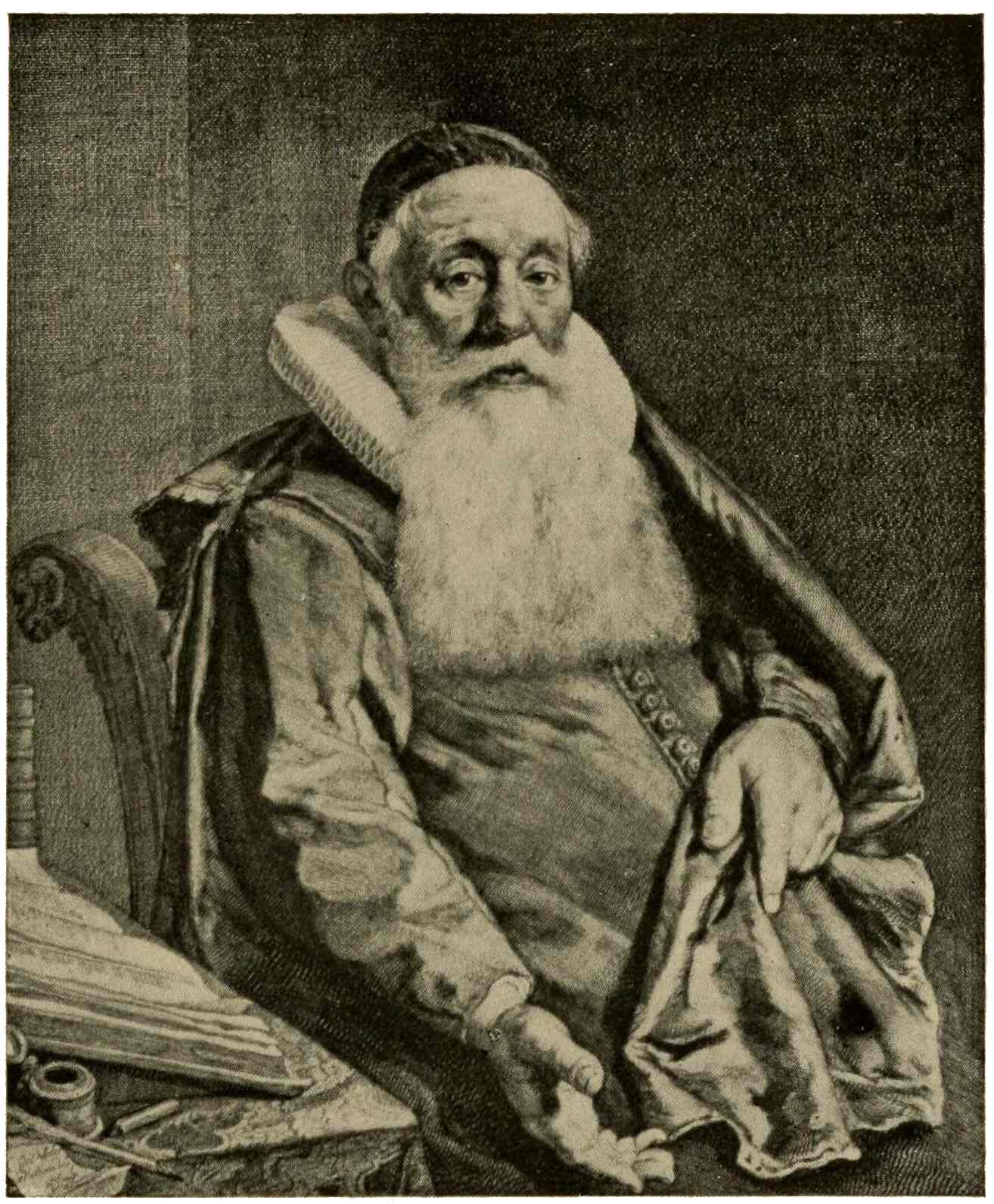
GELLIUS DE BOUMA
Cornel Visscher
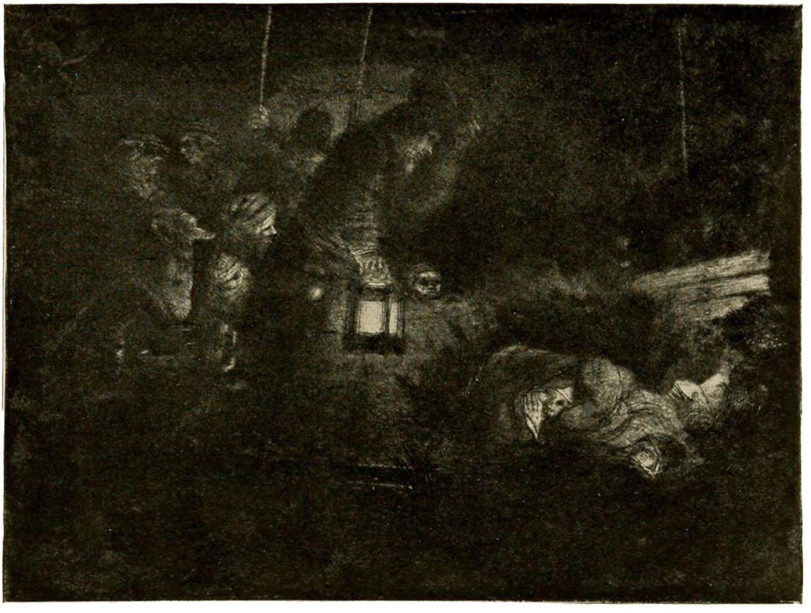
ADORATION OF THE SHEPHERDS
Rembrandt
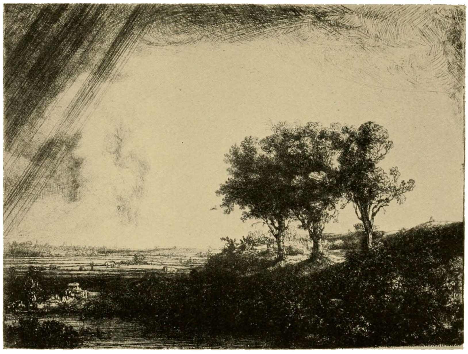
THE THREE TREES
Rembrandt
You will notice that the engraver has begun his work in fine, parallel lines, close together, in the upper corner of the plate. The print thus presents one aspect of the use—conjointly—of etching and engraving, which had then come into universal use. Another example of the combined use of the two processes, blended into a rich harmonious tone, is the portrait of Gellius de Bouma by one of the great portrait engravers of the seventeenth century, Cornel Visscher, an80 artist who tolerated no hard-and-fast system in the graphic arts. Here is a vigorous, well-modeled figure, broadly treated in so interesting a manner that the means of expression are quite forgotten in the enjoyment of the effect achieved. A new element now enters the sphere of our interest: the problem of light, bright or subdued, in infinite gradations. Interiors with the light focused on one spot; night effects partially brightened by a torch or lantern, or by a fire, all else enfolded in darkness. The pioneer in this clair-obscur manner is the painter, Adam Elzheimer, but no one made more effective use of this play of light and shade in the graphic arts than Rembrandt. Take the “Adoration of the Shepherds” as an instance, with the feeble light of the lantern and the rich tone of surrounding darkness, with indistinct forms of figures and objects half seen and half guessed, which gain shape as we look more closely. In the famous plate known as the “Three Trees” our attention is at first attracted by the vast expanse of threatening sky, with its lofty thunder-clouds, and the immense plains, with dikes and level fields stretching to the distant horizon. As we look at the picture, details appear,—the team behind the trees, the people in the fields, the couple in the bushes. They are overlooked, then seen, just as they would be in nature; they keep their subordinate places, and do not intrude and disturb the general effect of grand simplicity. Color is so well suggested by differentiations in handling and varying intensities of tone that one almost forgets the simple black and white presentation of the scene. As an example of Rembrandt’s mastery in etching applied to portraiture, no better print could be chosen than the “Janus Lutma,” especially if we can see it in the glorious richness exhibited by the first state of the plate. All the resources of the process are in evidence here,—they are seen in the subtle modeling, in the insensible gradations of tone, in the82 brilliancy of the accents, in the depth of the velvety shadows. It will be readily understood that such delicate, almost breathlike differences in shading, cannot long withstand the wear and strain to which they are subjected at each successive impression. Every print taken from the plate means rubbing the ink into every one of these delicate incisions in the copper; then comes the severe pressure as the plate passes through the press. A soft metal like copper soon shows the effect of these wearing influences: the delicate ridges of the dry-point work flatten down, and the edges of the etched lines become blunt. After a very little while the difference in the impressions grows more and more noticeable; then comes the touching-up of the plate, in an endeavor to restore—in a measure—its former brilliancy and freshness; naturally this modifies the appearance of the print to some extent. The first of these retouches are probably made by the artist himself; later on, as the plate again wears, it may have passed into the hands of dealers, who, in turn, have the copper touched up repeatedly for further printing. Thus you may have a Rembrandt print, from the original copper, yet without even the echo of that which the great master had originally expressed. This applies not to Rembrandt etchings only, but to prints in general; whatever the print, the first essential must always be to secure a good impression of it.
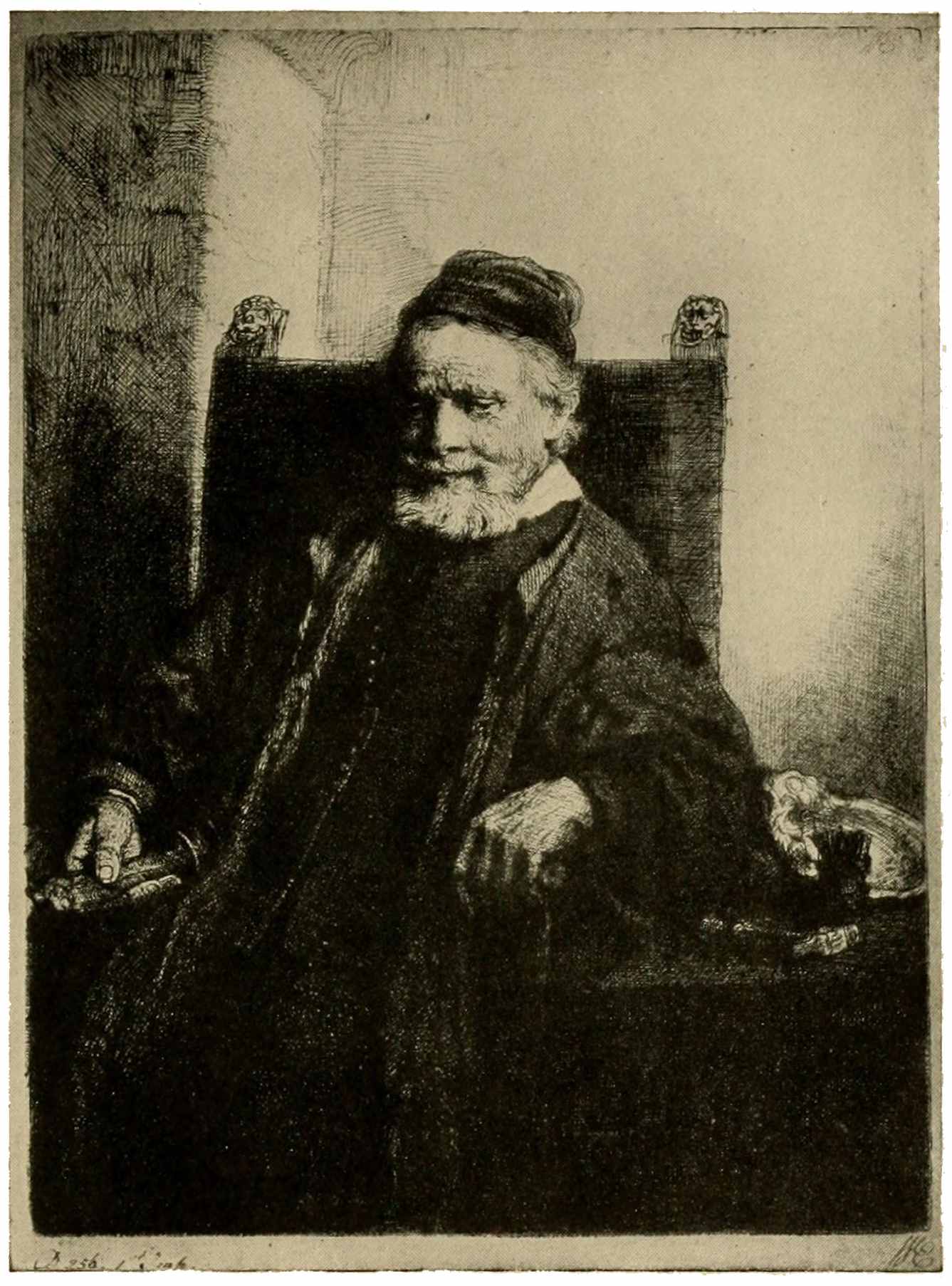
JANUS LUTMA
Rembrandt
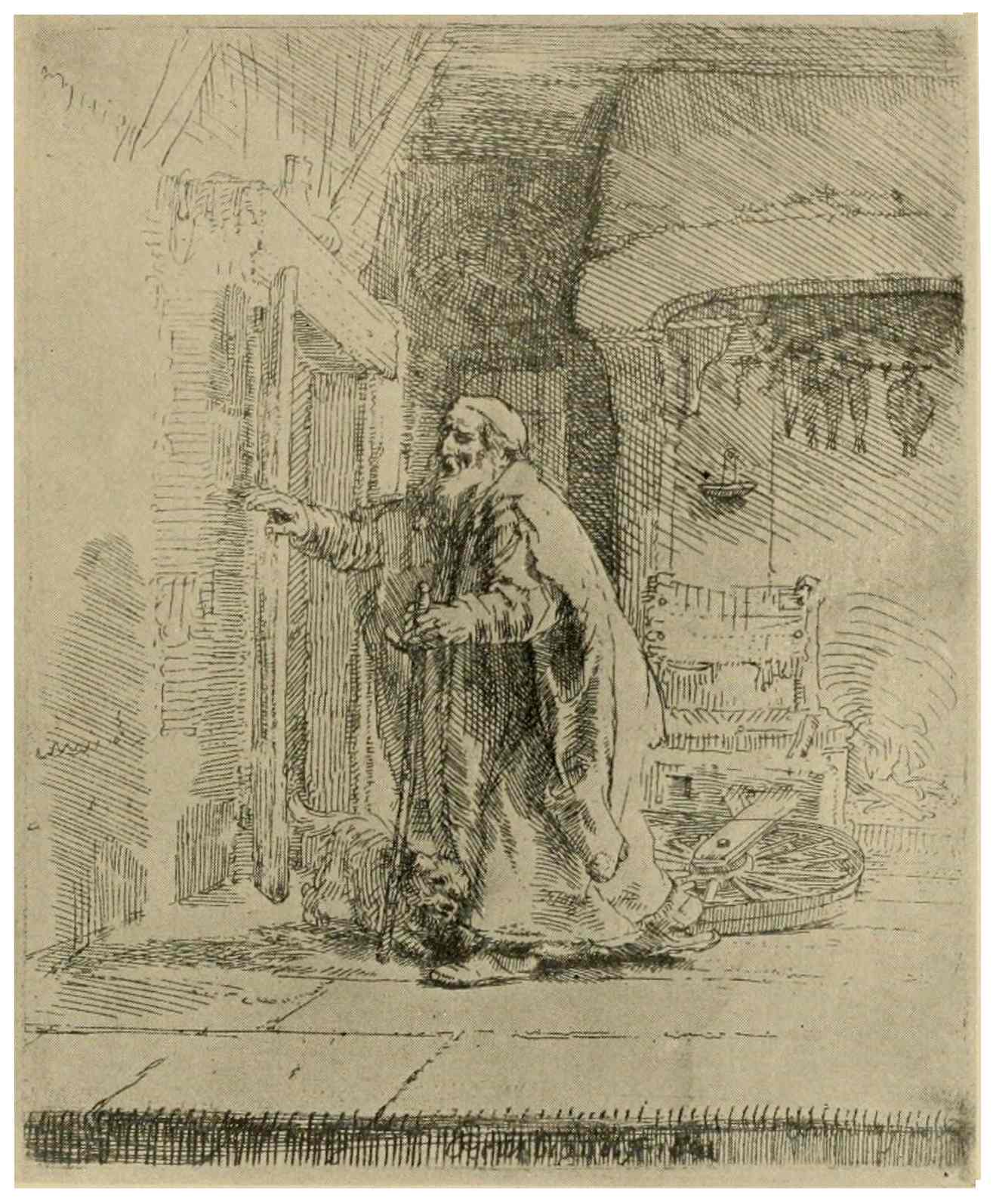
TOBIT BLIND
Rembrandt
We cannot leave Rembrandt without glancing at one of those sketchy little prints which, upon examination, reveal to us his big-hearted knowledge of human nature and his keen powers of observation. Here is the old Tobit, a groping figure, eloquently described by means of a few telling lines in its pathetic, helpless blindness, the little dog acting as a guide.
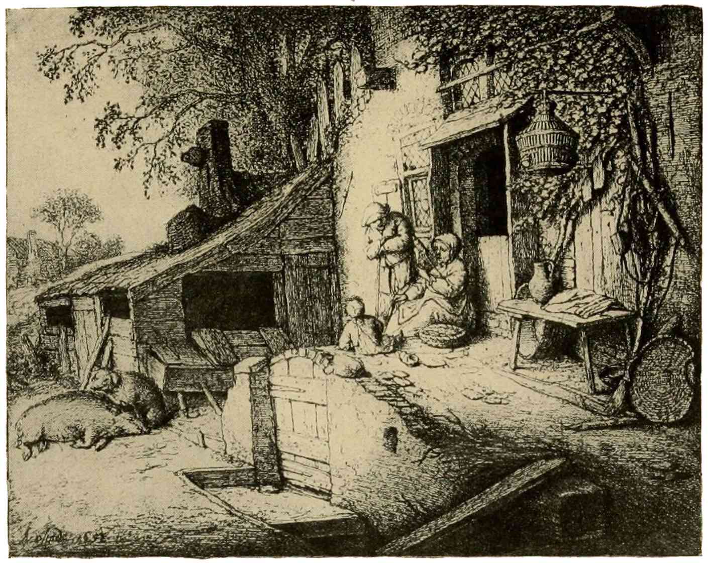
THE SPINNER
Adriaen van Ostade
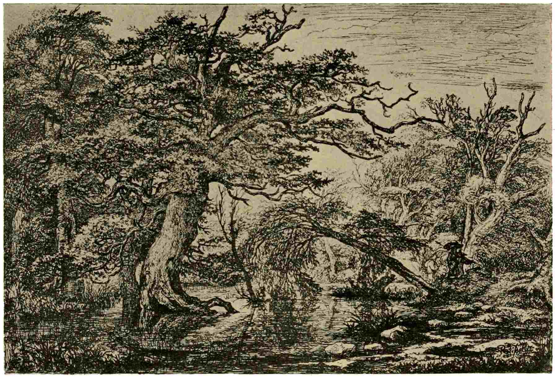
THE TRAVELERS
Jacob Ruysdael
The influence of Rembrandt on his contemporaries and on subsequent artistic productions is very great indeed; none of his84 followers, gifted though they be, approach him in excellence and universality. To the Northern mind there is a great fascination in presentments of the life of the common people. Brouwer, Brueghel, Teniers are among those partial to this theme, and each of them has done some experimental work with the etching-needle. In Germany we find plates relating to peasant life among the prints of Dürer, Holbein, and the little masters. Rembrandt has devoted a good many plates to character sketches of beggars and of peasants. Among the other Dutch etchers the greatest interpreter of the peasantry is without doubt Adriaen van Ostade. He shows them to us at their homes, or at the tavern, smoking, drinking, dancing, merrymaking. The gay, sunny side of their existence is revealed in his fifty etchings, which display a thorough command of the medium employed. In the scene which has been chosen as an example of his powers, we discern the sympathetic interest in85 country life which characterizes all his work. Jacob Ruysdael, the landscape painter, has sketched on the copper a number of characteristic subjects, none, perhaps, finer than this clump of sturdy, gnarled oaks, with roots bathed in a shallow pool. The distant trees are flooded with sunlight, while the foreground is toned down to a lower key. All this is done in the simplest possible manner. The whole plate speaks of close, careful observation, and truthfully, suggestively expresses actual nature. Another notable feature is the subordination of the figures. Here, as in Rembrandt’s “Three Trees,” the figures are quite subordinate; the quiet beauty of the scenery presented is the main theme of the artist’s message. Passing by numerous other delightful landscape etchers, Everdingen, Waterloo, Saftleven, likewise the gifted etcher of animals, Paul Potter, we must turn now to Nicolas Berghem, who combines animal life with landscape. In his masterpiece, known as the86 “Diamond,” there is apparent the close study of nature, characteristic of the period, also much clever mise en scène, but as we examine the plate more closely, we realize the admixture of Italian inspiration. The vigor of home influences is weakening, and the art of the South again asserts itself as we approach the eighteenth century. The same Southern influence pervades the landscapes of Jan Both; they are very pleasing, technically fine, but the evil which creeps into Dutch art is quite evident here. The ideal landscape of Titian, Poussin, and Claude Lorrain gradually warps the former frank realistic rendering of nature; elegance, hollow display gradually take the place of the good, wholesome naturalness of Dutch art.
With the advent of the eighteenth century, painting and the graphic arts decline to levels which we may pass by in this rapid survey.
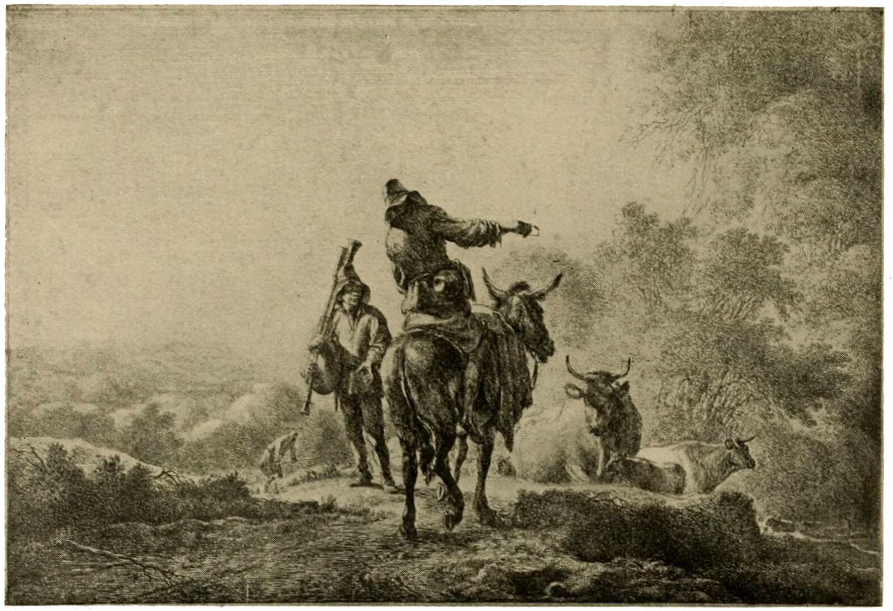
THE DIAMOND
Nicolaes Berghem
87
Having considered the fate of the graphic arts in Italy, Germany, and the Netherlands, our attention must dwell for a while on developments of the printed picture in France. In each of the countries above mentioned, we have witnessed a definite era of excellence in the sphere of prints; in Germany and in Italy, this zenith was reached in the late fifteenth and early sixteenth centuries. In the Netherlands, as we have just seen, the great awakening took place fully a century later. In this same seventeenth century, toward its close, as art declines in the Low Countries, French engraving rises to its highest perfection.
We needs must deal briefly with early French productions in relief and intaglio processes. Woodcut first: some few examples of early playing-cards which have88 survived destruction to these days, prove the trade of the card-printer to have flourished in France as well as in Germany. Book-printing speedily grew to important proportions; great printing firms were founded in Lyons and elsewhere, and carried on an extensive trade. Men of artistic originality, like Geoffroy Tory, knew how to infuse a distinctive character into type and illustration of their books; but apart from a few choice spirits, artistic France is not conspicuous in these early productions. Not only is printing largely carried on by printers from Germany and Switzerland, but these countries likewise furnish a large share of the relief-blocks needed for illustration. The Holbein “Dance of Death” is a notable instance of this practice. That series of wood-blocks had passed to Lyons, and there one edition after another was printed from the blocks, until they were quite worn out. Woodcut never was, in France, the important means of artistic expression which89 we have found it to have been in Germany. Its days sped by unheeded. The chief field of usefulness of the woodcut, the decoration and illustration of books and the sphere of the devotional print, were invaded by the intaglio processes. The woodcut lost ground everywhere in the seventeenth century; it had practically no share in solving the problems set to the graphic arts by the rising schools of Dutch, Flemish, and French painters. It sank to mere imitation of the fashionable book-decorations done in etching or engraving. The true, bold language of woodcut, spoken during the sixteenth century, finds no counterpart in the seventeenth; we must, therefore, turn to engraving, to vindicate France as a great center of development in the graphic arts.
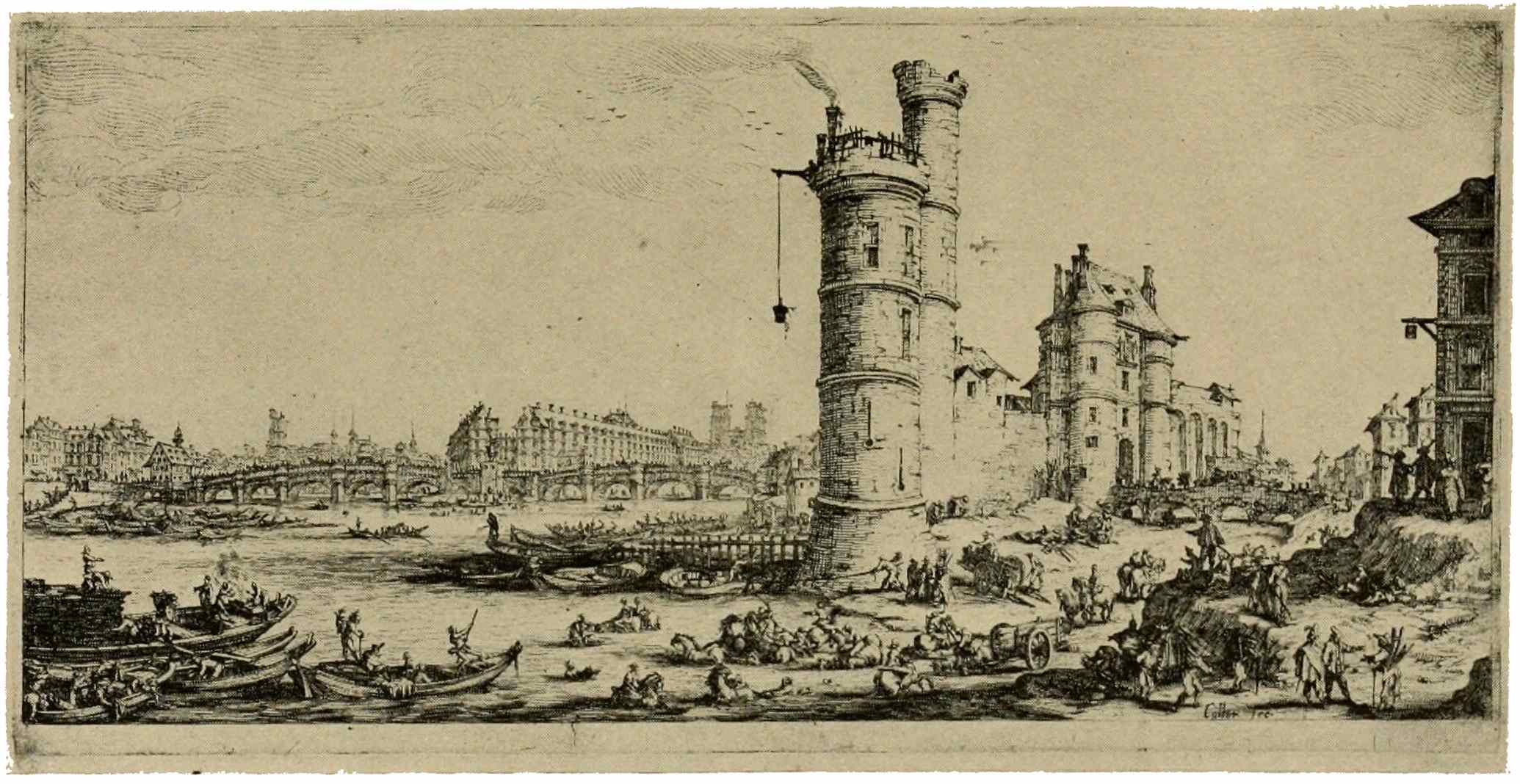
TOUR DE NESLE
Jacques Callot
In the early sixteenth century we meet in Jean Duvet an engraver of original merit. He adopts in his work the style of certain early Italian engravers. In his compositions he harks back to Dürer’s imaginative90 genius. A little later Etienne Delaune appears, affecting the elongated figures of contemporary Italians, while in his graver-work one discerns a resemblance with the manner of the German “little masters.” In etching a vital impulse is given to French work about the middle of the sixteenth century. At that time Francis I called Italian artists to France for the decoration of his castle of Fontainebleau. Many of these Italian artists—Primaticcio, Fantuzzi, and others—made use of etching occasionally in a hasty, sketchy style. The sensuous charm of their lithe, long figures appealed to French taste, and elicited a response in the plates etched by Jean Cousin, for instance. In all this early production we feel the dominating influence of Italian art, with an occasional echo of German thought or German technique. France seeks her own language in the graphic arts, and timidly ventures forth in an original manner of expression. This diffidence is of brief duration, however, and by the end of the seventeenth century we find her a leader in engraving, and by no means in engraving only. As we enter upon this broad development, we must cast a glance on two personalities of distinct originality, namely, Jacques Callot and Claude Lorrain. Both are natives of Lorraine, both are schooled in the art centers of Italy. Callot, endowed with an impulsive, expressive style, full of personal qualities, vividly describes in his plates the habits, customs, pleasures, the life, in short, of France and Italy at his time. He peoples his plates with multitudes of minute figures, with well-accented gestures. These little figures are written down, as it were, with consummate skill; they are expressive in their concerted action; in their grouping, these peasants, soldiers, beggars, cripples, actors, courtiers, as they troop across the scene, unfold a bird’s-eye view of the world in the midst of which the artist lived. From the vast number of his prints, let us select for illustration92 one of his views of old Paris, with the Tour de Nesle prominent in the foreground. In his hundreds of plates we see the miseries of warfare described as well as the gayety of public festivities and the pomp of ceremonies of state which he witnessed in Florence. Claude Lorrain, an originator and gifted exponent of landscape, has occasionally taken up the etching-needle, largely in an experimental spirit, modifying his technique at different times, and showing himself, like other noted painters and occasional etchers, infinitely more clever in the design than in the actual etching. The plate chosen for illustration, called “Le Bouvier,” is the most famous of his prints; in it we perceive (provided we see a fine early impression) the rich tonal effect, the sense of airiness, of space, the delightful composition, the knowledge of nature’s forms and of atmospheric aspects, which appear far more markedly still in the paintings of this master.
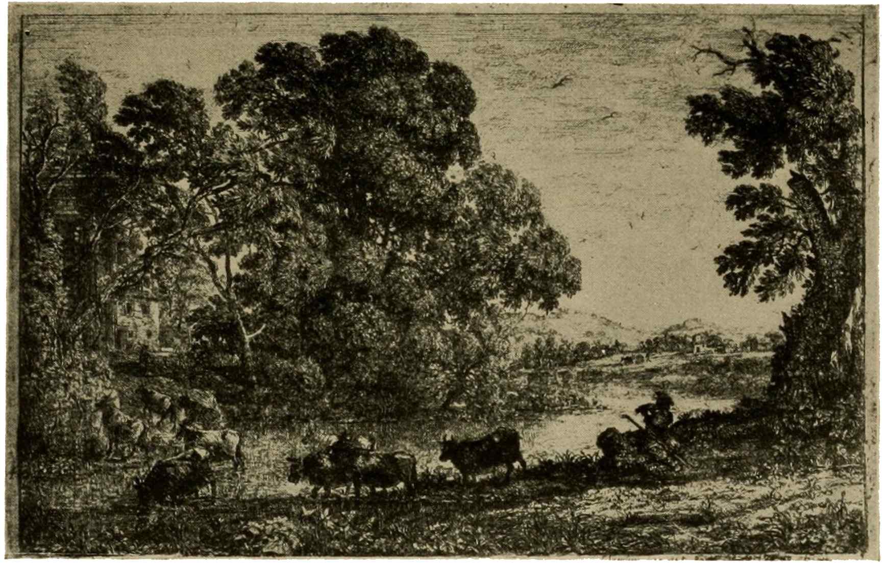
LE BOUVIER
Claude Lorrain
The new awakening in French engraving93 in the seventeenth century is especially notable in portrait engraving. Germany has lost its leadership in the graphic arts; the great days of Italian engraving are likewise over, though Italy continues a source of inspiration to painters of all nations, she can add no vital, helpful impulse to engraving. Such life-giving influences could only come from the Netherlands, where the great tide of art is now at its height, where painting and the graphic arts have unfolded all their glory. Here the etcher’s and the engraver’s technique, very highly developed, is growing yet in perfection. What could be more natural than the powerful stimulus exerted by such excellence on French engraving? Its greatest triumphs coincide, in point of time, with the period of political supremacy of France during the reign of Louis XIV. The “Grand Monarque” infused grandeur into all the arts. The stately graver is the medium aptly chosen for numerous portraits of the “roi soleil” himself. In this period of94 teeming fertility in portraiture, we find an abundance of likenesses of statesmen, generals, princes, nobles, of leaders in art, science, literature, and of distinguished churchmen. One cannot look through these prints without being struck by the prevalence, among them, of an element of stately aloofness which removes these men and women from the everyday sphere of life. They lack some of the freedom, some of the lifelike appearance, which characterize the achievements of the Netherlanders.
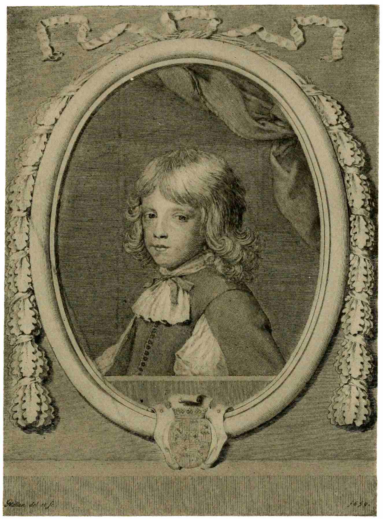
DUC DE GUISE
Claude Mellan
In glancing through the ranks of the French engravers, we come upon Claude Mellan, an artist-engraver of striking originality. He departs from the beaten track of cross-hatching, and develops a manner of shading which relies—for the rendering of shadows—solely on the swelling line peculiar to graver-work. His technique is seen in the portrait of the young Duc de Guise here reproduced. Lines very lightly traced in the lighted portions, grow in strength and swell proportionately to the depth of shadow to be expressed. The direction of the line and its degree of heaviness are the means of expression used by Mellan. The difficulties inherent in such a technique are evident, and it is equally evident that the elimination of cross-hatching is a heavy handicap to an engraver. Naturally enough, Claude Mellan did not have any following to speak of among engravers.
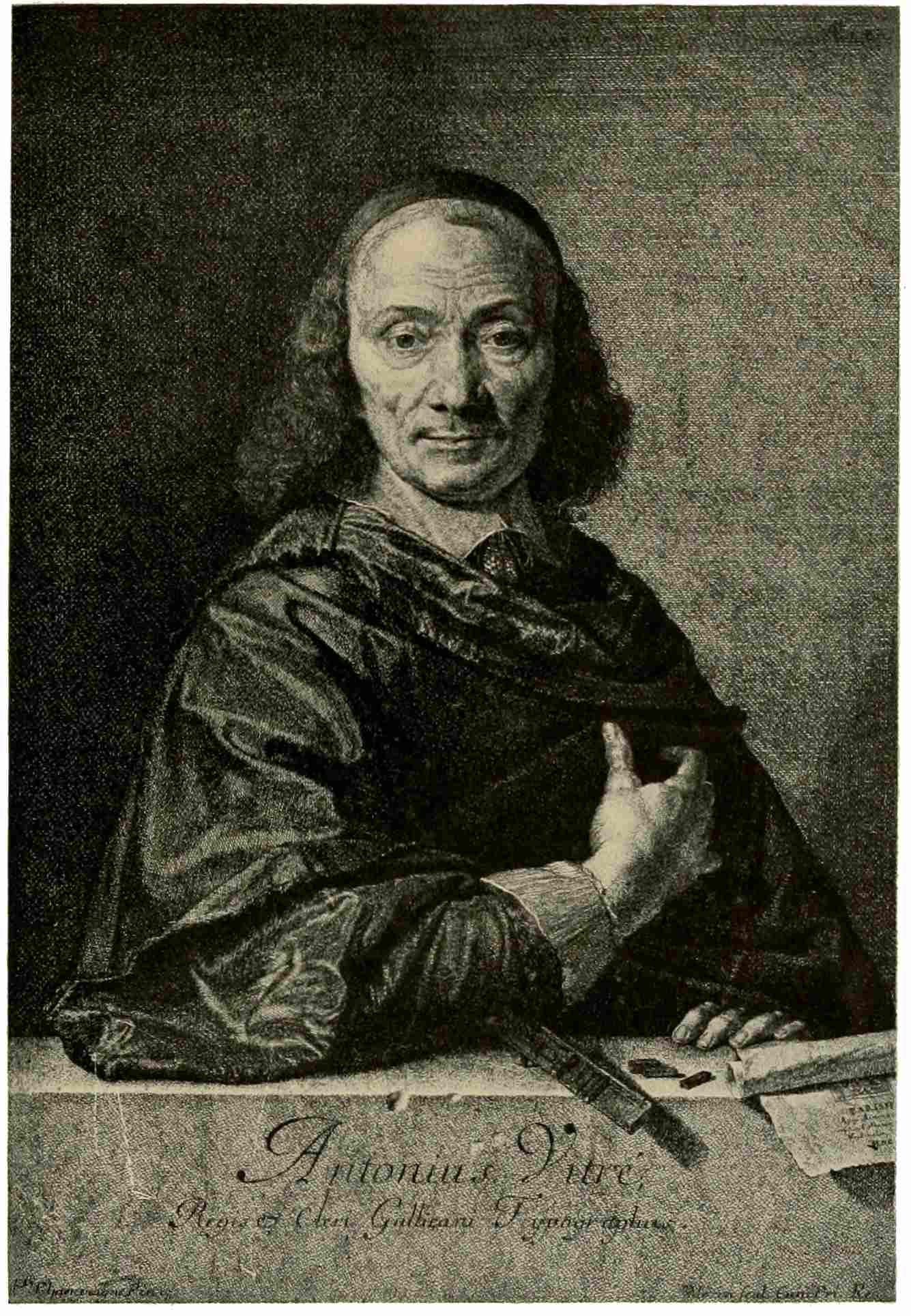
ANTOINE VITRÉ
Jean Morin
From this peculiar but fascinating artist, we pass on to another engraver of marked individuality, Jean Morin, an excellent technician who studied with profit the works of his Dutch and Flemish predecessors. He combines etching and graver-work in his plates, modeling the flesh exquisitely by means of minute stipple-like touches. Among his best productions the portrait of Antoine Vitré stands forth as a plate of great effectiveness and power, with rich, dark tones of shadow and brilliant lights.
The school of Philippe de Champaigne,96 which disciplined the powers of Morin, set upon his way the greatest of French portrait engravers, Robert Nanteuil. A finished draughtsman, known by his pastel portraits, and an engraver who carried the technique of the graver to perfection; he knows how to blend delicacy and strength in plates like this portrait of Pompone de Bellièvre. The longer one studies such a print, the more one realizes the unerring faculty of this master in the selection of line; each stroke fits the substance which it is meant to express. The eloquence of the graver is a matter too subtle for language, and far transcends the possibilities of reproduction, however skillful; a half-hour spent with some good, early impressions of Nanteuil prints will prove the truth of this assertion. Everything is expressed there, and wondrously well expressed, yet one is quite unconscious of any display of virtuosity. Nanteuil was too great an artist not to subordinate the beauty of line, the97 marvelous finish of elaborate detail, to the main consideration, namely, the beauty of a well-balanced, well-harmonized ensemble. He was an artist-engraver in the true sense of the word, since many of his finest plates have been drawn from life, as well as engraved by him.
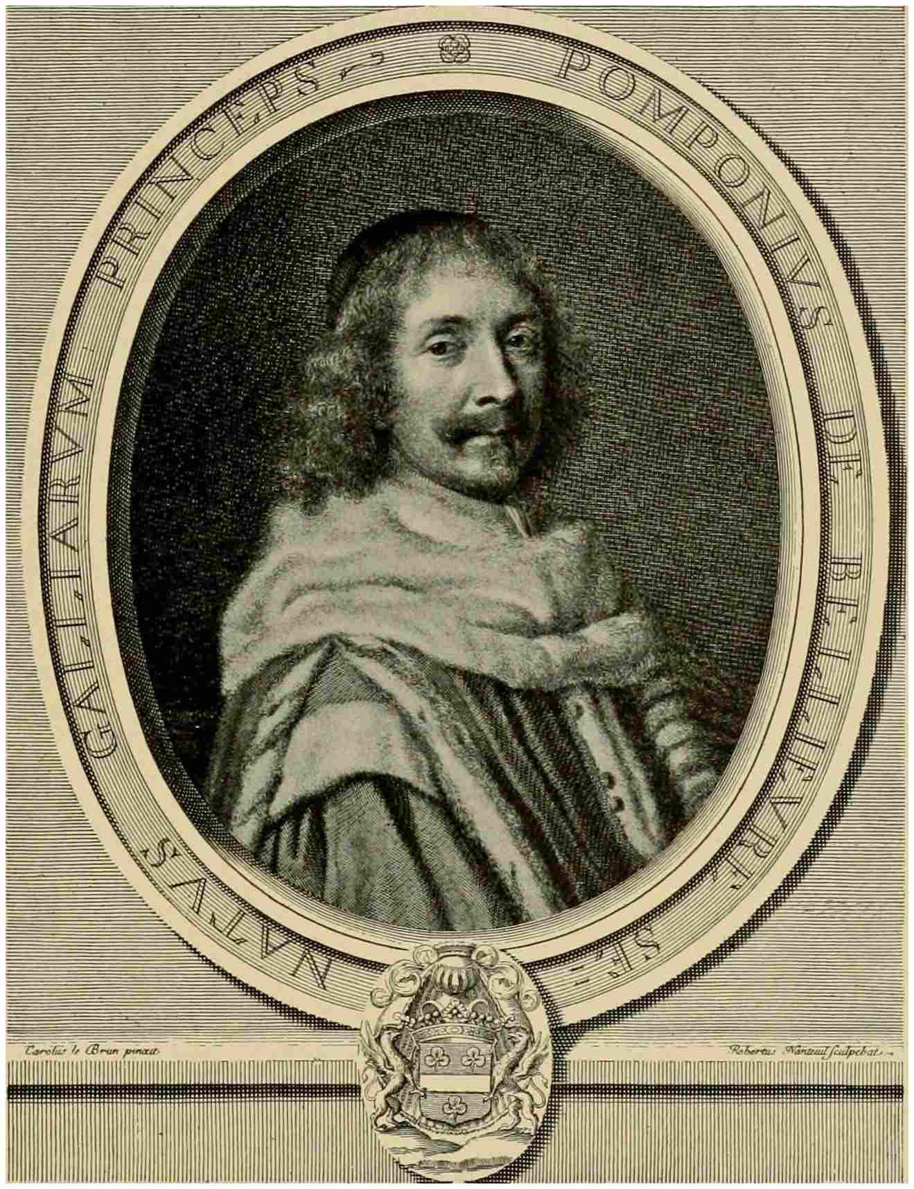
POMPONE DE BELLIÈVRE
Robert Nanteuil
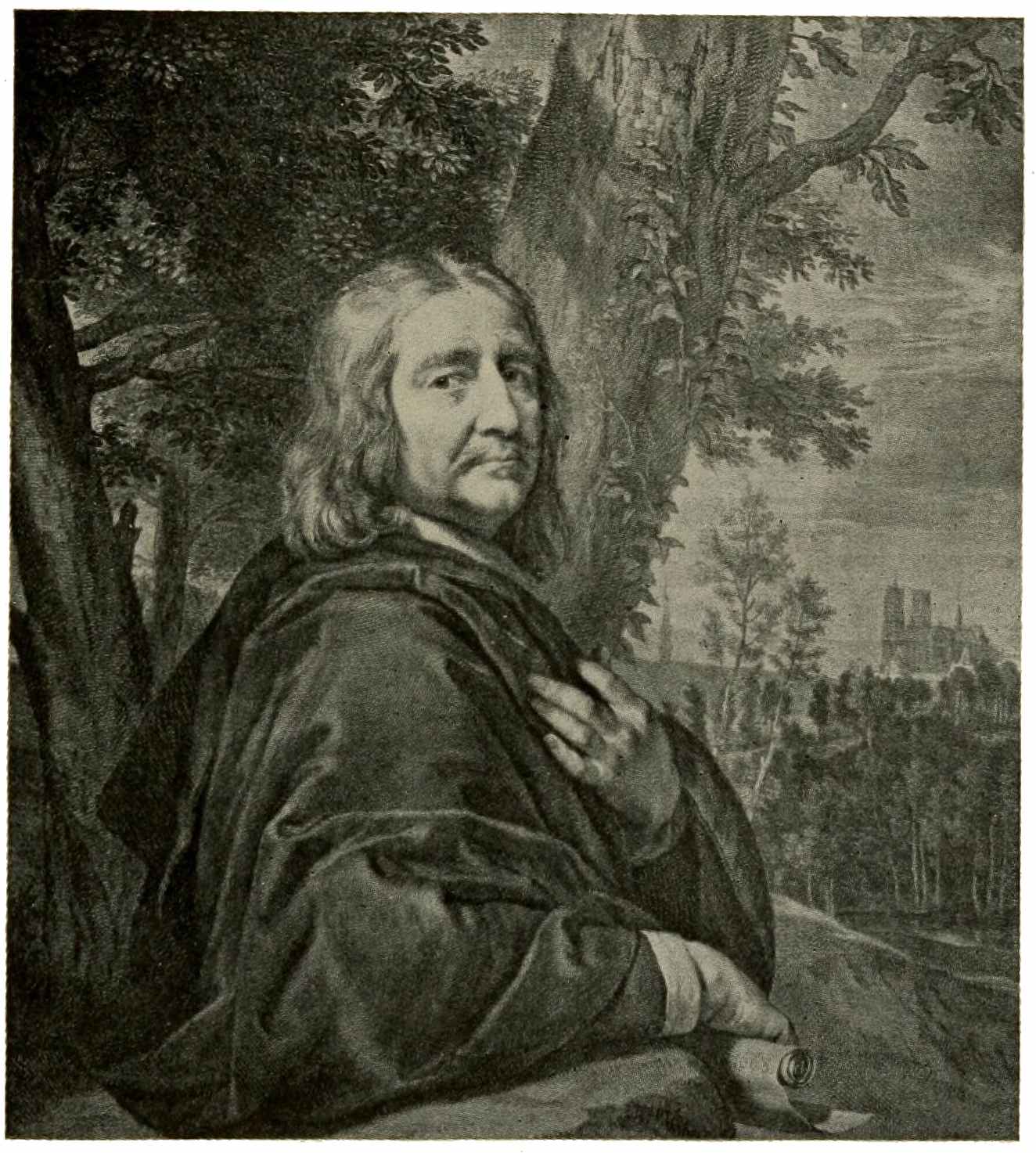
PHILIPPE DE CHAMPAIGNE
Gérard Edelinck
It is usual, in reviews of this period of art, to find the name of the noted Fleming, Gérard Edelinck, mentioned side by side with Nanteuil. With a technique akin to that of the Rubens school, in long, easy strokes, he models his figures and his draperies, and while he lacks the creative originality of Nanteuil, working always after the designs of other artists, his range of subjects is far more extended. In the striking likeness of the painter Philippe de Champaigne, he has left us a splendid example of his powers. His plate after the “Madonna of Francis I,” by Raphael, is a model of interpretative engraving, and when he undertakes to reproduce the canvases of Lebrun, he produces98 prints admittedly more attractive and brilliant than the originals.
Another man whom we cannot afford to omit from even this hasty enumeration is Antoine Masson, were it only for that superb “gray-haired man,” the portrait of Guillaume de Brisacier, brilliant, powerful, revealing an absolute mastery of the graver. The fact is, that we are drifting now toward an ever-growing worship of technique, at the expense of higher issues, artistically. Many names claim our notice, as we continue our survey, and a few will not be denied,—Gérard Audran, with his great series of the “Triumphs of Alexander,” a series, which, for breadth and beauty of treatment, assures him a place among the leaders, near Edelinck.
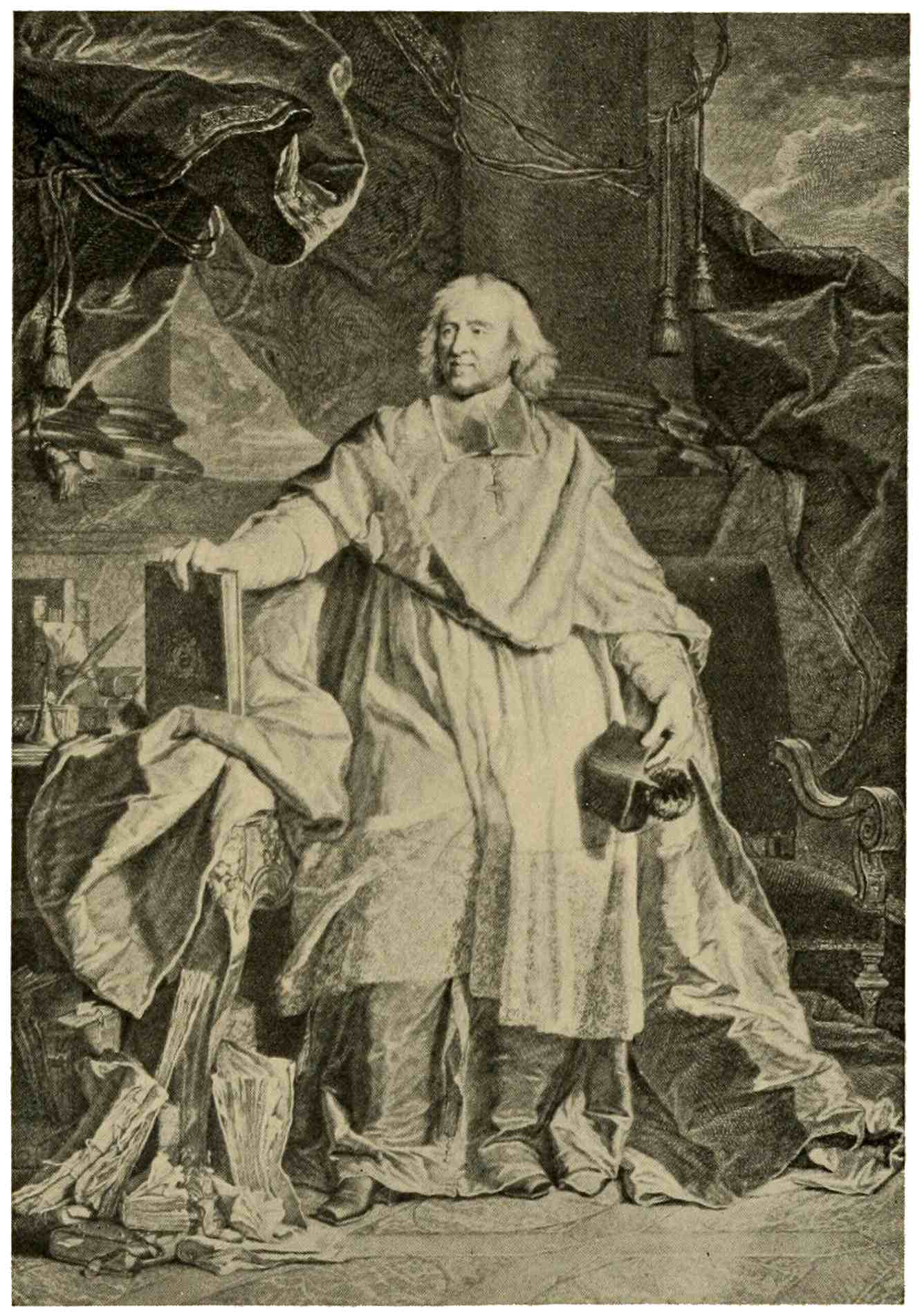
BOSSUET
Pierre Imbert Drevet
As we glance at portrait engraving farther afield, there is at least one name, among the notables of the eighteenth century, which demands recognition here: Pierre Imbert Drevet, a member of that well-known family of engravers. Perhaps his greatest title to fame is the portrait—here shown—of Jacques Bénigne Bossuet, the prelate, writer, and orator. Many regard this plate as the greatest engraving of the century. In a manner typical of those pomp-loving times, the eminent churchman is represented amidst columns and sweeping draperies. Here, indeed, we have the last word of technical resourcefulness in expanses of gorgeous silks and delicate laces, and many other textures and substances. If one should feel that all this elaboration of the setting distracts the attention from the portrait itself, he must blame the epoch and the painter whose design the engraver needs must follow.
Now the reign of Louis XIV is over, and we come to the Regency, and to Louis XV. Sensitive art, always the expression of the prevailing attitude of mind, shifts to that well-known sphere of light-hearted, trifling, idyllic, galant subjects, a sphere which we100 naturally connect with Watteau and Lancret, with Boucher and Greuze: subjects of which the illustration “Champs Élysées,” after Watteau, by Tardieu, is a fairly typical example. Playful shepherd scenes abound, dainty figures masquerading as housekeepers, school-teachers, laundresses; or else we have glimpses of the intimacy of the boudoir and chamber with sensuous allusions more or less veiled. It is clear that such scenes required a medium other than the serious, dignified form of engraving, which we have seen heretofore. Such light, gay, piquant scenes demanded a freer medium of expression; also they required the merry touch of light, joyous coloring.
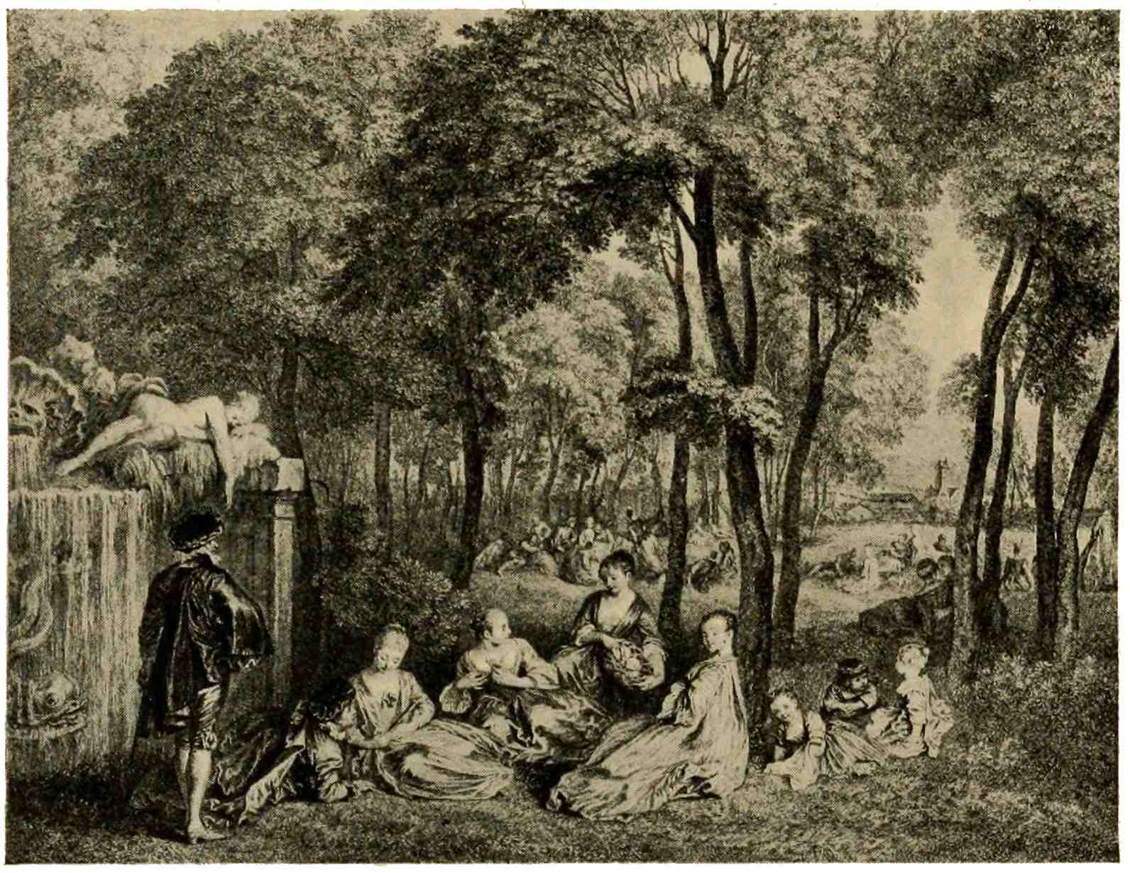
CHAMPS ÉLYSÉES
Nicolas Henri Tardieu
In response to these demands, Gilles Demarteau perfected a process admirably suited to rendering the effect of sketchy crayon drawing. Leprince devised the process known as “aquatint,” by means of which the washes of water-color or sepia might be closely imitated upon the copper.101 Both these media came into frequent use, and often a brown ink was used in the printing, being deemed more appropriate to the subjects than the usual black, or the copper plate was painted with colors for each impression, a lengthy and delicate operation, and these color-prints—not to be confounded with prints colored by hand—are prized by many amateurs. A word here on these color-prints: LeBlon evolved a cumbersome method of three-color printing, engraving one plate for each color; often a fourth plate was added, as a foundation for the other three. The other method, mentioned above, was generally adopted, quite a number of engravers devoting themselves to this color-work.
Now again temptation spreads out a world of enticing themes for discussion, which we must pass by: ornaments, elaborate decorations of theses, emblems, armorial designs, calendars. Even the teeming field of book decoration must not keep us long,102 entrancing though it be as a field for specializing study. It has already been remarked that in this field, formerly held by woodcut, the intaglio processes had assumed a monopoly. Artists of great repute were called upon for designs to ornament the elegant volumes offered to literary amateurs. The character of the illustration and ornamentation was dictated, not so much by the contents of the books as by the predilections of the buying public. A very high degree of technical efficiency prevailed among the engravers who busied themselves with illustrations for literary productions; they entered so thoroughly into the spirit of the designs that their own individual characteristics are hard to discern in the mass of light, dainty embellishments of the printed page. The fine harmony which blends together type and ornamentation in the books of that period, would be well worth imitation in our own advanced days. The subjects are amorous for the most part, as well befits a time when Venus ruled103 in French society. If you glance through the illustrated editions of the “Fables,” or the “Baisers” of Dorat, the “Temple de Gnide” of Montesquieu, the “Henriade” of Voltaire, the “Contes nouveaux” of Marmontel, or the “Chansons” of Delaborde, you will find there the best efforts of such masters of illustration as Eisen, Choffard, Gravelot, Moreau, and others, who struck the note demanded by the social élite of their day. They idealize a hollow, shamming society, which they carry into fairyland by an art true in its rendering of a play-acting world. The dimpled, rosy Venus, the shepherdess of well-rounded, shapely figure,—these ideals of beauty are not Greek, nor of the great Renaissance period. Such divinities are found in Versailles gardens; their prototypes are Jeanne Dubarry and her like, the ladies of the court, the beauties of the stage; and for this reason French art of the eighteenth century is genuine and true, because it does not seek its ideals in the104 dim past, but chooses them in contemporary life.
As we follow engraving, it declines from a spontaneous exercise of the thinking, artistic mind into drudgery of systematized routine. Engraving becomes petrified into a thing of tradition, with elaborate systems of lines and dots, to be dutifully acquired during long years of apprenticeship. Originality is frowned down by rigid precept, selection is made subservient to accepted prescription. In this so-called “classical” style of engraving, Georg Wille moves at ease, among the most perplexing technical intricacies. A virtuoso, and a purist, Wille deems the burin the one and only admissible tool of an engraver. The careful detail, the minutely finished paintings of Gérard Dou, Mieris, or Netscher give play to his powers. The plate reproduced here is the famous “Satin Gown” after Terborch, so called because of the wonderful rendering of the girl’s dress, with its silvery sheen and glossy shadows. The105 lighting of the scene, the modeling of forms, the translation of color-values into terms of black and white, have all received careful consideration, nor do we feel in the work of this leader the cold metallic hardness and monotony which often wearies in the immense output of the classical engravers. The names of Bervic, excellent but slow and excessively systematic, Boucher Desnoyers, the brilliant technician, come to mind among Frenchmen. Italy, however, became the real home of classical engraving, and names such as Longhi, Raphael Morghen, Toschi, with their large plates, chiefly dealing with religious subjects, must be familiar to any amateur of prints. Their fame, the great favor which they enjoyed with the art-loving public for a while, brought pupils from all parts of Europe to these Italian leaders.
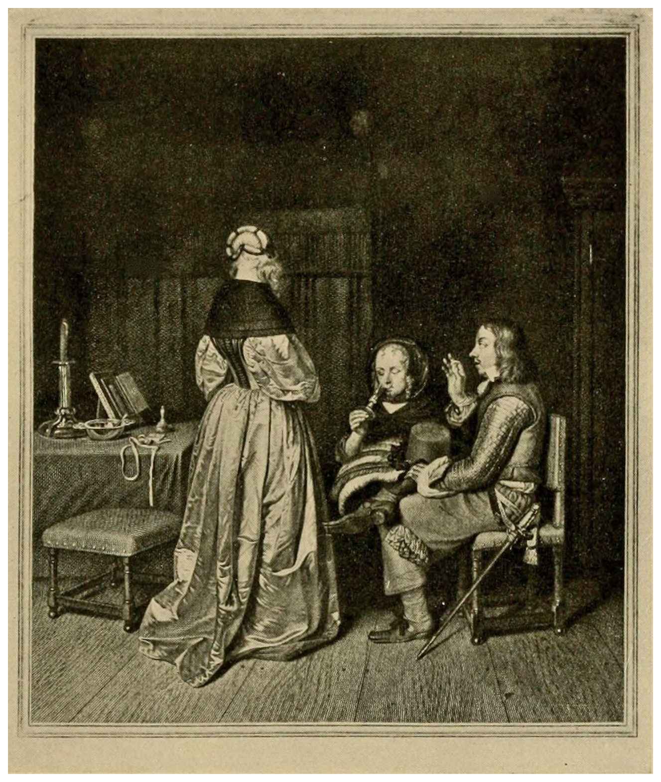
INSTRUCTION PATERNELLE (The “Satin Gown”)
Georg Wille
In France the triumphs which painter-etching achieved in the Netherlands had but a faint echo: Callot and Claude Lorrain106 have already been mentioned. Painters like Lebrun or Largillière left the graphic arts to the engravers; they viewed their skillful translations of painting into black and white as the work of colleagues, not craftsmen. We have noted the influence of Watteau on the “etcher-engravers”; he himself handled the etching-point at times, in a few sketchy plates; Boucher, Fragonard, and others dabbled in etching a little, nothing more. Jean Jacques de Boissieu and Jean Pierre Norblin, the latter an enthusiastic student of Rembrandt’s perplexing technique, should be mentioned as leading exponents of etching before the great nineteenth-century revival to which we shall presently turn. Now we must leave France, with the classical engravers at the helm, their formula spreading far and wide and with the vignettists busy on their portrayal of French society at the end of the ancien régime. As Watteau had shown us the customs of the grandfathers, at the beginning of the century, so107 Saint-Aubin, Eisen, Moreau, and other clever artists show us the life of the grandchildren: a society bound up in the pursuit of pleasure, blindly rushing on toward exile or the guillotine of the French Revolution.
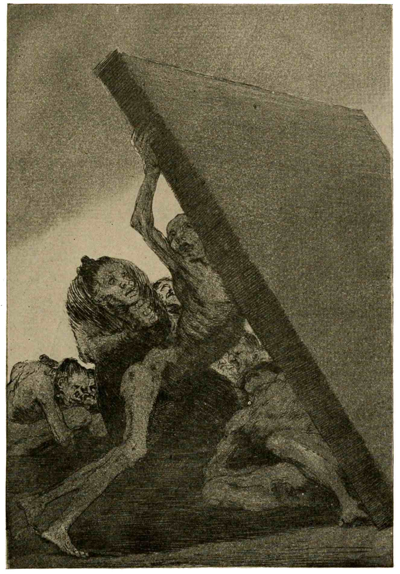
PLATE FROM THE CAPRICHOS
Francisco Goya
Before proceeding to English prints, let us glance at the one prominent figure in Spanish etching: Francisco Goya. A painter-etcher of intense feeling, fiery, impulsive, he feels acutely the evils under which his country is groaning. In an art largely allusive and bitterly satirical, he conjures before us an abyss of human wretchedness, greed, and misrule in those strange “Caprichos” from which an illustration has been selected. In other series he shows with the same graphic power the hazards of the bull-fight, and again the fearful consequences of warfare. Filled with his thought, he compels the copper to express the intensity of his conception. His medium is whatever will convey the message, usually an etched outline, modeled into with aquatint in a bold108 sketchy manner. His few, rare lithographs have the same powerful characteristics, and it is this energy of expression which makes his prints distinctive and desirable.
109
In point of time England is last, among European countries, in bringing forth any important manifestation in the realm of prints. During the early centuries of engraving the artistic demands of the country were supplied by foreigners. In the seventeenth century Wenzel Hollar accompanied the Earl of Arundel to England, and the name of this prolific etcher is, without a doubt, the most important for that period. Among his 2750 plates are landscapes, views, portraits, plates of costumes and events of the day, allegories, and what-not: all done with the skill of the practiced etcher, though not exalted by the master-touch of genius. Other foreign-born engravers are not lacking; among native Britons, Faithorne, Robert White, and George Vertue are the most noted. A portrait by William Faithorne110 gives an idea of early English work. It cannot offer anything new, relying as it does on the art of the Continent for every artistic impulse; imitative, not yet creative. Even well-known men of the eighteenth century—Robert Strange, William Sharp, and William Woollett, with his large ideal landscapes—hark back to the teachings of the Continent and follow in the beaten track. One personality stands out prominently in this period, a man with a message delivered by means of his prints, the painter-engraver William Hogarth, who, like Goya, uses the needle and graver as a medium for a powerful crusade against the social evils of his day. These he castigates with biting satire and forceful preachment. His might be called a literary art, with the stress laid on the moral theme, not on technical perfection.
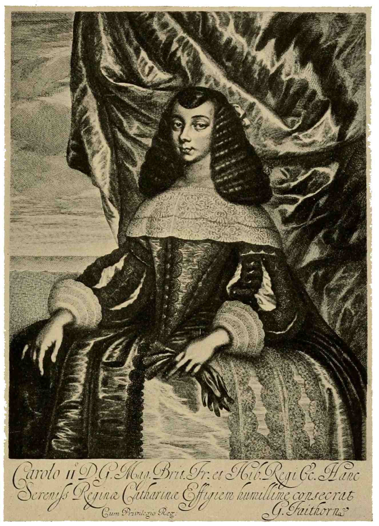
CATHARINE OF BRAGANZA
William Faithorne
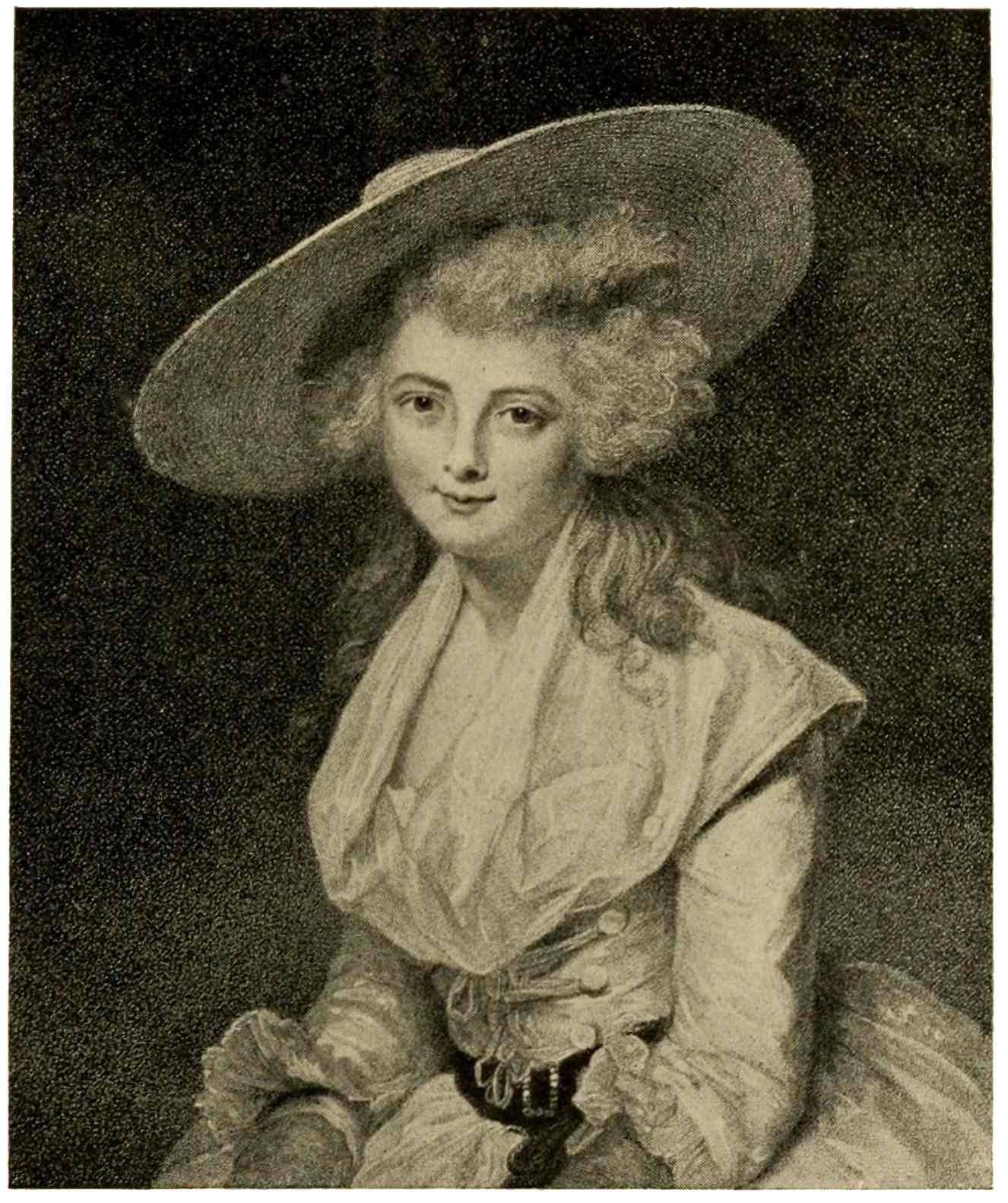
THE HON. MISS BINGHAM
Francesco Bartolozzi
Among the foreign talent Francesco Bartolozzi is preëminent as a stipple engraver in England. He is the foremost interpreter of the dainty compositions of Angelica Kauffmann and of Cipriani. Our illustration, “The Hon. Miss Bingham,” after Sir Joshua Reynolds, shows the Italian engraver at his best. The whole plate is a mass of minute dots which form the lines and the tones of the portrait. An adaptation, in a more minute grain, of the French crayon-manner, the English stipple lends itself admirably to the smooth blendings and soft modeling of the sweet allegorical plates, which Bartolozzi produced with indefatigable industry. Stipple prints quickly gained the favor not only of the British public, but also held sway for a while on the Continent. The process was eminently suited, and often used, for color-printing, or for slight suggestions of color introduced in the printing, to add to their charm.
The medium most particularly fostered in England is mezzotint engraving; originary from Germany, it found in the island kingdom a happy soil for its speedy growth. When Lely, Kneller, Gainsborough, Reynolds,112 and all that famous group of painters gave to the world their magnificent array of portraits, there existed no school of line engravers in England, no group of masterly engravers or etchers such as those of the Netherlands or of France. The field, therefore, was clear for mezzotint, and it seems as though no other process could have more adequately interpreted the achievements of the great portraitists. Their prevalent breadth of treatment, devoid of small, niggling detail, their numerous women’s portraits, with soft, rounded forms, subtle transitions of tone, sparkling accents of light and blending depths of shadow, were admirably suited to the “black art.” Hence the rise, during the eighteenth century, of a large school of mezzotint engravers, who attained great perfection in their chosen medium, progressing from prints of a sooty, black appearance to plates of clear, fine texture, like the portrait of Mrs. Carnac here reproduced, an engraving by John Raphael113 Smith. One is apt, quite naturally, to accord to engravings like this the credit due to the painter for his graceful composition. Quite aside, however, from matters of composition and beauty of subject, the mere charm of intense shadow and brilliant high light, with transitions of breath-like delicacy, rendered with the velvety richness peculiar to mezzotint, will readily explain the vogue and costliness of such prints. No half-tone reproduction, however good, can convey an idea of the texture of mezzotinting. An examination of good, early impressions of mezzotint portraits by such men as McArdell, Watson, Ward, Green, Reynolds, or other notables of the scraper, will prove their merits much more convincingly than words.
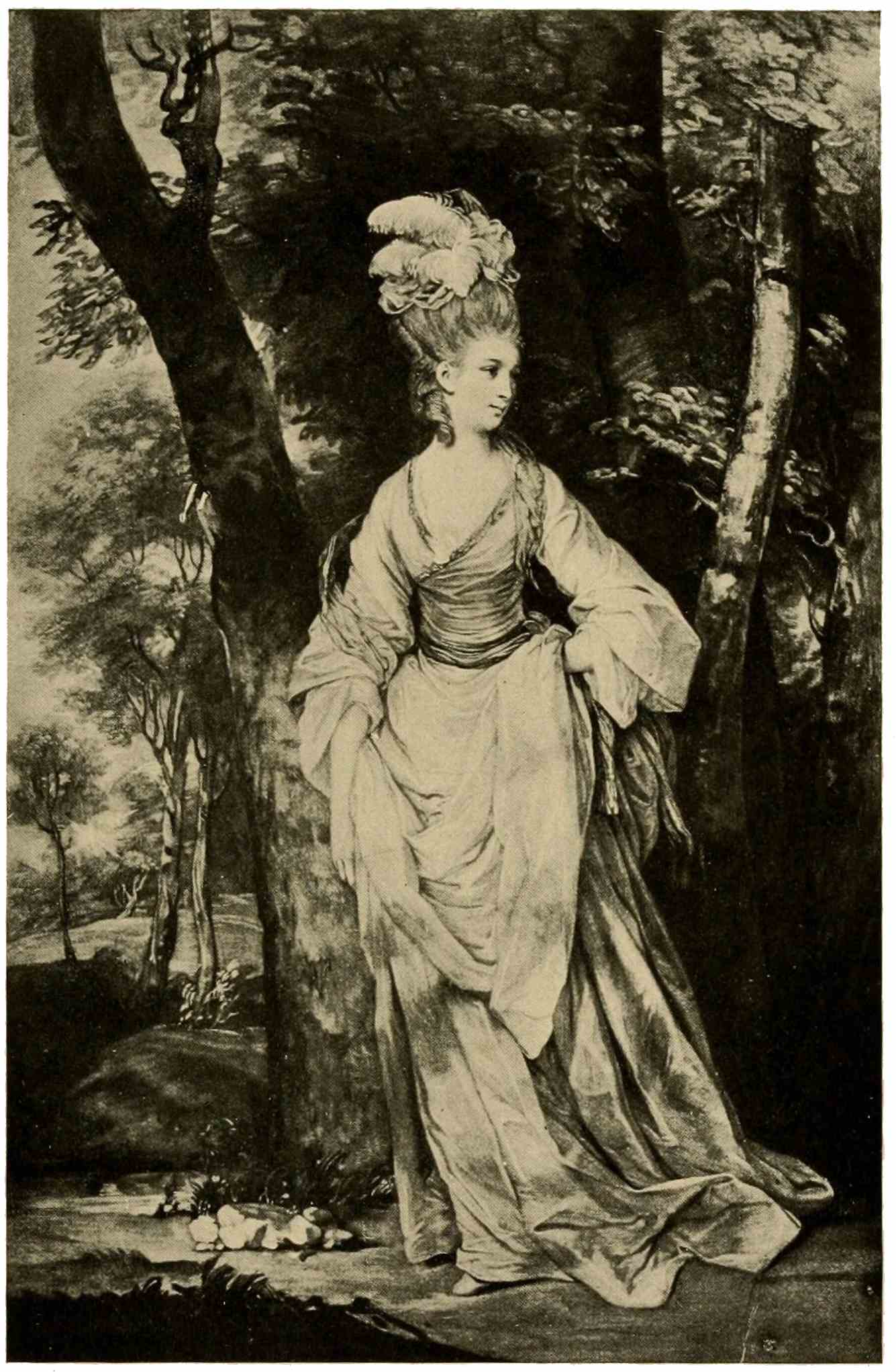
MRS. CARNAC
John Raphael Smith
While portraiture is the field par excellence of mezzotint achievement, other possibilities of the process are evidenced by plates like the flower and fruit piece here shown, in which Richard Earlom proves himself a114 gifted interpreter of Huysum. The varied surfaces, the delicate bloom on the fruit, and all those little touches dear to the Dutch painter—sparkling dewdrops, insects, the velvety underside of an overturned leaf—are faithfully reproduced. We almost seem to see the actual colors of the painting, so carefully have the values been gauged. In no other process could the painting have been transcribed more pleasingly. The mention of Earlom as the engraver of a large series of landscape plates, the “Liber Veritatis,” after sketches by Claude Lorrain, leads us to J. M. W. Turner, to whom these plates suggested the well-known “Liber Studiorum,” but of this more in our review of the nineteenth century.
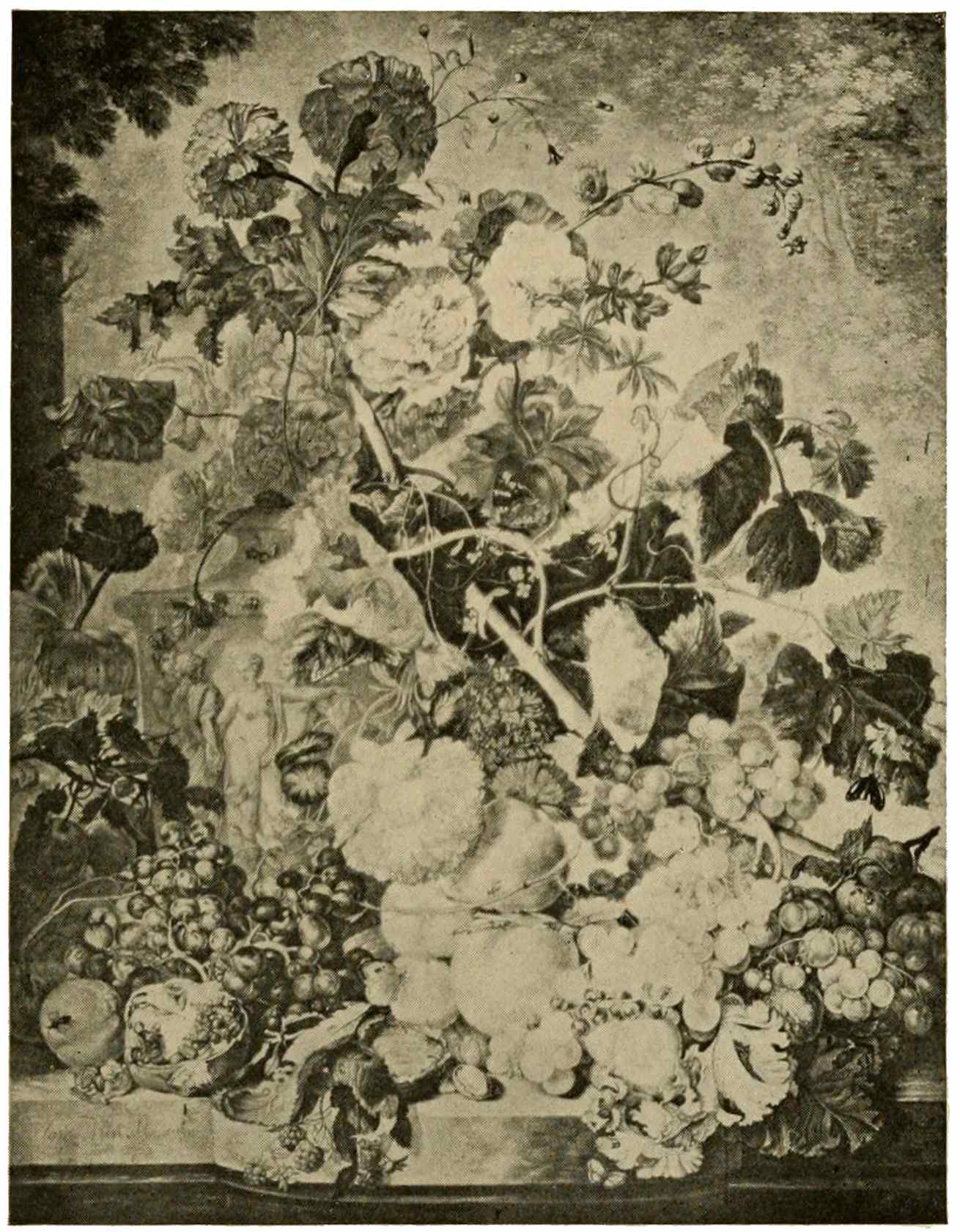
FLOWER AND FRUIT PIECE
Richard Earlom
In the matter of woodcut, little need be said in this brief outline, aside from Jackson’s chiaroscuros, until we come to Thomas Bewick and with him to an important revival of the relief process in modified form. Bewick recognized the possibilities of the wood block, if cut across the grain, instead of plank wise as used for the old woodcut. The plank block necessitates the use of the knife; a cross-grain block of boxwood on the other hand, permits the use of that king of instruments, the graver. Wood-engraving once established by Bewick, and elaborated by his followers, rapidly spread over Europe, ultimately to reach its highest form of technical perfection in the United States.
116
In early days, the American colonies were indifferent if not inhospitable to the fine arts. Only portraiture and expressions of patriotism found a welcome, both in painting and engraving. These, with some maps, diagrams, and views, gave partial employment to a few engravers, with such additions to their number as landed from time to time from Europe for a sojourn more or less prolonged. Prominent among early arrivals was Peter Pelham, an artist of good abilities, who portrayed in mezzotint a number of New England ministers.
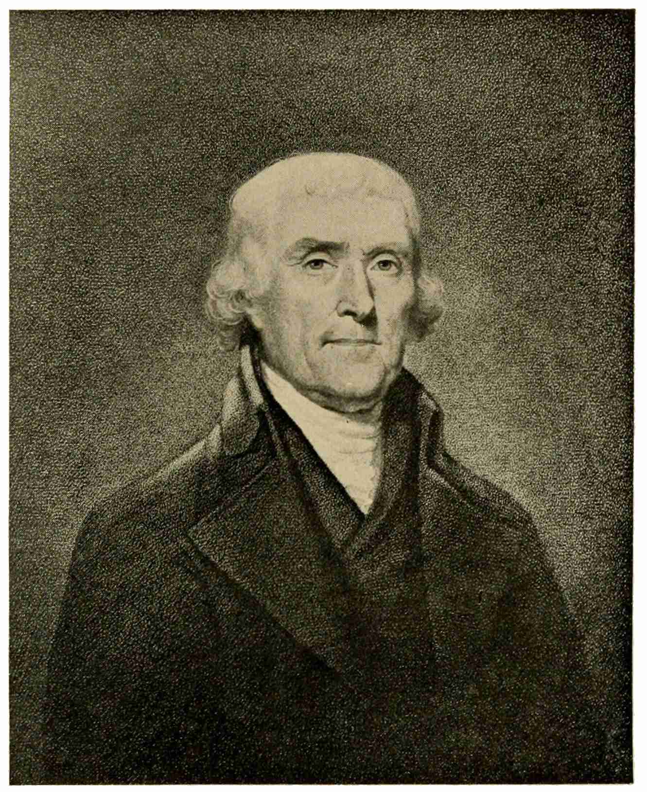
THOMAS JEFFERSON
David Edwin
Passing on to the Washington period, we find in Charles Willson Peale an American painter-engraver of merit. Such mezzotint portraits as General and Lady Washington, Lafayette, Franklin, and others easily rank117 among the best native productions of that period. David Edwin, an immigrant from England, brought proficiency in stipple engraving. His merits can be judged from the best of his plates, the portrait of Thomas Jefferson, appropriately simple and dignified in execution. With the advancing nineteenth century, engraving becomes plentiful in this country. Publishers require many portraits, views, subjects of all kinds, nor must we forget the important and flourishing branch of bank-note engraving. This teeming activity brings with it a commercial sameness of execution, a workmanlike, metallic sleekness, not quite absent even in the charming vignettes of John Cheney, which adorn the gift-books of the forties and fifties. A portrait of Chief Justice Marshall, engraved by Asher Brown Durand, after Inman’s painting, is shown as an illustration of good nineteenth-century work. Generally speaking, portrait engraving had fallen into a rut, suggested by the tonality118 of photographs, a development shared by wood-engraving.
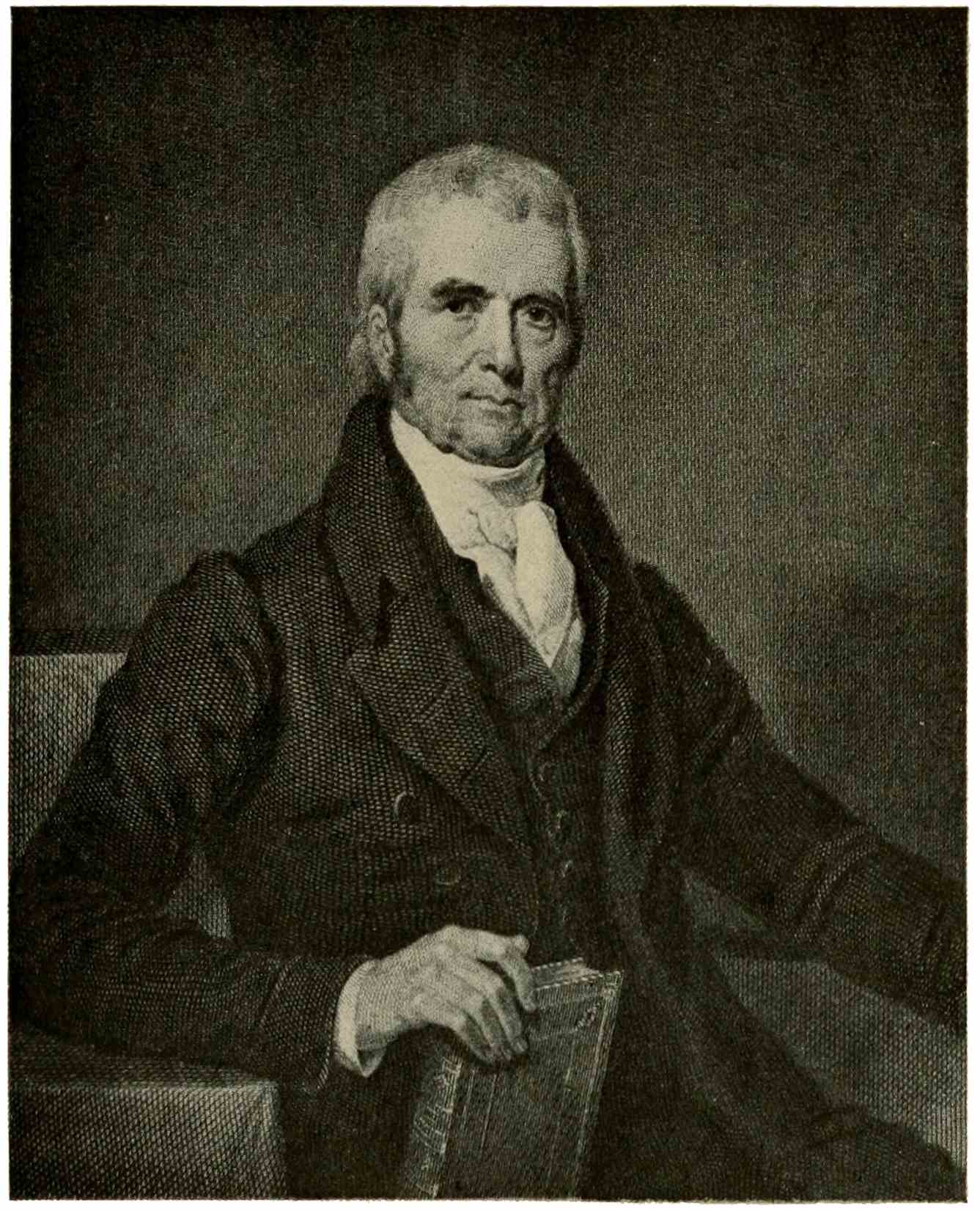
CHIEF JUSTICE MARSHALL
Asher Brown Durand
The ingenious innovation of the Englishman Thomas Bewick—which rejuvenated and refined the mishandled and discredited woodcut, by substituting cross-grained blocks of boxwood and the graver, for planks and the knife—was championed in America by Dr. Alexander Anderson. None of the early American wood-engravers were endowed with great artistic gifts, but ere long the steady demand by publishers brought to the fore men of acknowledged ability. Their achievements are plentifully illustrated in books and magazines; the “Still-life with the Peacock,” engraved by W. J. Linton, a well-known writer on wood-engraving, is reproduced here as a reminder of their skill. Originally the tendency of wood-engraving, or white-line engraving, as it is sometimes called, had been to obtain effects by white lines (the natural expression of the graver on the black surface of the block) and by black and white masses. As the wood-engraver grew proficient in his technique, he widened his field by imitating the effect of etching or engraving on copper, in rivalry with this form of illustration. In this he succeeded so well that the other, more expensive modes of adornment were largely driven from the field of book illustration. With the advent of photography, the design could be fixed upon the wood block mechanically, accurately, without the trouble of a careful drawing. The values of tone in the photograph relieved the engraver from the work of translating color-values into black and white. The blending half-tones of the photograph invited close imitation, and thus tone-engraving developed, with its masses of fine lines, close together, merging into tone. Beautiful results were achieved in this way by men like Jüngling, French, Timothy Cole, Wolf, and many other engravers; but soon the human hand was dispossessed altogether by the120 half-tone plate which makes the photographic image printable by mechanical means alone.
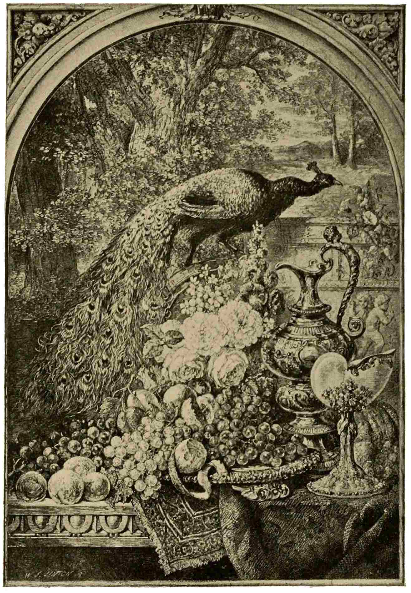
STILL-LIFE WITH THE PEACOCK
Wood-engraving. W. J. Linton
The great European revival of etching extended to the United States in the seventies. It proved a fruitful period, with names like the Morans, Ferris, Farrar, Duveneck, Charles Platt, and many others which might be mentioned. The vogue of etching, it will be remembered, was short because mediocrities soon glutted the market and sent purchasers to other fields for a while. Interest in the process has awakened again of late, but that is matter of too recent date to be discussed in these few pages.
121
From a survey of prints in their varying national aspects, we have arrived now at that vast period of an art increasingly cosmopolitan, the nineteenth century. In these last hundred years nationality has blended together to a great extent; travel is not the serious matter of former times, a pastime rather than a venture; all races have intermingled in the great world-centers; students from far and near congregate in the centers of art. All these factors, and many others, contribute in making artistic expression individual, less and less national in character. No sudden phase, this, rather an insensible general trend toward individuality as the great requisite in an artist’s work. The masterpieces of the fine arts had been interpreted by means of prints since the sixteenth, and especially since the advent of the122 “classical” engravers in the eighteenth, century. The increasing number of these reproductive prints made it ever easier for an artist to acquaint himself, in a way, with the great achievements of the past. Finally photography, and in its wake the photo-mechanical processes, brought a flood of exact documents invaluable for study, a lure to imitation for the unimaginative or indolent, a spur to the real artist, helpful in forming his own powers.
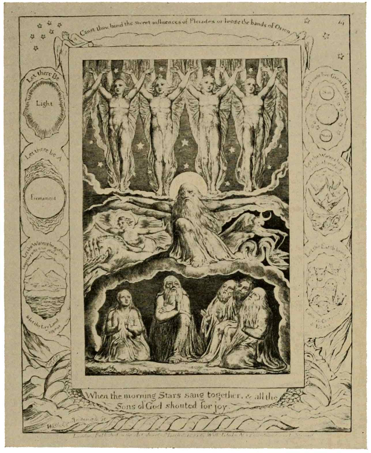
PLATE FROM THE BOOK OF JOB
William Blake
Individuality seems the keynote of the nineteenth century; hence it may be as well not to bind ourselves to headings and subdivisions, but rather to roam at large through this enormous sphere. Goya, of whom we spoke in a preceding chapter, belongs here by right, and with Fortuny forms the Spanish contingent in the new awakening of the graphic arts. In England there lived, about the turn of the century, a visionary poet and great artist, William Blake, who fluently expressed himself in strangely fascinating123 compositions of religious or fantastic import, doubtless familiar to us all. Our concern is not with Blake’s drawings, in which he adds the charm of exquisite color to his command of expressive form. A plate taken from his remarkable series of illustrations to the Book of Job, shows his powerful, poetic conception of the beginning of life, when the world was young and the morning stars sang together. In a totally different way, illustrative of another phase of this same new awakening, the work of Daniel Chodowiecki shows a man concerned with the world which surrounds him. We see him here, at work in the midst of his family, on his little illustrations which went forth in their hundreds to embellish the bountiful stream of German literature.
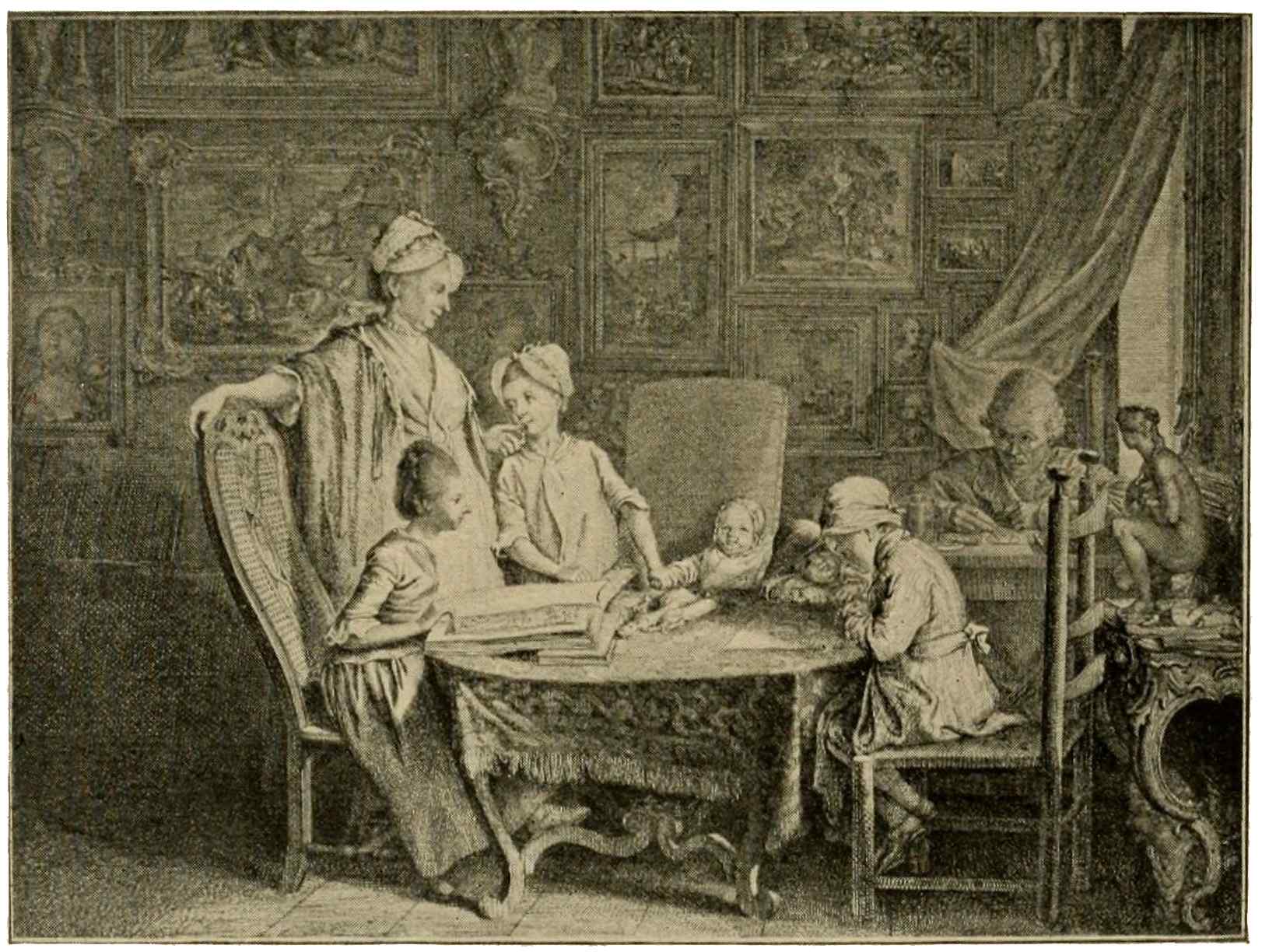
THE HOME OF A PAINTER
Daniel Chodowiecki
Goya’s vivid, realistic allegories, Blake’s fantastic, powerful conceptions, Chodowiecki’s living portrayal of the world of his day, no longer follow the beaten track of imitative work,—all these activities point to a124 new phase in art. All this seems a reaction, a protest against the mental attitude, the set standards and ideals of the eighteenth century. The vignette, so gay and graceful in the hands of Eisen, Gravelot, or Moreau, had lost much of its esprit in the heavier, more sober style of the Empire. The classical engraver was still in power, on the Continent as well as in England, where Boydell issued, in 1803, his monumental series of illustrations to Shakespeare’s plays in large folio plates. On the other hand, Constable had broken away from the accepted standards of landscape composition; he painted his native countryside as he saw it. England frowned upon him for this heresy, but his art was joyfully acclaimed in France. There arises everywhere a buoyant, youthful spirit, conscious of infinite possibilities, filled with unbounded aspirations. The leaders in the movement emancipate themselves from the sterile cult of precedent; they blaze new trails into the vast unknown, in their search125 for truth. Kant’s philosophy, Darwin’s theory of evolution, sufficiently denote the trend of the times; in literature, this is the period of Byron, Scott, Wordsworth, of Manzoni, of Goethe, of Nodier, Balzac, Victor Hugo. Barrye carries realism into his sculpture and such men as Delacroix, Decamps, and Célestin Nanteuil carry romanticism into French painting and French prints. Men, these, whose imaginative souls rebel against petrified classicism and formal, abstract beauty, and this protest of the young and ardent against the tyranny of the “old and accepted order of things” has been heard ever since,—sometimes the voice of coteries, sometimes that of individuals: Constable’s, for instance, which helped France in its remarkable awakening. His simple creed was faithfully transposed in terms of mezzotint by David Lucas. Unfortunately these effective landscape mezzotints are so fleeting in their delicate effects that they can be appreciated only in126 engraver’s proofs. The relative position of Constable and Turner, in English landscape, has been, not inaptly, compared with that of Van Dyck and Rubens in Flemish art. Certainly J. M. W. Turner was a sun in the English firmament, the painter of imposing canvases and water-colors of haunting loveliness; the leader likewise in a stupendous development of landscape engraving revealed in series like his “England and Wales” and his vignettes for “Roger’s Italy” among others of equal fame. Supreme among his prints stands a set known as “Liber Studiorum,” undertaken in rivalry with Claude Lorrain, whose memoranda sketches of pictures painted constitute the “Liber Veritatis,” engraved subsequently in England by Earlom. In his “Liber”5 Turner proceeds to display his art in all its versatility, engraving some of the plates127 himself and closely supervising the mezzotinting of the others. This “Inverary Pier,” his own throughout, is a glorious vision of morning on the shores of Loch Fyne. The night mists are clearing in the sunlight; a luminous haze still trails along between the hills, beyond the quiet water. The scene suggests unbounded space and calm, peaceful beauty. Another plate, “Æsacus and Hesperie,” carries us into the depth of the woods. The figures are mere accessories: what we potently feel is the fragrant shade, emphasized by a slanting shaft of sunlight, which gleams on soil, branch, and leaf, and builds a pathway of light amidst the luminous shadows.
5 A series of one hundred plates, seventy-one of which were published by the artist, then discontinued, because financially unsuccessful.
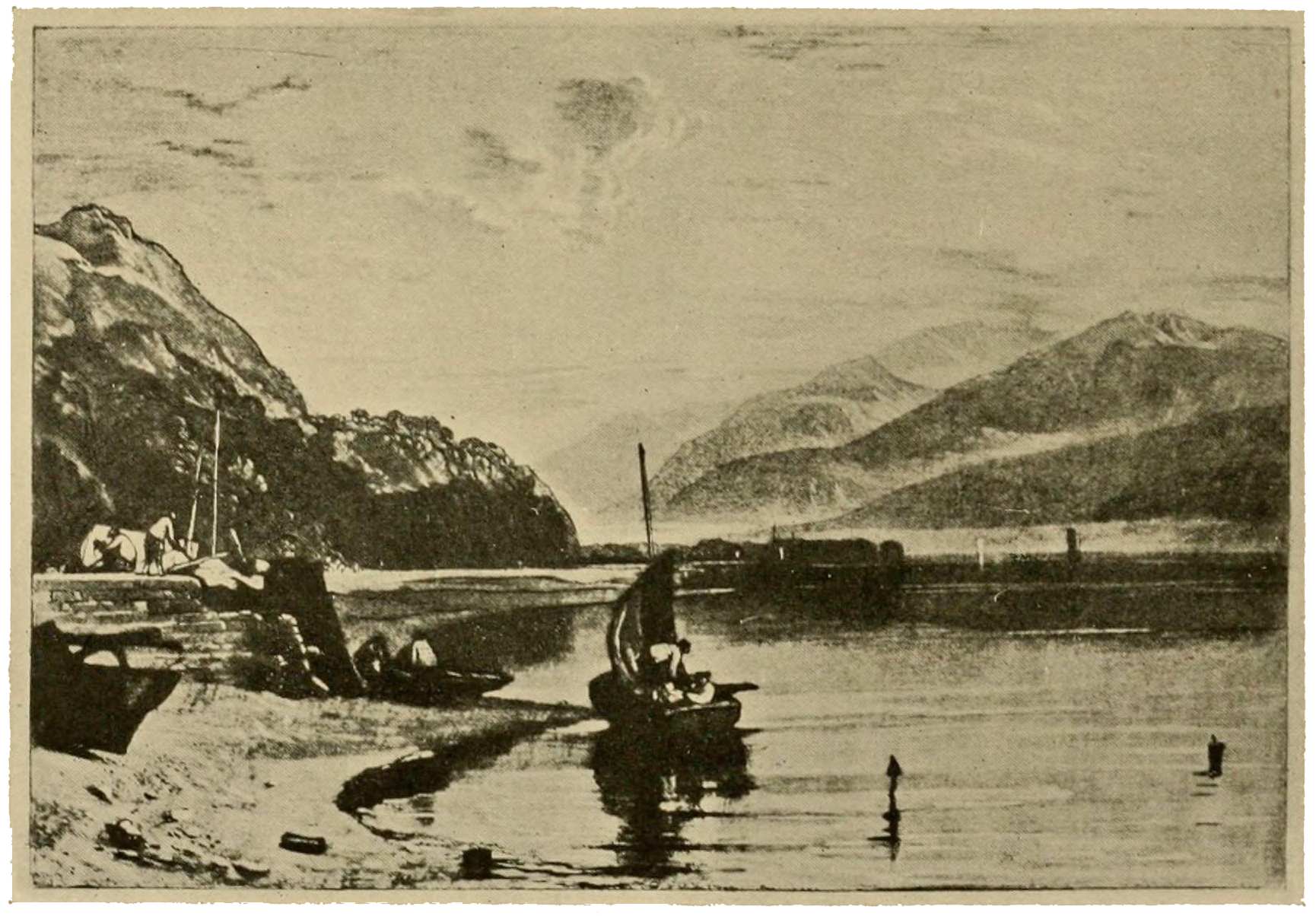
INVERARY PIER
From “Liber Studiorum.” J. M. W. Turner
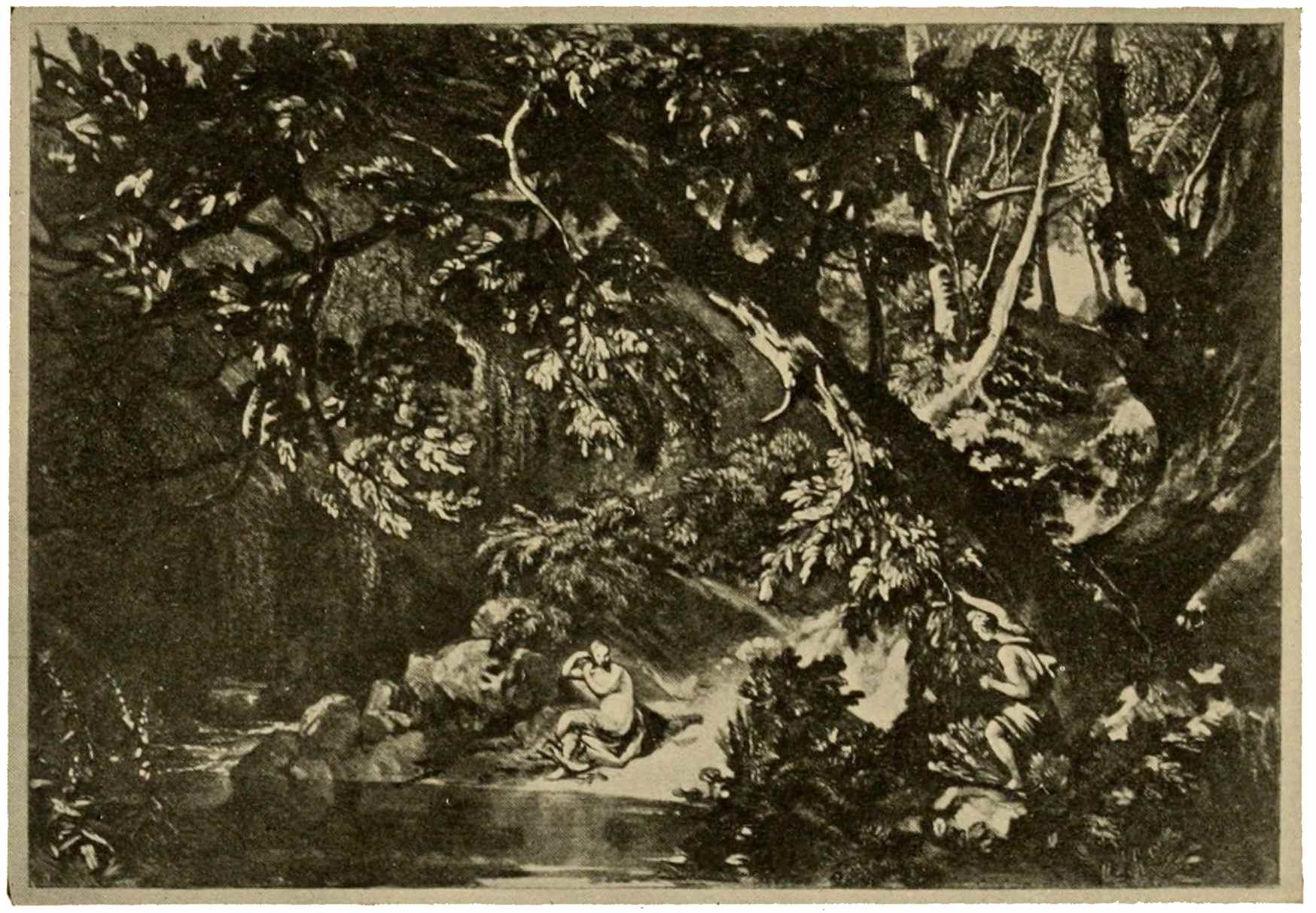
ÆSACUS AND HESPERIE
From “Liber Studiorum.” J. M. W. Turner
In the early nineteenth century two new processes demand recognition: wood-engraving and lithography. The former, reviewed in the preceding chapter with reference to its development in America, speedily gained in technical perfection at the hands of English128 engravers. It spread far and wide in Europe, adapting itself to the charming illustrations of Ludwig Richter and doing full justice to the expressive, accurate line of Adolph von Menzel’s pen-and-ink work. Light and vivacious in the vignettes of Tony Johannot, Gigoux, Célestin Nanteuil, it grows somber in Doré’s designs for the Bible and for Dante’s “Divina Commedia.”
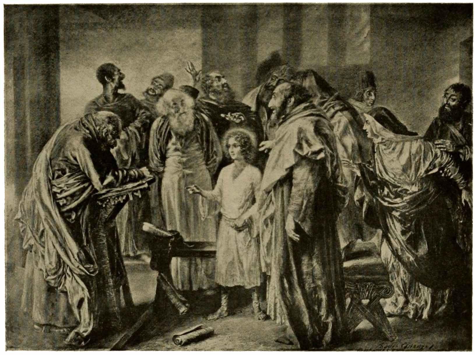
CHRIST DISPUTING WITH THE DOCTORS
Adolph von Menzel
Shortly after the advent of wood-engraving, lithography appears, and offers the tempting inducement of utmost technical simplicity to the artist. The drawing is made on the stone or on transfer paper with lithographic ink or crayon; the transferring and preparation of the stone (or metal plate) with acid, gum, and water is left to the printer. No wonder that the process found wide favor and that it was put to a great variety of uses: innumerable portraits, endless series of views, costume plates, music titles, reproductions of pictures. In the hands of artists the process proves its merit by such129 prints as “Christ Disputing with the Doctors,” by Adolph von Menzel, that untiring pioneer of realism in Germany. The scene with its masterly characterization is astonishing in the play of expression on each face and figure. In France both processes burst into profuse bloom with the awakening of romanticism. The thirties and forties bring a wealth of notable lithographic productions, the work of Delacroix, Isabey, Géricault, Decamps, Diaz, and a host of other artists. Gavarni uses this easy medium to portray in thousands of sketches the life of all Paris. Daumier portrays the frailties of humanity in his cartoons for “Charivari” and “La Caricature,” or else wields his crayon as a formidable political weapon; in the print selected for illustration he shows us Louis Philippe at the death-bed of a political offender “who can now be released, being no longer dangerous.”
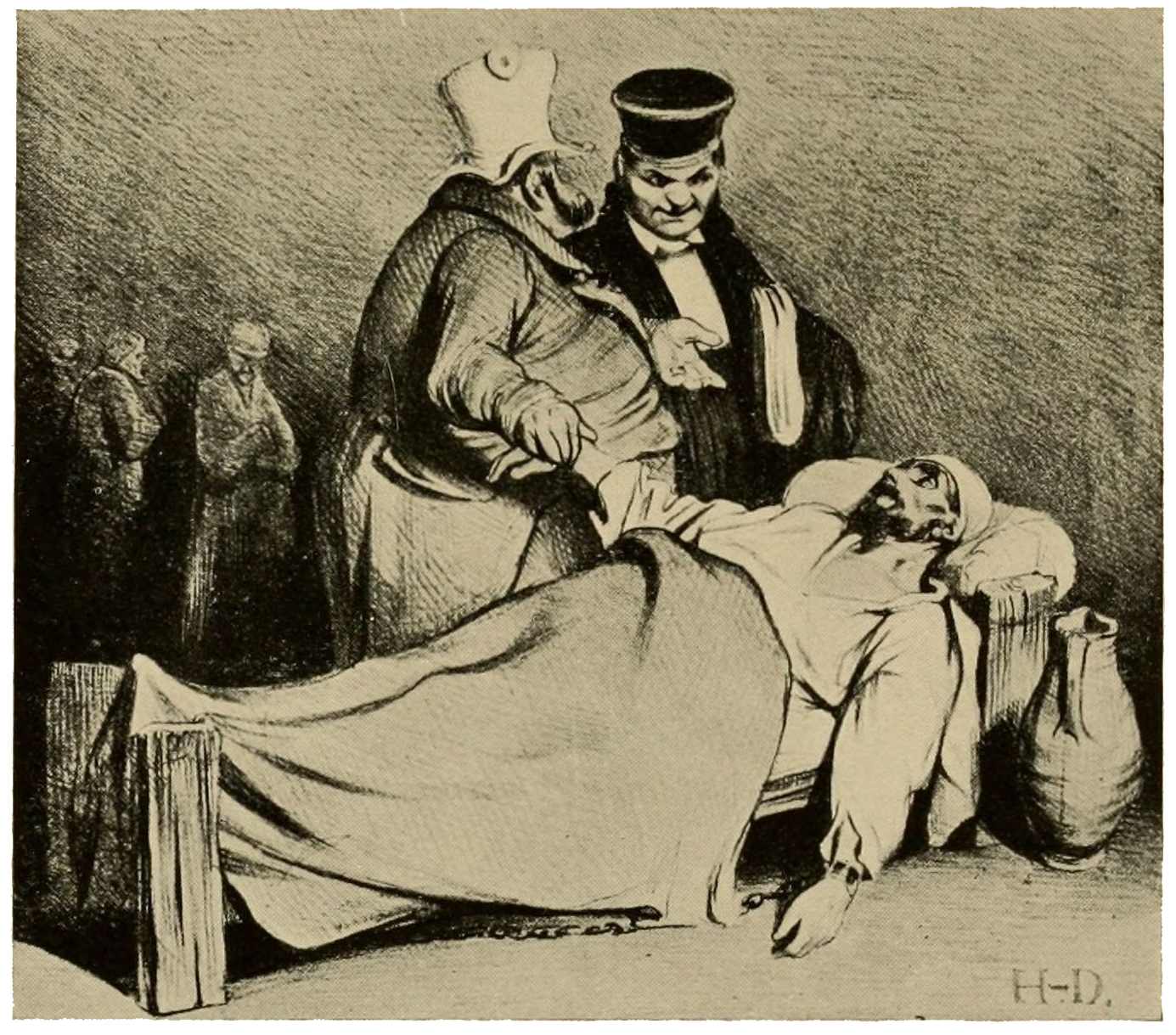
CARTOON ON LOUIS PHILIPPE
Honoré Daumier
The fortunes of France, fraught with conquest under the first Napoleon, sink to130 humdrum levels with the Restoration. For years all recollection of the Emperor and his Grande Armée is embittered by the final disaster. But passing years restore the luster of former great exploits, and gradually these become a favorite subject for illustration. The field is well covered by Charlet’s military scenes, though none of these approach the grandeur and skill displayed by Auguste Raffet. In his “Midnight Review” we see innumerable hosts of shades, passing in review before the phantom emperor on his white charger; an immense concourse insensibly merging into the mists of night.
In the forties there is a welcome revival of etching, Charles Jacque being one of the pioneers, skillful alike in his handling of acid and dry-point. His theme is the peasant’s life, his setting the wooded, undulating region about Barbizon: broad, sunny fields, thriving farms, pastures with cattle, sheep, and pigs, for which he shows an especial predilection. The peasant, here, is no longer131 the joyous, carousing, merry being of Ostade’s fancy. In the plates of Millet and Jacque we see him at his daily labors and the woman at her household tasks, as in the “Woman Churning,” by Jean François Millet, drawn in sober, telling lines, and evoking by some subtle magic a sense not only of the scene before us, but of her surroundings and her whole labor-laden life.
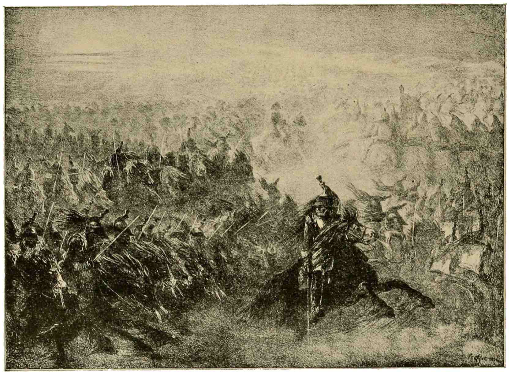
MIDNIGHT REVIEW
Auguste Raffet
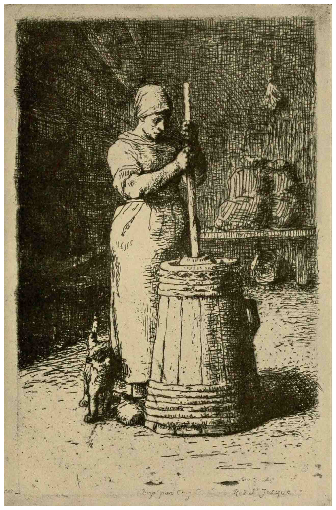
WOMAN CHURNING
J. F. Millet
We must pass with a mention even such masters as Corot and Daubigny, both of whom have left us spirited examples, in etching, of their masterly interpretation of nature. The period we now reach brings a flood of etching, and it is but natural that the sketchy freedom, the suggestiveness sought by this new school, should conflict with the set, time-honored traditions of engraving. That serious old gentleman—Engraving—did not approve of the rollicking youngster who knocked at the gates of the Academy and the Institut for admission. The battle, after all, was not so much a132 quarrel between etching and engraving; rather a contest between formula versus original thought. Both in England and France the same conflict arose, the etchers calling the other side mechanical, petrified; the engravers retorting that etching, “even in the hands of Rembrandt, is uncertain, blundering.” This dictum of Ruskin and the fiery rejoinder by Sir Seymour Haden are matters of history. Our illustration, the dry-point “Sunset in Ireland,” will sufficiently show that the president of the Painter-Etchers’ Society was as apt with the etching-point as he was formidable in debate. The painter-etcher is an originating artist, but the success of his creations on the copper depends a good deal on the skill of the printer, who can, by differences of inking, wiping, pressure, and heat make an impression hard or soft in effect, rich and dark or pale and silvery at wish. To a man of James McNeill Whistler’s exquisite sensibilities and refined taste this thought of133 dependence on another for his subtle effects of light and tone could not but prove unendurable. Therefore he installed a press at his home and did his own printing of choice impressions, realizing in these, to the fullest extent, the possibilities of effectiveness and beauty which we admire in his etchings. Art has been defined as a selection from the truth, and, indeed, the elimination of unimportant detail and the accenting of the essentials make for the great charm in Whistler’s etchings as well as in his numerous lithographs. From this versatile genius, delightful in his rendering of the human figure and likeness, who evokes with equal facility the shimmering vistas of Venetian lagoons or the quaintness of an old French street, who can fascinate with a fleeting glimpse of a fish-shop, or make a lovely vision of a foggy reach of the Thames, we must now turn to one who has forever fixed in his plates a truthful yet ideal likeness of old Paris. “Le Petit Pont” by Charles Meryon is a characteristic plate134 with heavy shadows, fine feeling for structural essentials, endless modifications of light, and with Notre Dame made duly impressive by lifting it high above the nearer buildings. Every plate has a character of its own, with here and there a weird reminder of the artist’s ultimate mental doom. Only a poet could have conceived a plate like the “Stryge,” that evil figure on Notre Dame, surveying the vast field of his conquests.
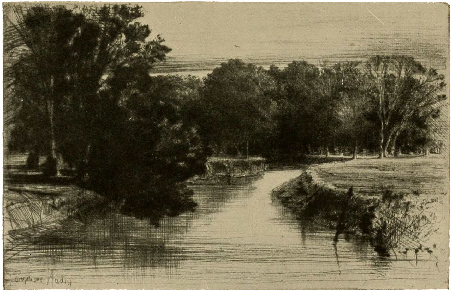
SUNSET IN IRELAND
Sir Seymour Haden
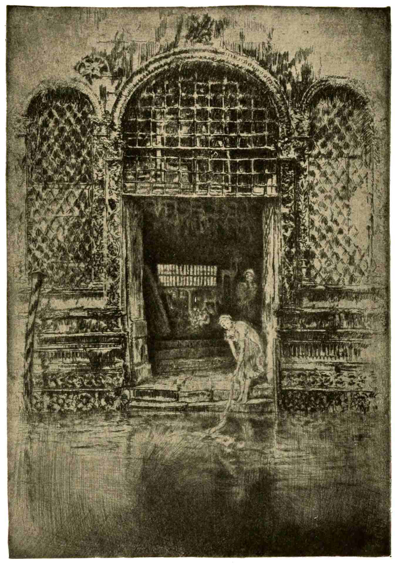
THE DOORWAY. VENICE
James McNeill Whistler
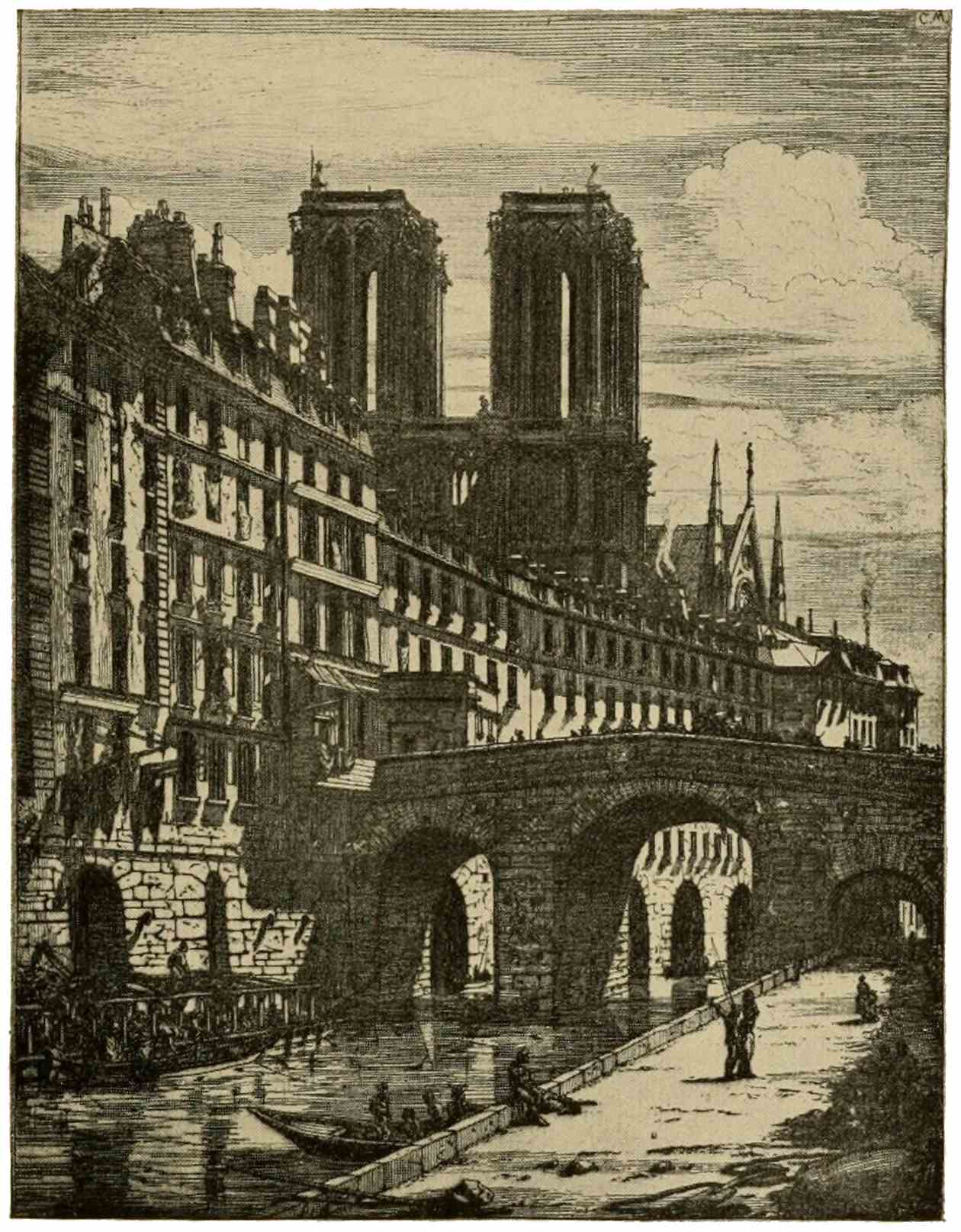
LE PETIT PONT
Charles Meryon
As we survey the reproductive processes, they are drawn, one and all, into the current of new, original expression. Innovators appear even in the conservative camp of engraving; Ferdinand Gaillard, for instance, an engraver, in that he uses the graver, though he uses it in a manner to him particular, expressive of minutest detail. “My aim,” he says, “is not to charm but to be truthful. My art consists in saying all.” And he expresses “all” in this wonderful portrait of Dom Prosper Guéranger. No detail has escaped him in his scrutiny of this strong, bright face with its searching, clear eyes. A counterpart of Gaillard—a painter-engraver similarly minute and precise with his burin—is Stauffer-Bern, a Swiss of German training.
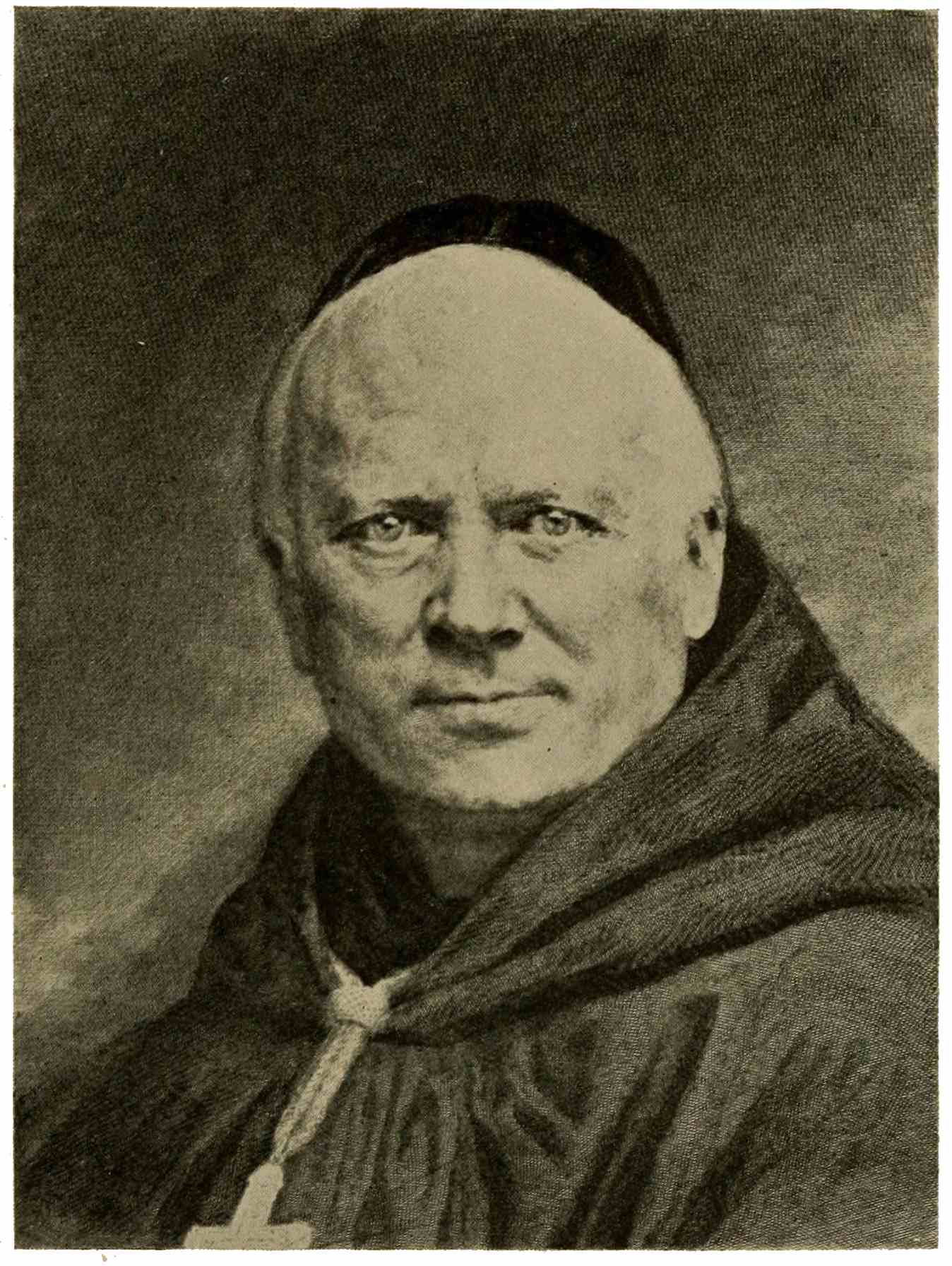
DOM PROSPER GUÉRANGER
Ferdinand Gaillard
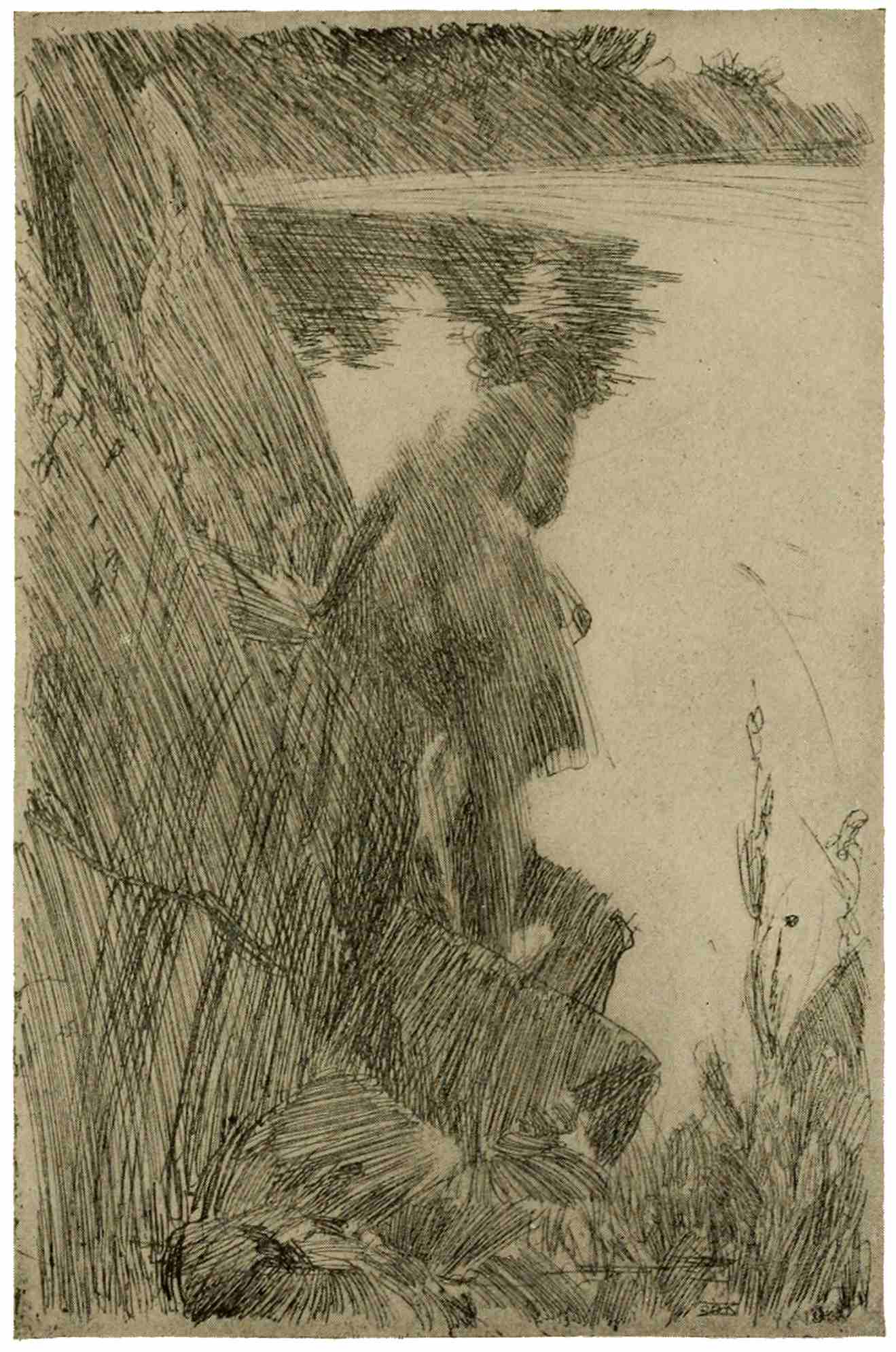
GIRL BATHING
Anders Zorn
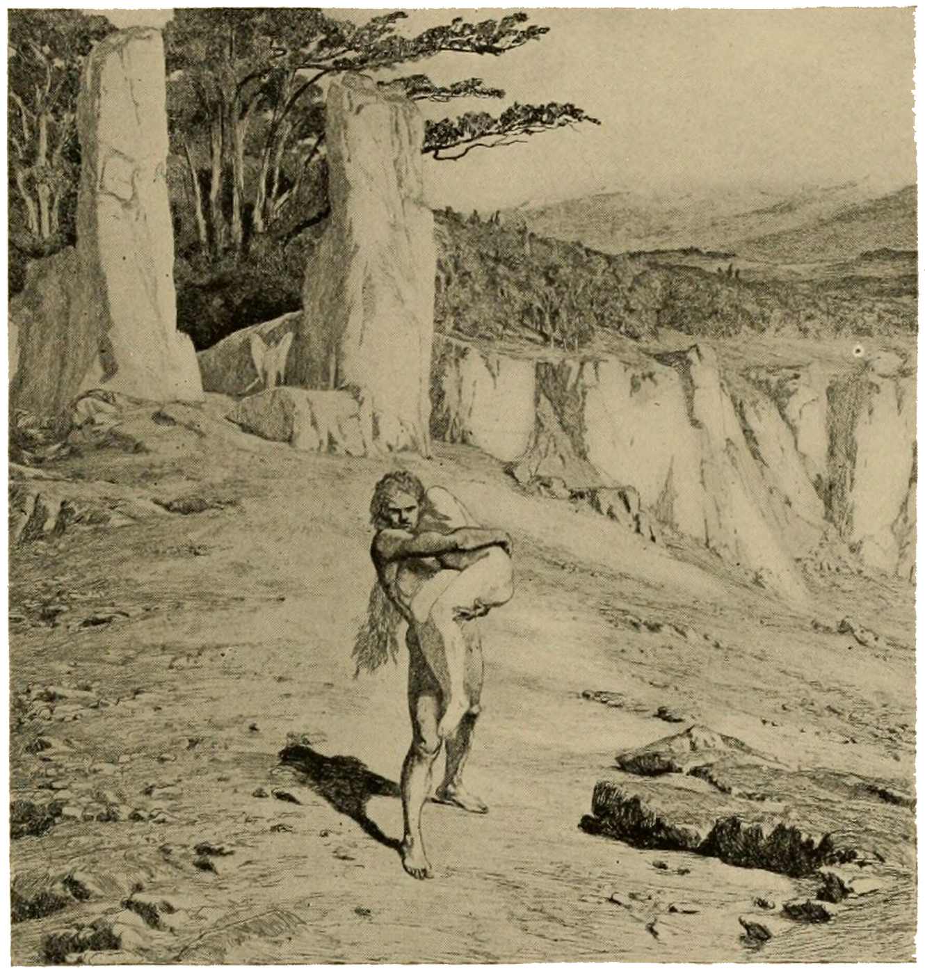
EXPULSION FROM PARADISE
From “Eva und die Zukunft.” Max Klinger
Now, if we compare a print of the early times with the technical creations of our present day, we cannot but realize the increased demands made upon the artist. The phenomena of light must be ever studied anew, in the endeavor to attain new, effective, convincing ways of expression—not merely of color and form as heretofore, but of atmosphere, of light, of vibrating, living, I had almost said “moving,” nature. Hence impressionism; hence, also, daring experiments like this girl bathing, by Anders Zorn, the Swedish painter-etcher. Here is a distinct outdoor feeling; the breeze and sun, the modeling of rock, and the softly rounded nude body against its hard face.136 Everything is done with long, slashing strokes, with hardly any definite outline; a wonderful display of skill. Another illustration, the “Expulsion from Paradise,” by that German master of many arts, Max Klinger, shows us an effect of most intense expression of light in the glaring foreground, where a merciless sun beats down on the first couple: a world all the more arid by contrast with the cool, shady woodland behind the huge, guarded gateway.
The nearer we approach to the present day, the more difficult, even painful, becomes the work of selection; painful because of the many gems barred from inclusion by the necessary restriction of space. A longer review, including men like Lalanne, Legros, Lepère, Schmutzer, Gevger, Munch, Liebermann, Bone, Cameron, Bauer, would needs have to include many others, and disproportionately swell this closing chapter.
If the few prints mentioned—a very few picked from a field immensely rich—should137 awaken in the reader a desire for further exploration in this world of prints, the purpose of these pages will have been achieved.
THE END
To those bent on further inquiry into the subject of prints, two books of prime importance can be most warmly recommended, namely:—
Hind, Arthur M. A Short History of Engraving and etching, with full bibliography, classified list and index of engravers. Boston, Houghton Mifflin Co., 1908.
(An excellent, comprehensive book, with exhaustive lists and indexes, dealing with intaglio prints up to the present day.)
Kristeller, Paul. Kupferstich und Holzschnitt in vier Jahrhunderten. Berlin, Bruno Cassirer, 1905.
(A masterly review of the whole field of prints, including woodcuts, but unfortunately exclusive of the nineteenth century. This also contains an extensive bibliography.)
The careful perusal of either book will provide a good foundation, and the excellent lists of books at the end of each of them will safely guide the reader in his subsequent studies.
The Riverside Press
CAMBRIDGE. MASSACHUSETTS
U.S.A
Larger versions of most illustrations may be seen by right-clicking them and selecting an option to view them separately, or by double-tapping and/or stretching them.
Punctuation, hyphenation, and spelling were made consistent when a predominant preference was found in the original book; otherwise they were not changed.
Simple typographical errors were corrected; unpaired quotation marks were remedied when the change was obvious, and otherwise left unpaired.
Illustrations in this eBook have been positioned between paragraphs and outside quotations. In versions of this eBook that support hyperlinks, the page references in the List of Illustrations lead to the corresponding illustrations.
***END OF THE PROJECT GUTENBERG EBOOK PRINTS***
******* This file should be named 65243-h.htm or 65243-h.zip *******
This and all associated files of various formats will be found in:
http://www.gutenberg.org/6/5/2/4/65243
Updated editions will replace the previous one--the old editions will be renamed.
Creating the works from print editions not protected by U.S. copyright law means that no one owns a United States copyright in these works, so the Foundation (and you!) can copy and distribute it in the United States without permission and without paying copyright royalties. Special rules, set forth in the General Terms of Use part of this license, apply to copying and distributing Project Gutenberg-tm electronic works to protect the PROJECT GUTENBERG-tm concept and trademark. Project Gutenberg is a registered trademark, and may not be used if you charge for the eBooks, unless you receive specific permission. If you do not charge anything for copies of this eBook, complying with the rules is very easy. You may use this eBook for nearly any purpose such as creation of derivative works, reports, performances and research. They may be modified and printed and given away--you may do practically ANYTHING in the United States with eBooks not protected by U.S. copyright law. Redistribution is subject to the trademark license, especially commercial redistribution.
To protect the Project Gutenberg-tm mission of promoting the free distribution of electronic works, by using or distributing this work (or any other work associated in any way with the phrase "Project Gutenberg"), you agree to comply with all the terms of the Full Project Gutenberg-tm License available with this file or online at www.gutenberg.org/license.
1.A. By reading or using any part of this Project Gutenberg-tm electronic work, you indicate that you have read, understand, agree to and accept all the terms of this license and intellectual property (trademark/copyright) agreement. If you do not agree to abide by all the terms of this agreement, you must cease using and return or destroy all copies of Project Gutenberg-tm electronic works in your possession. If you paid a fee for obtaining a copy of or access to a Project Gutenberg-tm electronic work and you do not agree to be bound by the terms of this agreement, you may obtain a refund from the person or entity to whom you paid the fee as set forth in paragraph 1.E.8.
1.B. "Project Gutenberg" is a registered trademark. It may only be used on or associated in any way with an electronic work by people who agree to be bound by the terms of this agreement. There are a few things that you can do with most Project Gutenberg-tm electronic works even without complying with the full terms of this agreement. See paragraph 1.C below. There are a lot of things you can do with Project Gutenberg-tm electronic works if you follow the terms of this agreement and help preserve free future access to Project Gutenberg-tm electronic works. See paragraph 1.E below.
1.C. The Project Gutenberg Literary Archive Foundation ("the Foundation" or PGLAF), owns a compilation copyright in the collection of Project Gutenberg-tm electronic works. Nearly all the individual works in the collection are in the public domain in the United States. If an individual work is unprotected by copyright law in the United States and you are located in the United States, we do not claim a right to prevent you from copying, distributing, performing, displaying or creating derivative works based on the work as long as all references to Project Gutenberg are removed. Of course, we hope that you will support the Project Gutenberg-tm mission of promoting free access to electronic works by freely sharing Project Gutenberg-tm works in compliance with the terms of this agreement for keeping the Project Gutenberg-tm name associated with the work. You can easily comply with the terms of this agreement by keeping this work in the same format with its attached full Project Gutenberg-tm License when you share it without charge with others.
1.D. The copyright laws of the place where you are located also govern what you can do with this work. Copyright laws in most countries are in a constant state of change. If you are outside the United States, check the laws of your country in addition to the terms of this agreement before downloading, copying, displaying, performing, distributing or creating derivative works based on this work or any other Project Gutenberg-tm work. The Foundation makes no representations concerning the copyright status of any work in any country outside the United States.
1.E. Unless you have removed all references to Project Gutenberg:
1.E.1. The following sentence, with active links to, or other immediate access to, the full Project Gutenberg-tm License must appear prominently whenever any copy of a Project Gutenberg-tm work (any work on which the phrase "Project Gutenberg" appears, or with which the phrase "Project Gutenberg" is associated) is accessed, displayed, performed, viewed, copied or distributed:
This eBook is for the use of anyone anywhere in the United States and most other parts of the world at no cost and with almost no restrictions whatsoever. You may copy it, give it away or re-use it under the terms of the Project Gutenberg License included with this eBook or online at www.gutenberg.org. If you are not located in the United States, you'll have to check the laws of the country where you are located before using this ebook.
1.E.2. If an individual Project Gutenberg-tm electronic work is derived from texts not protected by U.S. copyright law (does not contain a notice indicating that it is posted with permission of the copyright holder), the work can be copied and distributed to anyone in the United States without paying any fees or charges. If you are redistributing or providing access to a work with the phrase "Project Gutenberg" associated with or appearing on the work, you must comply either with the requirements of paragraphs 1.E.1 through 1.E.7 or obtain permission for the use of the work and the Project Gutenberg-tm trademark as set forth in paragraphs 1.E.8 or 1.E.9.
1.E.3. If an individual Project Gutenberg-tm electronic work is posted with the permission of the copyright holder, your use and distribution must comply with both paragraphs 1.E.1 through 1.E.7 and any additional terms imposed by the copyright holder. Additional terms will be linked to the Project Gutenberg-tm License for all works posted with the permission of the copyright holder found at the beginning of this work.
1.E.4. Do not unlink or detach or remove the full Project Gutenberg-tm License terms from this work, or any files containing a part of this work or any other work associated with Project Gutenberg-tm.
1.E.5. Do not copy, display, perform, distribute or redistribute this electronic work, or any part of this electronic work, without prominently displaying the sentence set forth in paragraph 1.E.1 with active links or immediate access to the full terms of the Project Gutenberg-tm License.
1.E.6. You may convert to and distribute this work in any binary, compressed, marked up, nonproprietary or proprietary form, including any word processing or hypertext form. However, if you provide access to or distribute copies of a Project Gutenberg-tm work in a format other than "Plain Vanilla ASCII" or other format used in the official version posted on the official Project Gutenberg-tm web site (www.gutenberg.org), you must, at no additional cost, fee or expense to the user, provide a copy, a means of exporting a copy, or a means of obtaining a copy upon request, of the work in its original "Plain Vanilla ASCII" or other form. Any alternate format must include the full Project Gutenberg-tm License as specified in paragraph 1.E.1.
1.E.7. Do not charge a fee for access to, viewing, displaying, performing, copying or distributing any Project Gutenberg-tm works unless you comply with paragraph 1.E.8 or 1.E.9.
1.E.8. You may charge a reasonable fee for copies of or providing access to or distributing Project Gutenberg-tm electronic works provided that
1.E.9. If you wish to charge a fee or distribute a Project Gutenberg-tm electronic work or group of works on different terms than are set forth in this agreement, you must obtain permission in writing from both the Project Gutenberg Literary Archive Foundation and The Project Gutenberg Trademark LLC, the owner of the Project Gutenberg-tm trademark. Contact the Foundation as set forth in Section 3 below.
1.F.
1.F.1. Project Gutenberg volunteers and employees expend considerable effort to identify, do copyright research on, transcribe and proofread works not protected by U.S. copyright law in creating the Project Gutenberg-tm collection. Despite these efforts, Project Gutenberg-tm electronic works, and the medium on which they may be stored, may contain "Defects," such as, but not limited to, incomplete, inaccurate or corrupt data, transcription errors, a copyright or other intellectual property infringement, a defective or damaged disk or other medium, a computer virus, or computer codes that damage or cannot be read by your equipment.
1.F.2. LIMITED WARRANTY, DISCLAIMER OF DAMAGES - Except for the "Right of Replacement or Refund" described in paragraph 1.F.3, the Project Gutenberg Literary Archive Foundation, the owner of the Project Gutenberg-tm trademark, and any other party distributing a Project Gutenberg-tm electronic work under this agreement, disclaim all liability to you for damages, costs and expenses, including legal fees. YOU AGREE THAT YOU HAVE NO REMEDIES FOR NEGLIGENCE, STRICT LIABILITY, BREACH OF WARRANTY OR BREACH OF CONTRACT EXCEPT THOSE PROVIDED IN PARAGRAPH 1.F.3. YOU AGREE THAT THE FOUNDATION, THE TRADEMARK OWNER, AND ANY DISTRIBUTOR UNDER THIS AGREEMENT WILL NOT BE LIABLE TO YOU FOR ACTUAL, DIRECT, INDIRECT, CONSEQUENTIAL, PUNITIVE OR INCIDENTAL DAMAGES EVEN IF YOU GIVE NOTICE OF THE POSSIBILITY OF SUCH DAMAGE.
1.F.3. LIMITED RIGHT OF REPLACEMENT OR REFUND - If you discover a defect in this electronic work within 90 days of receiving it, you can receive a refund of the money (if any) you paid for it by sending a written explanation to the person you received the work from. If you received the work on a physical medium, you must return the medium with your written explanation. The person or entity that provided you with the defective work may elect to provide a replacement copy in lieu of a refund. If you received the work electronically, the person or entity providing it to you may choose to give you a second opportunity to receive the work electronically in lieu of a refund. If the second copy is also defective, you may demand a refund in writing without further opportunities to fix the problem.
1.F.4. Except for the limited right of replacement or refund set forth in paragraph 1.F.3, this work is provided to you 'AS-IS', WITH NO OTHER WARRANTIES OF ANY KIND, EXPRESS OR IMPLIED, INCLUDING BUT NOT LIMITED TO WARRANTIES OF MERCHANTABILITY OR FITNESS FOR ANY PURPOSE.
1.F.5. Some states do not allow disclaimers of certain implied warranties or the exclusion or limitation of certain types of damages. If any disclaimer or limitation set forth in this agreement violates the law of the state applicable to this agreement, the agreement shall be interpreted to make the maximum disclaimer or limitation permitted by the applicable state law. The invalidity or unenforceability of any provision of this agreement shall not void the remaining provisions.
1.F.6. INDEMNITY - You agree to indemnify and hold the Foundation, the trademark owner, any agent or employee of the Foundation, anyone providing copies of Project Gutenberg-tm electronic works in accordance with this agreement, and any volunteers associated with the production, promotion and distribution of Project Gutenberg-tm electronic works, harmless from all liability, costs and expenses, including legal fees, that arise directly or indirectly from any of the following which you do or cause to occur: (a) distribution of this or any Project Gutenberg-tm work, (b) alteration, modification, or additions or deletions to any Project Gutenberg-tm work, and (c) any Defect you cause.
Project Gutenberg-tm is synonymous with the free distribution of electronic works in formats readable by the widest variety of computers including obsolete, old, middle-aged and new computers. It exists because of the efforts of hundreds of volunteers and donations from people in all walks of life.
Volunteers and financial support to provide volunteers with the assistance they need are critical to reaching Project Gutenberg-tm's goals and ensuring that the Project Gutenberg-tm collection will remain freely available for generations to come. In 2001, the Project Gutenberg Literary Archive Foundation was created to provide a secure and permanent future for Project Gutenberg-tm and future generations. To learn more about the Project Gutenberg Literary Archive Foundation and how your efforts and donations can help, see Sections 3 and 4 and the Foundation information page at www.gutenberg.org.
The Project Gutenberg Literary Archive Foundation is a non profit 501(c)(3) educational corporation organized under the laws of the state of Mississippi and granted tax exempt status by the Internal Revenue Service. The Foundation's EIN or federal tax identification number is 64-6221541. Contributions to the Project Gutenberg Literary Archive Foundation are tax deductible to the full extent permitted by U.S. federal laws and your state's laws.
The Foundation's principal office is in Fairbanks, Alaska, with the mailing address: PO Box 750175, Fairbanks, AK 99775, but its volunteers and employees are scattered throughout numerous locations. Its business office is located at 809 North 1500 West, Salt Lake City, UT 84116, (801) 596-1887. Email contact links and up to date contact information can be found at the Foundation's web site and official page at www.gutenberg.org/contact
For additional contact information:
Dr. Gregory B. Newby
Chief Executive and Director
gbnewby@pglaf.org
Project Gutenberg-tm depends upon and cannot survive without wide spread public support and donations to carry out its mission of increasing the number of public domain and licensed works that can be freely distributed in machine readable form accessible by the widest array of equipment including outdated equipment. Many small donations ($1 to $5,000) are particularly important to maintaining tax exempt status with the IRS.
The Foundation is committed to complying with the laws regulating charities and charitable donations in all 50 states of the United States. Compliance requirements are not uniform and it takes a considerable effort, much paperwork and many fees to meet and keep up with these requirements. We do not solicit donations in locations where we have not received written confirmation of compliance. To SEND DONATIONS or determine the status of compliance for any particular state visit www.gutenberg.org/donate.
While we cannot and do not solicit contributions from states where we have not met the solicitation requirements, we know of no prohibition against accepting unsolicited donations from donors in such states who approach us with offers to donate.
International donations are gratefully accepted, but we cannot make any statements concerning tax treatment of donations received from outside the United States. U.S. laws alone swamp our small staff.
Please check the Project Gutenberg Web pages for current donation methods and addresses. Donations are accepted in a number of other ways including checks, online payments and credit card donations. To donate, please visit: www.gutenberg.org/donate
Professor Michael S. Hart was the originator of the Project Gutenberg-tm concept of a library of electronic works that could be freely shared with anyone. For forty years, he produced and distributed Project Gutenberg-tm eBooks with only a loose network of volunteer support.
Project Gutenberg-tm eBooks are often created from several printed editions, all of which are confirmed as not protected by copyright in the U.S. unless a copyright notice is included. Thus, we do not necessarily keep eBooks in compliance with any particular paper edition.
Most people start at our Web site which has the main PG search facility: www.gutenberg.org
This Web site includes information about Project Gutenberg-tm, including how to make donations to the Project Gutenberg Literary Archive Foundation, how to help produce our new eBooks, and how to subscribe to our email newsletter to hear about new eBooks.