THERE is less satisfactory holiday hunting for greeting cards than for any other gift. Visit any shop where gift cards are in evidence and you will note how prospective purchasers go over and over the display, finding one here, discarding it later and at the end possibly making a hesitating and unsatisfied selection.
Publishers have stated to me that if there is one symbol of the holiday season that should be rejuvenated, it is the custom of sending gift cards. We can all recall how dear to our eyes were the lace-edged, isinglass, snow-encrusted gift cards, which had to be handled with finger tips, and the singing bird sentiments, which were so daintily revealed by a surprise opening of a flap. These cards, together with the horse-hair sofa and the wax flowers in a glass dome, were part of a certain evolution, and, of course, the only place now for such cards is way down at the bottom of some memory box.
Previous to the world war, America was flooded with cards of a gingerbread tinsel order of decorations turned out by the million in foreign countries. These, as well as postcards, were printed in huge editions by sweat-shop methods, which, together with certain “can’t-be-done-better” slogans, caused our own shops to fall back as competitors.
Now we all know that, no matter how perfect the printing may be, the design and idea must be the selling factor of the gift card. And again, the more the idea and wording meet with the personal or local trend of the community in which it is distributed, the better it will be accepted.
That possibly is the reason why you and I can’t find what we want when we look for a card to express our personal feeling, because it was expressed either in Dresden or London or Hoboken or Squashville. What we need are cards that are typical community expressions from the parts of the country from which they come. It is just as foolish for me to send you a card from California with a home-coming sleigh scene having snow-burdened roofs for a back-ground, as it would be for you to send a decoration unrelated to your environment. Let’s use motifs and scenes and wording which create the charm of our home section, and we will find that the card will be doubly welcomed by the recipient on that account.
If the American card is to be encouraged in America, the designing and appreciation of such must be started right in the art rooms of our schools; and the most important part of such a problem is the lettering.
Lettering need not be approached with fear and trembling, for it can be done with ease and pleasure. I know of students who shunned lettering because they thought it mechanical and laborious, but who, after discovering its possibilities, had almost to be bribed to do anything else.
The old masters and artist-craftsmen recognized that lettering could be as artistic as the worker desired and nothing is more beautiful in lettering than the illuminated manuscripts and books of those ages.
The easiest way to produce lettering is to use the lettering pens. These pens are made with a separate, small brass tip which is placed on the pen as a fountain. The fountain is filled from the quill of the drawing ink bottle, just as the ink is put into a ruling pen. As the pens come in about twelve different stroke-widths, it is well to have a pen holder for each size. This will save confusion and time. When the pen is being used it should be held so that both sides of the pen-point rest on the paper. It is not necessary to press the pen for wide parts, as it will almost automatically produce the wide strokes when brought downward and the thin strokes when brought upward.
The board on which the drawing is made should be placed at an angle of 45 degrees to permit the ink to flow well. If too great a slant is used, the ink, strange to say, refuses to run up hill, and if the board is placed flat, the ink on the pen will be too ambitious to arrive.
Before beginning a card, the idea should be roughly planned, so that the general forms may be considered. This is termed the “dummy.” In planning the dummy, consider carefully the margins. Good lettering is often spoiled by poor spacing. Because you are doing lettering, do not ignore design principles. Every design principle you know of can be used in lettering, just as it can be in any art application.
To prevent your lettering from being at a slant, or “off its feet,” to use the printer’s term, you should rule light vertical plumb lines to guide your letter strokes.
When lettering, remember that unity must be thought of continually. If the finish of each stroke or “serif” is large on the first letter, it must be similar on all other letters. The thin strokes throughout a line of lettering should be equal in weight. This rule applies also to the thick strokes. The lettering pens take care of this if used properly and if no undue pressure is placed on the pen.
A beautiful initial is always a happy beginning to a quotation. With color or illumination added, much charm is possible. If the lettering is on soft-surfaced paper, it will be found that a leather tool or other metal point can be used for tooling the initial from the back as well as from the front. Gold or silver water colors, added with proper restraint give a sparkle to the card.
If your class wishes to raise funds for some worthy enterprise try having a class competition for gift cards. The verses can be a problem for the class in English. Selecting the best half-dozen designs, get in touch with an engraver, and have the students make working-drawings. Right there you will learn something new about drawing for the industries. Then after the engravings are received, if your school is one of the fortunate ones with a printing department, have your students co-operate with the printing students in securing the right colors, etc. Plan envelopes, which can be easily made by cutting the paper from patterns and then folding and pasting them together.
Beginners in gift card designing should all be encouraged to start with simple work, similar to that in Plate 3. Such work results in well-designed cards and is encouraging to the originator. The idea of using cut paper is always good with amateur artists, as it helps them to keep their work simple and makes color harmonies easier. Elaborate ideas, such as figures, ornate designs, etc., should be avoided at the start.
In selecting colors, the students should be encouraged to use subdued or grayed tones, for, by this means, they are much more certain of obtaining a rich-looking card. There are too many printed cards already on the market which are done in gaudy colors, without adding more. If cut paper cards are made, the students can decide on the colors they want by laying strips of the colored paper side by side, until the best color scheme has been decided upon.
Too much stress cannot be laid upon good placing or arrangement of the lettering. In Plate 4, we have a series of cards that are fairly good, but that would have been quite a bit improved by better lettering. The ideas and general arrangement of these cards make them good suggestions.
Often we find students in classes turning out cards all based upon the same general composition. It is easy for students to follow a general type of card suggested by the teacher or some progressive young artist. In Plate 5, we find a page of ten typical arrangements. Although different as to basic composition, they are all good, and can be used as a start for original work. Always bear in mind the idea that both lettering and decoration should be in complete harmony. Light fantastic lettering, for instance, would not be in harmony with heavy, bold decorations.
In late years we find many artists and designers, who cannot find suitable cards in the book shops, sketching designs of their own and having them printed. In this way they can put in an individual touch and produce a card that exactly meets their requirements. Although such a card is more expensive than a stock card, the plan works out well for those who have a fair list of mailing acquaintances. A page of such cards is shown in Plate 6.
The use of flat, massive tones, provided the colors are not too heavy, always makes a distinctive card. Plate 7 shows a page of such designs. A good typical example is the card in the lower right hand corner which contains the quotation from Dickens. The use of toned paper often helps. At most art stores it is possible to obtain a vegetable parchment paper which makes splendid material on which to draw or print the strong, decorative type of gift card.
Oftentimes we receive or send holiday cards that are based on a humorous trend. Nothing takes so well as a bit of verse with a smile tied onto it somewhere, provided it is well done. A cheerful card is generally kept and placed where its owner can see it often. Designs for such cards should be well-planned, in order to avoid an appearance of the comic valentine in their general make-up. A page of work having the semi-humorous element is found in Plate 8.
Anyone desiring to reproduce an artistic card with the minimum expense, will do well to look into the idea of using cut linoleum. By planning motifs that hold well together, and are strong in design, it is possible to cut out some very acceptable blocks in heavy linoleum. From these, almost any number of gift cards can be printed by hand in varied colors. When dry, these cards can be hand colored. Because of the difficulty in cutting out the letters, one should use as few words as possible. Designs adapted to this work are found in Plate 9.
Occasionally, students having a natural bent or enthusiasm for design will be found anxious to produce a card of the style found in Plate 10. In cards of this kind, careful attention must be given to the motifs used and to the placing of these motifs in the general composition. As most of the stress is laid on the design, rather than the lettering, it is important that this design be well planned and equally well carried out. In case of doubt, it is better to leave out some of the ornament rather than have the card overcrowded or ornate.
The holiday motifs shown in Plate 11 are not only adapted to gift cards, but also to posters, place cards, and room or tree decorations. It is a good problem to allow the students to take such a page of motifs and from them to plan their own card, using their own ideas as to size of card, proportion, lettering, etc. This is splendid training for the artists in the line of what is known to the printers as “make-up.” After the preliminary sketches have been made the teacher can call attention to mistakes in balance, rhythm, etc., and suggest corrections.
Other useful ornaments, not only for Christmas but also for Easter and Hallowe’en, are found in Plates 12 and 13. The test of a student’s ability lies in the way he is able to arrange such motifs into a good card, or the manner in which he derives ideas from these motifs for original work.
Plate 14 gives us some very effective motifs for Washington’s Birthday. These figures can be cut in paper, done in opaque wash, or finished in pen and ink. Original poems may be written by members of the class and added to the card. School programs or invitations can be made a class problem for this topic.
Valentines also afford a good opportunity for a class problem. Try to encourage in the students the development of new ideas or original treatment in the handling of their valentine cards. A card does not need to be gaudy, over-elaborate, or grotesque, in order to be attractive. A few simple motifs, well placed, and with good coloring, will produce the most pleasing kind of a card. Humorous cards, containing good clean fun are always acceptable, if well done.
A Valentine containing unique possibilities is shown in Plate 16. The same idea can be varied so as to make a number of novel cards. The little envelope, which this card features, is easily constructed and will hold quite a message, if written carefully. The figure of the messenger can be hand colored in buff and vermilion.
The cards and motifs shown on these plates make a series of general suggestions. Based on the types shown here, as regards lettering, design, and card sizes, gift cards for the various holidays and for birthdays can be planned and worked out. Once your students produce such cards, they will never again be satisfied with stock cards. Successful students can find remuneration as well as much joy in designing gift cards for their friends’ needs, and in time may be able to create a market in their own locality.
Problem 1. Have students select or originate a good Christmas sentiment. Next, sketch on an 8 x 10 sheet of pencil paper four different arrangements of this idea.
Problem 2. After selecting the best composition from sketches in Problem 1, plan a card and envelope arrangement to go with it. Study over suggestions given in Plate 2.
Problem 3. Using three colors and a tinted paper, complete the idea planned in Problems 1 and 2. Possibly two varied types of cards can be worked up.
Problem 4. As a variation, design and complete two simple cards in cut paper. Use about four colors, using the background as one of the colors.
Problem 5. Keeping the flat decorative type of work as a standard study the cards in Plate 7. Next, design a Christmas folder of two or four pages, having a cover design and lettered verse inside.
Problem 6. Plan a set of four holiday tags or stickers to go with packages. These should not exceed 2 x 3 inches in size and can be of the semi-humorous type.
Problem 7. Have students copy a good pen alphabet using both the capitals and small letters. This card should be made on a 8 x 10 sheet of bristol board.
Problem 8. Either look up or originate some text that will make a good holiday gift. Block out a wall card that will be about 6 x 9 inches in proportion and design the motto to fit this space using the pen letters studied.
Problem 9. Study the cut paper cards made in Problem 4. Also look at Plate 9. Next, on pencil paper, block out two compositions that will cut well in linoleum. Select the best and work it out carefully in color, planning every part in flat tones.
Problem 10. From color sketch, trace and cut out the linoleum blocks. Using opaque water colors, print a set of fifteen or twenty good cards. Make envelopes to go with them. Vary color schemes if desired.
Problem 11. Allow each student to originate a color scheme and table plan for a Christmas dinner. After this has been perfected, have each student make six place cards to go with the decorations.
Problem 12. Study suggestions in Plate 12 and 13. From these or other material, design one round and one oblong sticker to be placed on a gift package. This may be for any of the holidays or for a birthday.
Problem 13. Look over Plate 14. Using these suggestions or similar ones, plan a program or an invitation to Washington’s Birthday exercises at the school. Size and color optional.
Problem 14. Study Plates 15 and 16. Next, design two good Valentines, one being of the greeting type and the other having some novelty added, as the one found in Plate 16. Keep lettering clear and simple.
Problem 15. Design an artistic Easter Card, using white or cream paper and delicate coloring. Tie with appropriate cord or ribbon.
Problem 16. Plan invitations to a Fourth of July party. Work for a unique effect without using too many colors.
Problem 17. Do the same with Hallowe’en, using cut paper instead of colors.
Problem 18. Design an invitation to a Thanksgiving dinner, using a combination of ink outlines and flat washes of watercolor.
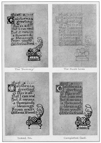
A Good Gift Card is always first sketched in lightly and planned from the standpoint of good balance and design. In designing a card always try several small arrangements or compositions before deciding on the one to complete.
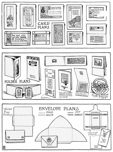
In Addition to the planning of the lettering, the designer has an opportunity for invention as regards the type of card and its envelope or container. A novel idea goes a long way toward success.
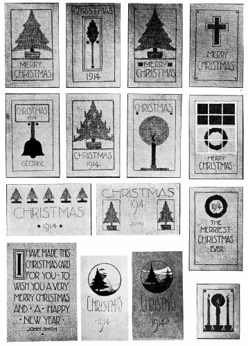
Nothing pleases the receiver so much as a hand finished card from some good friend. Above are some simple designs that any artist could produce. These originals were made by children.
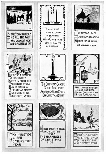
Another Page containing some simple compositions. By using subdued tones of green, red and white on a gray or buff paper, very interesting color effects may be obtained. These were made by students in high school grades.
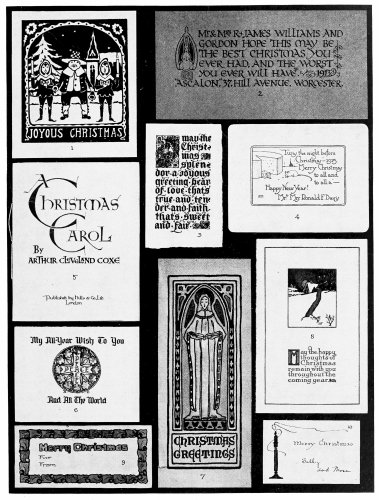
Christmas Cards. Ten typical arrangements. 1. Full panel decorations. 2. Initial decoration. 3. Ornamental initial. 4. Text illustrated. 5. Lettering only. 6. Lettering and panel ornament. 7. Panel decoration and text panel. 8. Pictorial panel and text. 9. Border decoration. 10. Free symbol and text. All the originals, several published for general sale, others privately printed, were in color. 3, 6, 7, 9, and 10 were hand colored. To make an original card, choose the arrangement that seems most desirable, and substitute elements having a personal appeal—other salutations or quotations and appropriate decorative elements.
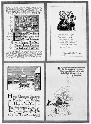
Four Varied Styles of design in holiday cards, for more advanced talent. Note how each one is based on a foundation of good design. These cards were all designed by those sending them out as personal greetings.
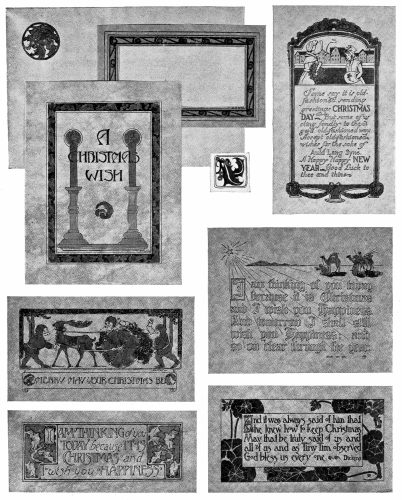
A Page of strong designs made by art school students. Notice how the designs have been kept in simple broad masses and the lettering made part of the design. The originals in color were even more unified.
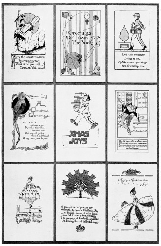
A Page of Christmas Cards in which a semi-humorous element has been incorporated. Cards like these often create a pleasant variation from the more formal ones. These were designed by high school students.
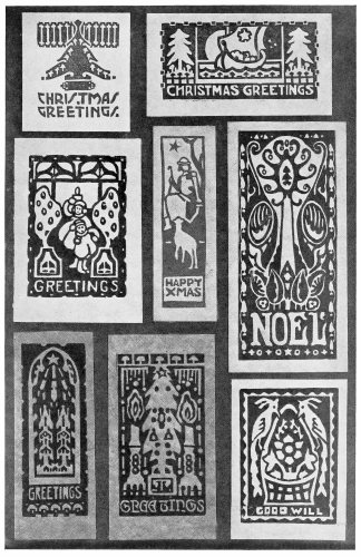
Strong, Well Massed Designs like these are well adapted to work in cut linoleum. If printed in a deep gray or brown and hand colored with light washes of transparent color they make an unusually rich looking card.
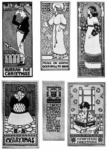
Cards using figures of the poster type. In these the accent has been placed on the decorative design quality. If properly done, such a problem gives the student fine training in spacing, balance and rhythm, and results in a highly artistic card.
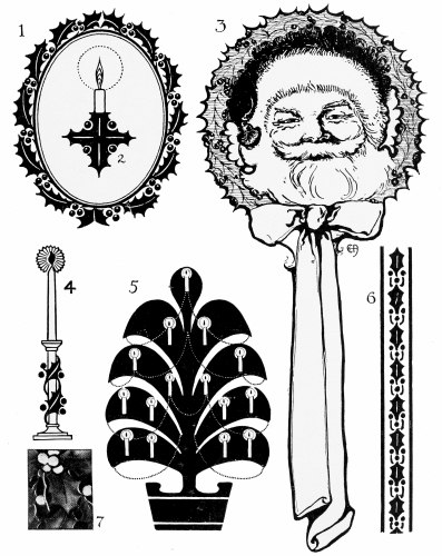
A Set of holiday motifs that will help in planning Christmas Gift Cards or quotations. These are simple enough to be used by beginners.
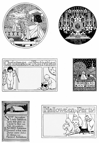
A Page of useful holiday designs. These may be used as the basis of original cards. Their wide range suggests a variation of techniques. Simple line drawings, similar to that of Hallowe’en are best adapted to hand coloring.
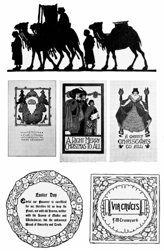
Another Page of good suggestions. The silhouette at the top suggests possibilities in cut paper for the little folks. The use of cut out motifs in colored paper is an easy way for the younger artists to make their cards.
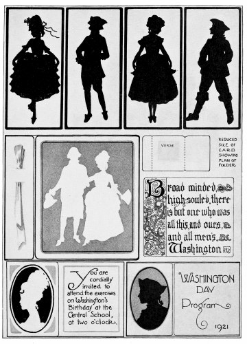
Suggestions for Washington’s Birthday. Silhouettes may be produced in cut paper, stencil work, opaque colors or pen and ink. Both Washington’s and Lincoln’s Birthday offer good opportunities for art projects.
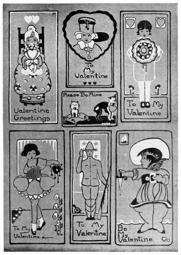
A Page of interesting Valentine designs. The use of a light and dark color against a medium toned paper is a sure way of obtaining quick and effective results. Variations, without figures, can be made by the younger artists.
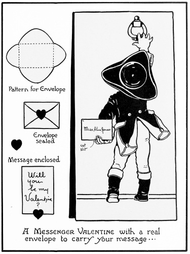
A Unique Valentine Design. In this one an individual message can be written and put in the little envelope. Variations, such as a little dog holding a valentine-letter or a bird with one in his bill might be worked out similar to this idea.